SoLAR, the Society for Learning Analytics Research has recently made available a dataset covering research publications in learning analytics and educational data mining and issued the LAK Data Challenge, challenging the community to use the dataset to answer the question:
What do analytics on learning analytics tell us? How can we make sense of this emerging field’s historical roots, current state, and future trends, based on how its members report and debate their research?
Thanks to too many repeats on the TV schedule I managed to re-learn a bit of novice-level SPARQL and manipulate the RDF/XML provided into a form I can handle with R.
Now, I’ve had a bit of a pop at the sociograms – i.e. visualisations of social networks – in the past but they do have their uses and one of these is getting a feel for the shape of a dataset that deals with relations. In the case of the LAK challenge dataset, the relationship between authors and papers is such a case. So as part of thinking about whether I’m up for the approaching the challenge from this perspective it makes sense to visualise the data.
And with it being the Christmas season, the colour scheme chose itself.

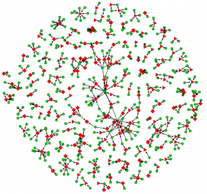
Paper Authorship for Proceedings from LAK, EDM and the JETS Special Edition on Learning and Knowledge Analytics (click on image for full-size version)
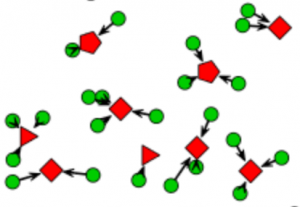
This is technically a “bipartite sociogram” since it shows two kinds of entity and relationships between types. In this case people are shown as green circles and papers shown as red polygons. The data has been limited to the conferences on Learning Analytics and Knowledge (LAK) 2011 and 2012 (red triangles) and the Educational Data Mining (EDM) Conference for the same years (red diamonds). The Journal of Educational Technology and Society special edition on learning and knowledge analytics was also published in 2012 (red pentagons). Thus, we have a snapshot of the main venues for scholarship vicinal to learning analytics.
So, what does it tell me?
My first observation is that there are a lot of papers that have been written by people who have written no others in the dataset for 2011/12(from now on, please assume I always mean this subset). I see this as being consistent with this being an emergent field of research. It is also clear that JETS attracted papers from people who were not already active in the field. This is not the entire story, however as the more connected central region of the diagram shows. Judging this region by eye and comparing it to the rest of the diagram, it looks like there is a tendency for LAK papers (triangles) to be under-represented in the more-connected region compared to EDM (diamonds). This is consistent with EDM conferences having been run since 2008 and their emergence from workshops on the Artificial Intelligence in Education. LAK, on the other hand began in 2011. Some proper statistics are needed to confirm judgement by eye. It would be interesting to look for signs of evolution following the 2013 season.
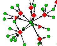
The sign of an established research group is the research group head who co-authors several papers with each paper having some less prolific co-authors who are working for the PhDs. The chief and Indians pattern. A careful inspection of the central region shows this pattern as well as groups with less evidence of hierarchy.
LAK came into being and attracted people without a great deal of knowledge of the prior existence of the EDM conference and community so some polarisation is to be expected. There clearly are people, even those with many publications, the have only published to one venue. Consistent with previous comments about the longer history of EDM it isn’t surprising that this is most clear for that venue since there are clearly established groups at work. What I think will be some comfort to the researchers in both camps who have made efforts to build bridges is that there are signs of integration (see the Chiefs and Indians snippet). Whether this is a sign of integrating communities or a consequence of individual preference alone is an open question. Another question to consider with more rigour and something to look out for in the 2013 season.
Am I any the wiser? Well… slightly, and it didn’t take long. There are certainly some questions that could be answered with further analysis and there are a few attributes not taken account of here, such as institutional affiliation or country/region. I will certainly have a go at using the techniques I outlined in a previous post if the weather is poor over the Christmas break but I think I will have to wait until the data for 2013 is available before some of the interesting evolutionary shape of EDM and LAK becomes accessible.
Merry Christmas!


