Analytics is Not New!

As we collectively climb up the hype cycle towards the peak of inflated expectations for analytics, and I think this can be argued for many industries and applications of analytics, a bit of historical perspective makes a good antidote both to exaggerated claims but also to the pessimists who would say it is “all just hype”.

That was my starting point for a  paper I wrote towards the end of 2012 and which is now published as “A Brief History of Analytics“. As I did the desk research, three aspects recurred:

  1. much that appears recent can be traced back for decades;
  2. the techniques being employed by different communities of specialists are rather complementary;
  3. there is much that is not under the narrow spotlight of marketing hype and hyperbole.

The historical perspective gives us inspiration in the form of Florence Nightingale‘s pioneering work on using statistics and visualisation to address problems of health and sanitation and to make the case for change. It also reminds us that Operational Researchers (Operations Researchers) have been dealing with complex optimisation problems including taking account of human factors for decades.

I found that writing the paper helped me to clarify my thinking about what is feasible and plausible and what the likely kinds of success stories for analytics will be in the medium term. Most important, I think, is that our collective heritage of techniques for data analysis, visualisation and use to inform practical action shows that the future of analytics is a great deal richer than the next incarnation of Business Intelligence software or the application of predictive methods to Big Data. These have their place but there is more; analytics has many themes that combine to make it an interesting story that unfolds before us.

The paper “A Brief History of Analytics” is the ninth in the CETIS Analytics Series.

A Seasonal Sociogram for Learning Analytics Research

SoLAR, the Society for Learning Analytics Research has recently made available a dataset covering research publications in learning analytics and educational data mining and issued the LAK Data Challenge, challenging the community to use the dataset to answer the question:

What do analytics on learning analytics tell us? How can we make sense of this emerging field’s historical roots, current state, and future trends, based on how its members report and debate their research?

Thanks to too many repeats on the TV schedule I managed to re-learn a bit of novice-level SPARQL and manipulate the RDF/XML provided into a form I can handle with R.

Now, I’ve had a bit of a pop at the sociograms – i.e. visualisations of social networks – in the past but they do have their uses and one of these is getting a feel for the shape of a dataset that deals with relations. In the case of the LAK challenge dataset, the relationship between authors and papers is such a case. So as part of thinking about whether I’m up for the approaching the challenge from this perspective it makes sense to visualise the data.

And with it being the Christmas season, the colour scheme chose itself.

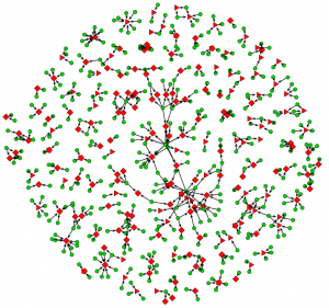
Bipartite Sociogram for Paper Authorship for Proceedings from LAK, EDM and the JETS Special Edition on Learning Analytics

Paper Authorship for Proceedings from LAK, EDM and the JETS Special Edition on Learning and Knowledge Analytics (click on image for full-size version)

This is technically a “bipartite sociogram” since it shows two kinds of entity and relationships between types. In this case people are shown as green circles and papers shown as red polygons. The data has been limited to the conferences on Learning Analytics and Knowledge (LAK) 2011 and 2012 (red triangles) and the Educational Data Mining (EDM) Conference for the same years (red diamonds). The Journal of Educational Technology and Society special edition on learning and knowledge analytics was also published in 2012 (red pentagons). Thus, we have a snapshot of the main venues for scholarship vicinal to learning analytics.

So, what does it tell me?

My first observation is that there are a lot of papers that have been written by people who have written no others in the dataset for 2011/12(from now on, please assume I always mean this subset). I see this as being consistent with this being an emergent field of research. It is also clear that JETS attracted papers from people who were not already active in the field. This is not the entire story, however as the more connected central region of the diagram shows. Judging this region by eye and comparing it to the rest of the diagram, it looks like there is a tendency for LAK papers (triangles) to be under-represented in the more-connected region compared to EDM (diamonds). This is consistent with EDM conferences having been run since 2008 and their emergence from workshops on the Artificial Intelligence in Education. LAK, on the other hand began in 2011. Some proper statistics are needed to confirm judgement by eye. It would be interesting to look for signs of evolution following the 2013 season.

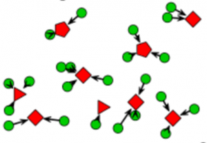
A lot of papers were written by people who wrote no others.

A lot of papers were written by people who wrote no others.

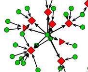
The sign of an established research group is the research group head who co-authors several papers with each paper having some less prolific co-authors who are working for the PhDs. The chief and Indians pattern. A careful inspection of the central region shows this pattern as well as groups with less evidence of hierarchy.

Cheif and Indians.

Chief and Indians.

A less hierarchical group.

A less hierarchical group.

LAK came into being and attracted people without a great deal of knowledge of the prior existence of the EDM conference and community so some polarisation is to be expected. There clearly are people, even those with many publications, the have only published to one venue. Consistent with previous comments about the longer history of EDM it isn’t surprising that this is most clear for that venue since there are clearly established groups at work. What I think will be some comfort to the researchers in both camps who have made efforts to build bridges is that there are signs of integration (see the Chiefs and Indians snippet). Whether this is a sign of integrating communities or a consequence of individual preference alone is an open question. Another question to consider with more rigour and something to look out for in the 2013 season.

Am I any the wiser? Well… slightly, and it didn’t take long. There are certainly some questions that could be answered with further analysis and there are a few attributes not taken account of here, such as institutional affiliation or country/region. I will certainly have a go at using the techniques I outlined in a previous post if the weather is poor over the Christmas break but I think I will have to wait until the data for 2013 is available before some of the interesting evolutionary shape of EDM and LAK becomes accessible.

Merry Christmas!

Looking Inside the Box of Analytics and Business Intelligence Applications

To take technology and social process at face value is to risk failing to appreciate what they mean, do, and can do. Analytics and business intelligence applications or projects, in common with all technology supported innovations, are more likely to be successful if both technology and social spheres are better understood. I don’t mean to say that there is no room for intuition in such cases, rather that it is helpful to decide which aspects are best served by intuition or not and by whose intuition, if so. But how to do this?

Just looking can be a poor guide to understanding an existing application and just designing can be a poor approach to creating a new one. Some kind of method, some principles, some prompts or stimulus questions – I will use “framework” as an umbrella term – can all help to avoid a host of errors. Replication of existing approaches that may be obsolete or erroneous, falling into value or cognitive traps, failure to consider a wider range of possibilities, etc are errors we should try to avoid. There are, of course, many approaches to dealing with this problem other than a framework. Peer review and participative design have a clear role to play when adopting or implementing analytics and business intelligence but a framework can play a part alongside these social approaches as well as being useful to an individual sense-maker.

The culmination of my thinking about this kind of framework has just been published as the seventh paper in the CETIS Analytics Series, entitled “A Framework of Characteristics for Analytics“. This started out as a personal attempt to make sense of my own intuitive dissatisfaction with the traditions of business intelligence combined with concern that my discussions with colleagues about analytics were sometimes deeply at cross purposes or just unproductive because our mental models lacked sufficient detail and clarity to properly know what we were talking about or to really understand where our differences lay.

The following quotes from the paper.

A Framework of Characteristics for Analytics considers one way to explore similarities, differences, strengths, weaknesses, opportunities, etc of actual or proposed applications of analytics. It is a framework for asking questions about the high level decisions embedded within a given application of analytics and assessing the match to real world concerns. The Framework of Characteristics is not a technical framework.

This is not an introduction to analytics; rather it is aimed at strategists and innovators in post-compulsory education sector who have appreciated the potential for analytics in their organisation and who are considering commissioning or procuring an analytics service or system that is fit for their own context.

The framework is conceived for two kinds of use:

  1. Exploring the underlying features and generally-implicit assumptions in existing applications of analytics. In this case, the aim might be to better comprehend the state of the art in analytics and the relevance of analytics methods from other industries, or to inspect candidates for procurement with greater rigour.
  2. Considering how to make the transition from a desire to target an issue in a more analytical way to a high level description of a pilot to reach the target. In this case, the framework provides a starting-point template for the production of a design rationale in an analytics project, whether in-house or commissioned. Alternatively it might lead to a conclusion that significant problems might arise in targeting the issue with analytics.

In both of these cases, the framework is an aid to clarify or expose assumptions and so to help its user challenge or confirm them.

I look forward to any comments that might help to improve the framework.

What does “Analytics” Mean? (or is it just another vacuuous buzz word?)

“Analytics” certainly is a buzz word in the business world and almost impossible to avoid at any venue where the relationship between technology and post-compulsory education is discussed, from bums-on-seats to MOOCs. We do bandy words like analytics or cloud computing around rather freely and it is so often the case with technology-related hype words that  they are used by sellers of snake oil or old rope to confuse the ignorant and by the careless to refer vaguely to something that seems to be important.

Cloud computing is a good example. While it is an occasionally useful umbrella term for a range of technologies, techniques and IT service business models, it masks differences that matter in practice. Any useful thinking about cloud must work on a more clear understanding of the kinds of cloud computing service delivery level and the match to the problem to be solved. To understand the very real benefits of cloud computing, you need to understand the distinct offerings; any discussion that just refers to cloud computing is likely to be vacuuous.  These distinctions are discussed in a CETIS briefing paper on cloud computing.

But is analytics like cloud computing, is the word itself useful? Can a useful and clear meaning, or even a definition, of analytics be determined?

I believe the answer is “yes” and the latest paper in our Analytics Series, which is entitled “What is Analytics? Definition and Essential Characteristics” explores the background and discusses previous work on defining analytics before proposing a definition. It then extends this to a consideration of what it means to be analytical as opposed to being just quantitative. I realise that the snake oil and old rope salesmen will not be interested in this distinction; it is essentially a stance against uncritical use of “analytics”.

There is another way in which I believe the umbrella terms of cloud computing and analytics differ. Whereas cloud computing  becomes meaningful by breaking it down and using terms such as “software as a service”, I am not convinced that a similar approach is applicable to analytics. The explanation for this may be that cloud computing  is bound to hardware and software, around which different business models become viable, whereas analytics is foremost about decisions, activity and process.

Terms for kinds of analytics, such as “learning analytics”, may be useful to identify the kind of analytics that a particular community is doing but to define such terms is probably counter-productive (although working definitions may be very useful to allow the term to be used in written or oral communications). One of the problems with definitions is the boundaries they draw. Where would learning analytics and business analytics have boundary in an educational establishment? We could probably agree that some cases of analytics were on one side or the other but not all cases. Furthermore, analytics is a developing field that certainly has not covered all that is possible and is very immature in many industries and public sector bodies. This is likely to mean revision of definitions is necessary, which rather defeats the object.

Even the use of nouns, necessary though it may be in some circumstances, can be problematical. If we both say “learning analytics”, are we talking about the same thing? Probably not, because we are not really talking about a thing but about processes and practices. There is a danger that newcomers to something described as “learning analytics” will construct quite a narrow view of “learning analytics is ….” and later declaim that learning analytics doesn’t work or that learning analytics is no good because it cannot solve problem X or Y. Such blinkered sweeping statements are a warning sign that opportunities will be missed.

Rather than say what business analytics, learning analytics, research analytics, etc is, I think we should focus on the applications, the questions and the people who care about these things. In other words, we should think about what analytics can and cannot help us with, what it is for, etc. This is reflected in most of the titles in the CETIS Analytics Series, for example our recently-published paper entitled “Analytics for Learning and Teaching“. The point being made about avoiding definitions of kinds of analytics is expanded upon in “What is Analytics? Definition and Essential Characteristics“.

The full set of papers in the series is available from the CETIS Publications site.

Modelling Social Networks

Social network analysis has become rather popular over the last five (or so) years; the proliferation of different manifestations of the social web has propelled it from being a relatively esoteric method in the social sciences to become something that has touched many people, if only superficially. The network visualisation – not necessarily a social network, e.g. Chris Harrison’s internet map – has become a symbol of the transformation in connectivity and modes of interaction that modern hardware, software and infrastructure has brought.

This is all very well, but I want more than network visualisations and computed statistics such as network density or betweenness centrality. The alluring visualisation that is the sociogram tends to leave me rather non-plussed.

How I often feel about the sociogram

How I often feel about the sociogram

Now, don’t get me wrong: I’m not against this stuff and I’m not attacking the impressive work of people like Martin Hawksey or Tony Hirst, the usefulness of tools like SNAPP or recent work on the Open University (UK) SocialLearn data using the NAT tool. I just want more and I want an approach which opens up the possibility of model building and testing, of hypothesis testing, etc. I want to be able to do this to make more sense of the data.

Warning:
this article assumes familiarity with Social Network Analysis.

Tools and Method

Several months ago, I became rather excited to find that exactly this kind of approach – social network modelling – has been a productive area of social science research and algorithm development for several years and that there is now a quite mature package called “ergm” for R. This package allows its user to propose a model for small-scale social processes and to evaluate the degree of fit to an observed social network. The mathematical formulation involves an exponential to calculate probability hence the approach is known as “Exponential Random Graph Models” (ERGM). The word “random” captures the idea that the actual social network is only one of many possibilities that could emerge from the same social forces, processes, etc and that this randomness is captured in the method.

I have added some what I have found to be the most useful papers and a related book to a Mendeley group; please consult these for an outline of the historical development of the ERGM method and for articles introducing the R package.

The essential idea is quite simple, although the algorithms required to turn it into a reality are quite scary (and I don’t pretend to understand enough to do proper research using the method). The idea is to think about some arguable and real-world social phenomena at a small scale and to compute what weightings apply to each of these on the basis of a match between simulations of the overall networks that could emerge from these small-scale phenomena and a given observed network. Each of the small-scale phenomena must be expressed in a way that a statistic can be evaluated for it and this means it must be formulated as a sub-graph that can be counted.

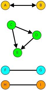
Example sub-graphs that illustrate small-scale social process.

Example sub-graphs that illustrate small-scale social process.

The diagram above illustrates three kinds of sub-graph that match three different kinds of evolutionary force on an emerging network. Imagine the arrows indicate something like “I consider them my friend”, although we can use the same formalism for less personal kinds of tie such as “I rely on” or even the relation between people and resources.

  • The idea of mutuality is captured by the reciprocal relationships between A and B. Real friendship networks should be high in mutuality whereas workplace social networks may be less mutual.
  • The idea of transitivity is captured in the C-D-E triangle. This might be expressed as “my friend’s friend is my friend”.
  • The idea of homophily is captured in the bottom pair of subgraphs, which show preference for ties to the same colour of person. Colour represents any kind of attribute, maybe a racial label for studies of community polarisation or maybe gender, degree subject, football team… This might be captured as “birds of a feather fly together”.

One of the interesting possibilities of social network modelling is that it may be able to discover the likely role of different social processes, which we cannot directly test, with qualitatively similar outcomes. For example, both homophily and transitivity favour the formation of cohesive groups. A full description of research using ERGMs to deal with this kind of question is “Birds of a Feather, or Friend of a Friend? Using Exponential Random Graph Models to Investigate Adolescent Social Networks” (Goodreau, Kitts & Morris): see the Mendeley group.

A First Experiment

In the spirit of active learning, I wanted to have a go. This meant using relatively easily-available data about a community that I knew fairly well. Twitter follower networks are fashionable and not too hard to get, although the API is a bit limiting, so I wrote some R to crawl follower/friends and create a suitable data structure for use with the ERGM package.

Several evenings later I concluded that a network defined as followers of the EC-TEL 2012 conference was unsuitable. The problem seems to be that the network is not at all homogeneous while at the same time there are essentially no useful person attributes to use; the location data is useless and the number of tweets is not a good indicator of anything. Without some quantitative or categorical attribute you are forced to use models that assume homogeneity. Hence nothing I tried was a sensible fit.

Lesson learned: knowledge of person (vertex) attributes is likely to be important.

My second attempt was to consider the Twitter network between CETIS staff and colleagues in the JISC Innovation Group. In this case, I know how to assign one attribute that might be significant: team membership.

Without looking at the data, it seems reasonable to hypothesise as follows:

  1. We might expect a high density network since:
    • Following in Twitter is not an indication of a strong tie; it is a low cost action and one that may well persist due to a failure to un-follow.
    • All of the people involved work directly or indirectly (CETIS) for JISC and within the same unit so we might expect.
  2. We might expect a high degree of mutuality since this is a professional peer network in a university/college setting.
  3. The setting and the nature of Twitter may lead to a network that does not follow organisational hierarchy.
  4. We might expect teams to form clusters with more in-team ties than out-of-team ties. i.e. a homphily effect.
  5. There is no reason to believe any team will be more sociable than another.
  6. Since CETIS was created primarily to support the eLearning Team we might expect there to be a preferential mixing-effect.
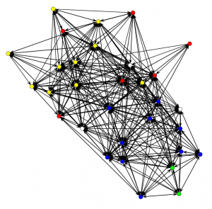
CETIS and JISC Innovation Group Twitter follower network. Colours indicate the team and arrows show the "follows" relationship in the direction of the arrow.

CETIS and JISC Innovation Group Twitter follower network. Colours indicate the team and arrows show the "follows" relationship in the direction of the arrow.

Nonplussed? What of the hypotheses?

Well… I suppose it is possible to assert that this is quite a dense network that seems to show a lot of mutuality and, assuming the Fruchterman-Reingold layout algorithm hasn’t distorted reality, which shows some hints at team cohesiveness and a few less-connected individuals. I think JISC management should be quite happy with the implications of this picture, although it should be noted that there are some people who do not use Twitter and that this says nothing about what Twitter mediates.

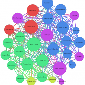
A little more attention to the visualisation can reveal a little more. The graph below (which is a link to a full-size image) was created using Gephi with nodes coloured according to team again but now sized according to the eigenvector centrality measure (area proportional to centrality), which gives an indication of the influence of that person’s communications within the given network.

Visualising the CETIS and JISC Innovation network with centrality measures.

Visualising the CETIS and JISC Innovation network with centrality measures. The author is among those who do not tweet.

This does, at least, indicate who is most, least and middling in centrality. Since I know most of these people, I can confirm there are no surprises.

Trying out several candidate models in order to try to decide on the previously enumerated hypotheses (and some others omitted for brevity) leads to the following tentative conclusions, i.e. to a model that appeared to be consistent with the observed network. “Appeared to be consistent” means that my inexperienced eye considered that there was acceptable goodness of fit between a range of statistics computed on the observed network and ensembles of networks simulated using the given model and best-fit parameters.

Keeping the same numbering as the hypotheses:

  1. ERGM isn’t needed to judge network density but the method does show the degree to which connections can adequately be put down to pure chance.
  2. There is indeed a large positive coefficient for mutuality, i.e. that reciprocal “follows” are not just a consequence of chance in a relatively dense network.
  3. It is not possible to make conclusions about organisational hierarchy.
  4. There is a statistically significant greater density within teams. i.e. team homophily seems to be affecting the network. This seems to be strongest for the Digital Infrastructure team, then CETIS then the eLearning team but the standard errors are too large to claim this with confidence. The two other teams were considered too small to draw a conclusion
  5. None of CETIS, the eLearning team or the Digital Infrastructure team seem to be more sociable. The two other teams were considered too small to draw a conclusion. This is known as a “main effect”.
  6. There is no statistically significant preference for certain teams to follow each other. In the particular case of CETIS, this makes sense to an insider since we have worked closely with JISC colleagues across several teams.

One factor that was not previously mentioned but which turned out to be critical to getting the model to fit was individual effects. Not everyone is the same. This is the same issue as was outlined for the EC-TEL 2012 followers: heterogeneity. In the present case, however, only a minority of people stand out sufficiently to require individual-level treatment and so it is reasonable to say that, while these are necessary for goodness of fit, they are adjustments. To be specific, there were four people who were less likely to follow and another four who were less likely to be followed. I will not reveal the names but suffice to say that, surprising though the results was at first, it is explainable for the people in CETIS.

A Technical Note

This is largely for anyone who might play with the R package. The Twitter rules prevent me from distributing the data but I am happy to assist anyone wishing to experiment (I can provide csv files of nodes and edges, a .RData file containing a network object suitable for use with the ERGM package or the Gephi file to match the picture above).

The final model I settled on was:

twitter.net ~ edges +
sender(base=c(-4,-21,-29,-31)) +
receiver(base=c(-14,-19,-23,-28)) +
nodematch("team", diff=TRUE, keep=c(1,3,4)) +
mutual

This means:

  • edges = > the random chance that A follows B unconditionally on anything.
  • sender => only these four vertices are given special treatment in terms of their propensity to follow.
  • receiver => special treatment for propensity to be followed.
  • nodematch => consider the team attribute for teams 1, 3 and 4 and use a different parameter for each team separately (i.e. differential homophily).
  • mutual => the propensity for a person to reciprocate being followed.

And for completeness the estimated model parameters for my last run. The parameter for “edges” indicates the baseline random chance and, if the other model elements are ignored, an estimate of -1.64 indicates that there is about a 16% chance of a randomly chosen A->B tie being present (the estimate = logit(p)). The interpretation of the other parameters is non-trivial but in general terms, a randomly chosen network containing a higher value statistic for a given sub-graph type will be more probable than one containing a lower value when the estimated parameter is positive and less probable when it is negative. The parameters are estimated such that the observed network has the maximum likelihood according to the model chosen.

                         Estimate Std. Error MCMC %  p-value
edges                     -1.6436     0.1580      1  < 1e-04 ***
sender4                   -1.4609     0.4860      2 0.002721 **
sender21                  -0.7749     0.4010      0 0.053583 .
sender29                  -1.9641     0.5387      0 0.000281 ***
sender31                  -1.5191     0.4897      0 0.001982 **
receiver14                -2.9072     0.7394      9  < 1e-04 ***
receiver19                -1.3007     0.4506      0 0.003983 **
receiver23                -2.5929     0.5776      0  < 1e-04 ***
receiver28                -2.5625     0.6191      0  < 1e-04 ***
nodematch.team.CETIS       1.9119     0.3049      0  < 1e-04 ***
nodematch.team.DI          2.6977     0.9710      1 0.005577 **
nodematch.team.eLearning   1.1195     0.4271      1 0.008901 **
mutual                     3.7081     0.2966      2  < 1e-04 ***
---
Signif. codes:  0 ‘***’ 0.001 ‘**’ 0.01 ‘*’ 0.05 ‘.’ 0.1 ‘ ’ 1

Outlook

The point of this was a learning experience; so what did I learn?

  1. It does seem to work!
  2. Size is an issue. Depending on the model used, a 30 node network can take several tens of seconds to either determine the best fit parameters or to fail to converge.
  3. Checking goodness of fit is not simple; the parameters for a proposed model are only determined for the statistics that are in the model and so goodness of fit testing requires consideration of other parameters. This can come down to “doing it by eye” with various plots.
  4. Proper use should involve some experimental design to make sure that useful attributes are available and that the network is properly sampled if not determined a-priori.
  5. There are some pathologies in the algorithms with certain kinds of model. These are documented in the literature but still require care.

The outlook, as I see it, is promising but the approach is far from being ready for “real users” in a learning analytics context. In the near term I can, however, see this being applied by organisations whose business involves social learning and as a learning science tool. In short: this is a research tool that is worthy of wider application.

This is an extended description of a lightning talk given at the inaugural SoLAR Flare UK event held on November 19th 2012. It may contain errors and omissions.

How to do Analytics Right…

There is, of course, no simple recipe, no cookie-cutter template and perfection is an unattainable… but there are some good examples.

The Signals Project at Perdue University is among the most celebrated examples of analytics in Higher Education at the moment so I was intrigued as to what the person behind it would have to say when I met him just prior to his presentation at the recent SURF Education Day (actually “Dé Onderwijsdagen 2012“; SURF is a similar organisation to JISC but in the Netherlands). This person is John Campbell and he is not at all the slightly exhausting (to dour Brits) kind of American IT leader, full of hyperbole and sweeping statement; his is a level-headed and grounded story. It is also a story from which I think we can draw some tips on how to do analytics right. These are my take-home thoughts.

Analytics = Actionable Intelligence

Anyone who has read my previous blog posts on analytics will know I’m rather passionate about “actionable insight” as a key point about analytics so I was naturally pleased to hear John’s similar take on the subject. We vigorously agreed that more reports is not what we need. If you can’t use the results of analysis to act differently it isn’t worth the effort. The corollary is that we should design systems around the people who need to take action.

Take a Multi-disciplinary Approach

Putting analytics into practice (at scale) is not “just” addressing IT or a statistical matters but requires domain knowledge of the area to be addressed and an understanding of the operational and cultural realities of the context of use. John stressed the varied team as a means to taking this kind of rounded approach. Important actors in this kind of team are people who understand how to influence change in organisational culture: politics.

You do still need good technical knowledge to avoid false insights, of course.

Take Account of “User” Psychology

The people who use the analytics – whether driving it or intended to be influenced by it – are the engine for change. This is really pointing out aspects of a multi-disciplinary approach; think soft systems, participatory design, and a team with some direct experience as a teacher/tutor/etc.

Signals has several examples, all elementary is some respects but significant by their presence:

  • teaching staff trigger the analysis and can over-ride the results (although rarely do);
  • it is emphasised to students that signals is NOT about grades but about engagement;
  • there are helpful suggestions given to students in addition to the traffic-light and, although these come from a repertoire, the teachers have a hand in targetting these.

Start Off Manually

OK, a process based on spreadsheets and people manually pushing and pulling data between databases and analysis software is not scalable but this can be an important stage. Is it really wise to start investing money and reputation in a big system before you have properly established what you really need, what your data quality can sustain, what works in practice?

This provides opportunity to move from research into practice, to properly adapt (rather than blindly adopt or superficially replicate) effective practice from elsewhere,etc. A manual start-off helps to expose limitations and risks (see next point).

KISS

The old adage “keep it simple stupid” (a modern vernacular expression of Occam’s razor) is not what John actually said, but he got close. Signals uses some well established and thoroughly mainstream statistical methods. It does not use the latest fancy predictive algorithms.

Why? Because fancy treatments would be like putting F1 tyres on a Citroen 2CV: worse than pointless. The data quality and a range of systematic biases* means that the simpler method and a traffic-light result is appropriate technology. John made it clear that quoting a percentage chance of drop-out (etc) is simply an indefensible level of precision given the data: red, amber and green with teacher over-ride is.

(*- VLE data, for example, does not mean the same across all courses/modules, teachers)

Be Part of a Community

OK… I liked this one because it is the kind of thing that JISC and CETIS has been promoting across all of their areas of work for many years. Making sense of what is possible, imagining and realising new ideas works so much better when ideas, experiences and reflections are shared.

This is why we were pleased to be part of the first SoLAR Flare UK event earlier this week and hope to be working with that community for some time.

Conclusion

Many have, and will, attempt to replicate the success of Signals in addressing student retention but not all will succeed. The points I mentioned above are indicative of an approach that worked in totality; a superficial attempt to replicate Signals will probably fail. This is about matching an appropriate level technology with organisational culture and context. It is innovation in socio-technical practice. So: doing analytics right is about holism directed towards action.

The views above include my own and not necessarily John Campbell’s.

Exploratory Data Analysis

It doesn’t take much to trigger me into a rant about the weaknesses of reports on data and “dashboards” purporting to be “analytics” or “business intelligence”. Lots of pie charts and line graphs with added bling are as the proverbial red rag to a bull.

Until recently my response was to demand more rigorous statistics: hypothesis testing, confidence limits, tests for reverse causality (but recognising that causality is a slippery concept in complex systems). Having recently spent some time thinking about using data analysis to gain actionable insights, particularly in the setting of an educational institution, it has become clear to me that this response is too shallow. It embeds an assumption of a linear process: ask a question, operationalise it in terms of data and statistics and crunch some numbers. As my previous post indicates, I don’t suppose all questions are approachable. Actually, thinking back to the ways I’ve  done a little text and data mining in the past, it wasn’t quite like this either.

The label “exploratory data analysis” captures the antithesis to the linear process. It was popularised in statistical circles by John W Tukey in the early 1960’s and he used it as a title for a highly influential book. Tukey was trying to challenge a statistical community that was very focused on hypothesis testing and other forms of “confirmatory data analysis”. He argued that statisticians should do both, approaching data with flexibility and an open frame of mind and he saw having a well-stocked toolkit of graphical methods as being essential for exploration (Tukey was responsible for inventing a number of plot types that are now widely used).

Tukey read a paper entitled “The Technical Tools of Statistics” at the 125th Anniversary Meeting of the American Statistical Association in 1964 which anticipated the development of computational tools (e.g. R and RapidMiner), is well worth a read and has timeless gems like:

“Some of my friends felt that I should be very explicit in warning you of how much time and money can be wasted on computing, how much clarity and insight can be lost in great stacks of computer output. In fact, I ask you to remember only two points:

  1. The tool that is so dull that you cannot cut yourself on it is not likely to be sharp enough to be either useful or helpful.
  2. Most uses of the classical tools of statistics have been, are, and will be, made by those who know not what they do.”

There is a correspondence between the open-minded and flexible approach to exploratory data analysis that Tukey advocated and the Grounded Theory (GT) Method of the social sciences. As a non-social scientist, GT seems to be a trying a bit too hard to be a Methodology (academic disputes and all) but the premise of using both inductive and deductive reasoning and going in to a research question free of the prejudice of a hypothesis that you intend to test (prove? how often is data analysed to find a justification for a prejudice?) is appealing.

Although GT is really focussed on qualitative research, some of the practical methods that the GT originators and practitioners have proposed might be applicable to data captured in IT systems and for practitioners of analytics. I quite like the dictum of “no talk” (see the wikipedia entry for an explanation).

My take home, then, is something like: if we are serious about analytics we need to be thinking about exploratory data analysis and confirmatory data analysis and the label “analytics” is certainly inappropriate if neither is occurring. For exploratory data analysis we need: visualisation tools, an open mind and an inquisitive nature.

A Poem for Analytics

There are many traps for the unwary in the practice of analytics, which I take to be the process of developing actionable insights through problem definition and the application of statistical models. The technical traps are most obvious but the epistemological traps are better disguised.

That these traps exist and are seemingly not recognised in the commercial and corporate rhetoric around analytics worries the more philosphically-minded; Virginia Tech’s Garner Campbell has shared some clear and well-received thoughts on the potential for damaging reductionism in Learning Analytics. I particularly like Anne Zelenka’s blogged reaction to Gardner’s LAK12 MOOC (I believe there is a recording but elluminate recordings don’t seem to play on linux) and my colleague Sheila has also blogged on the topic.

I don’t see reduction as being the issue per se but careless reductionism and failing to remember that our models are surrogates for what might be does worry me. Analytics does give us power for “myth busting” and a means to reduce the degree to which anecdote, prejudice and the opinion of the powerful determines action but let us be very wary indeed.

This all reminded me of the following poem by my favourite poet and mythographer, Robert Graves. Let us be slow.

In Broken Images

He is quick, thinking in clear images;
I am slow, thinking in broken images.

He becomes dull, trusting to his clear images;
I become sharp, mistrusting my broken images,

Trusting his images, he assumes their relevance;
Mistrusting my images, I question their relevance.

Assuming their relevance, he assumes the fact,
Questioning their relevance, I question the fact.

When the fact fails him, he questions his senses;
When the fact fails me, I approve my senses.

He continues quick and dull in his clear images;
I continue slow and sharp in my broken images.

He in a new confusion of his understanding;
I in a new understanding of my confusion.

Robert Graves

Making Sense of “Analytics”

There is currently a growing interest in increasing the degree to which data from various sources can be put to use by organisations to be more effective and a growing number of strategies for doing this. The term “analytics” is frequently being applied to descriptions of these situations but often without clarity as to what the word is intended to mean. This makes it difficult to make sense of what is happening, to decide what to appropriate from other sectors, and to make creative leaps forward in exploring how to adopt analytics.

I have just completed a public draft of a paper entitled “Making Sense of Analytics: a framework for thinking about analytics” [link removed – please visit our publications site to access the final versions] in an attempt to help anyone who is grappling with these questions in relation to post-compulsory education (as I am). It does so by:

  • considering the definition of “analytics”;
  • outlining analytics in relation to research management, teaching and learning or whole-institution strategy and operational concerns;
  • describing some of the key characteristics of analytics (the Framework).

The Framework is intended to support critical evaluation of examples of analytics, whether from commerce/industry or the research community, without resorting to definition of application or product categories. The intention behind this approach is to avoid discussion of “what it is” and to focus on “what it does” and “how it does it”.

This is a draft. Please feel free to comment via this blog or directly to me. A revised version will be published in June.

This paper is the first of a series that CETIS is producing and commissioning. These will be emerging during the coming months and collected together in a unified online resource in July/August. This is referred to briefly by Sheila MacNeill in her recent post “Learning Analytics, where do you stand?

Analytics and Big Data – Reflections from the Teradata Universe Conference 2012

As part of our current work on investigating trends in analytics and in contextualising it to post-compulsory education – which we are calling our Analytics Reconnoitre – I attended the Teradata Universe Conference recently. Teradata Universe is very much not an academic conference; this was a trip to the far side of the moon, to the land of corporate IT, grey-suits galore and a dress code…

Before giving some general impressions and then following with some more in-depth reflections and arising thoughts, I should be clear about the terms “analytics” and “big data”.

My working definition for Analytics, which I will explain in more detail in a forthcoming white paper and associated blog post is:
“Analytics is the process of developing actionable insights through problem definition and the application of statistical models and analysis against existing and/or simulated future data.”

I am interpreting Big Data as being data that is at such a scale that conventional databases (single server relational databases) can no longer be used.

Teradata has a 30 year history of selling and supporting Enterprise Data Warehouses so it should not have been a surprise that infrastructure figured in the conference. What was surprising was the degree to which infrastructure (and infrastructural projects) figured compared to applications and analytical techniques. There were some presentations in which brief case studies outlined applications but I did not hear any reference to algorithmic, methodological, etc development nor indeed any reference to any existing techniques from the data mining (a.k.a. “knowledge discovery in databases”) repertoire.

My overall impression is that the corporate world is generally grappling with pretty fundamental data management issues and generally focused on reporting and descriptive statistics rather than inferential and predictive methods. I don’t believe this is due to complacency but simply to the reality of where they are now. As the saying goes “if I was going there, I wouldn’t start here”.

The Case for “Data Driven Decisions”

Erik Brynjolfsson, Director of the MIT Center for Digital Business, gave an interesting talk entitled “Strength in Numbers: How do Data-Driven Decision-Making Practices affect Performance?”

The phrase “data driven decisions” raises my hackles since it implies automation and the elimination of the human component. This is not an approach to strive for. Stephen Brobst, Teradata CTO, touched on this issue in the last plenary of the conference when he asserted that “Sucess = Science + Art” and backed up the assertion with examples. Whereas my objections to data driven decisions revolve around the way I anticipate such an approach would lead to staff alientation and significant disruption to effective working of an organisational, Brobst was referring to the pitfall trap of incremental improvement leading to missed opportunities for breakthrough innovation.

As an example of a case where incremental improvement found a locally optimal solution but a globally sub-optimal one, Brobst cited actuarial practice in car insurance. Conventionally, risk estimation uses features of the car, the driver’s driving history and location and over time the fit between these parameters and statistical risk has been honed to a fine point. It turns out that credit risk data is actually a substantially better fit to car accident risk, a fact that was first exploited by Progressive Insurance back in 1996.

Rather than “data driven decisions”, I advocate human decisions supported by the use of good tools to provide us with data-derived insights. Paul Miller argues the same case against just letting the data speak for itself on his “cloud of data” blog.

This is, I should add, something Brynjolfsson and co-workers also advocate; they are only adopting terminology from the wider business world. See, for example an article in The Futurist (Brynjolfsson, Erik and McAfee, Andrew, “Thriving in the Automated Economy” The Futurist, March-April 2012.). In this article, Brynjolfsson and McAfee make the case for partnering humans and machines throughout the world of work and leisure. They cite an interesting example of the current best chess “player” in the world, which is 2 amateur American chess players using 3 computers. They go on to make some specific recommendations to try to make sure that we avoid some socio-economic pathologies that might arise from a humans vs technology race (as opposed to humans with machines), although not everyone will find all the recommendations ethically acceptable.

To return to the topic of Brynjolfsson’s talk, which is expanded in a paper of the same title (Brynjolfsson, Erik, Hitt, Lorin and Kim, Heekyung “Strength in Numbers: How Does Data-Driven Decisionmaking Affect Firm Performance”, April, 2011). The abstract:
“We examine whether performance is higher in firms that emphasize decisionmaking based on data and business analytics (which we term a data-driven decisionmaking approach or DDD). Using detailed survey data on the business practices and information technology investments of 179 large publicly traded firms, we find that firms that adopt DDD have output and productivity that is 5-6% higher what would be expected given their other investments and information technology usage. Using instrumental variables methods, we find evidence that these effects do not appear to be due to reverse causality. Furthermore, the relationship between DDD and performance also appears in other performance measures such as asset utilization, return on equity and market value. Our results provide some of the first large scale data on the direct connection between data-driven decisionmaking and firm performance.”

This is an important piece of research, adding to a relatively small existing body – which shows correlation between high levels of analytics use and factors such as growth (see the paper) – and one which I have no doubt will be followed up. They have taken a thorough approach to the statistics of correlation and tested for reverse causation. The limitations of the conclusion is clear from the abstract, however in “large publicly traded firms”. What of smaller firms? Futhermore, business sector (industry) is treated as a “control” but my hunch is that the 5-6% figure conceals some really interesting variation. The study also fails to establish mechanism, i.e. to demonstrate what it is about the context of firm A and the interventions undertaken that leads to enhanced productivity etc. These kinds of issues with evaluation in the social sciences are the subject of writings by Nick Tilley and Ray Pawson (see for example, “Realistic Evaluation: An Overview“) which I hold in high regard. My hope is that future research will attend to these issues. For now we must settle for less complete, but still useful, knowledge.

I expect that as our Analytics Reconnoitre proceeds we will return to this and related research to explore further whether any kind of business case for data-driven decisions can be robustly made for Higher or Further Education, or whether we need to gather more evidence by doing. I suspect the latter to be the case and that for now we will have to resort to arguments on the basis of analogy and plausibility of benefits.

Zeitgeist: Data Scientists

“Data Scientist” is a term which seems to be capturing the imagination in the corporate big data and analytics community but which has not been much used in our community.

A facetious definition of data scientist is “a business analyst who lives in California”. Stephen Brobst gave his distinctions between data scientist and business analyst in his talk. His characterisation of a business analyst is someone who: is interested in understanding the answers to a business question; uses BI tools with filters to generate reports. A data scientist, on the other hand, is someone who: wants to know what the question should be; embodies a combination of curiosity, data gathering skills, statistical and modelling expertise and strong communication skills. Brobst argues that the working environment for a data scientist should allow them to self-provision data, rather than having to rely on what is formally supported in the organisation, to enable them to be inquisitive and creative.

Michael Rappa from the Institute for Advanced Analytics doesn’t mention curiosity but offers a similar conception of the skill-set for a data scientist in an interview in Forbes magazine. The Guardian Data Blog has also reported on various views of what comprises a data scientist in March 2012, following the Strata Conference.

While it can be a sign of hype for new terminology to be spawned, the distinctions being drawn by Brobst and others are appealing to me because they are putting space between mainstream practice of business analysis and some arguably more effective practices. As universities and colleges move forward, we should be cautious of adopt the prevailing view from industry – the established business analyst role with a focus on reporting and descriptive statistics – and miss out on a set of more effective practices. Our lack of baked-in BI culture might actually be a benefit if it allows us to more quickly adopt the data scientist perspective alongside necessary management reporting. Furthermore, our IT environment is such that self-provisioning is more tractable.

Experimentation, Culture and HiPPOs

Like most stereotypes, the HiPPO is founded on reality; this is decision-making based on the Highest Paid Person’s Opinion. While it is likely that UK universities and colleges are some cultural distance from the world of corporate America that stimulated the coining of “HiPPO”, we are certainly not immune from decision-making on the basis of management intuition and anecdote suggests that many HEIs are falling into more autocratic and executive style management in response to a changing financial regime. As a matter of pride, though, academia really should try to be more evidence-based.

Avanish Kaushik (Digital Marketing Evangelist at Google) talked of HiPPOs and data driven decision making (sic) culture back in 2006 yet in 2012 these issues are still main stage items at Teradata 2012. Cultural inertia. In addition to proposing seven steps to becoming more data-driven, Kaushik’s posting draws the kind of distinctions between reporting and analysis that accords with the business analyst vs data scientist distinctions, above.

Stephen Brobst’s talk – “Experimentation is the Key to Business Success” – took a slightly different approach to challenging the HiPPO principle. Starting from an observation that business culture expects its leadership to have the answers to important and difficult questions, something even argumentative academics can still be found to do, Brobst argued for experimentation to acquire the data necessary for informed decision-making. He gained a further nod from me by asserting that the experiment should be designed on the basis of theorisation about mechanism (see earlier reference to the work of Tilley and Paulson).

Proctor and Gamble’s approach to pricing a new product by establishing price elasticity through a set of trial markets with different price points is one example. It is hard to see this being tractable for fee-setting in most normal courses in most universities but maybe not for all and it becomes a lot more realistic with large-scale distance education. Initiatives like coursera have the opportunity to build-out for-fee services with much better intelligence on pricing than mainstream HE can dream of.

Big Data and Nanodata Velocity

There is quite a lot of talk about Big Data – data that is at such a scale that conventional databases can no longer be used – but I am somewhat sceptical that the quantity of talk is merited. One presenter at Teradata Universe actually proclaimed that big data was largely an urban myth but this was not the predominant impression; others boasted about how many petabytes of data they had (1PB = 1,000TB = 1,000,000GB). There seems to be an unwarranted implication that big data is necessary for gaining insights. While it is clear that more data points improves the statistical significance and that if you have a high volume of transactions/interactions then even small % improvements can have significant bottom line value (e.g. a 0.1 increase in purchase completion at Amazon), there remains a great deal of opportunity to be more analytical in the way decisions are made using smaller scale data sources. The absence of big data in universities and colleges is an asset, not an impediment.

Erik Brynjolfsson chose the term “nanodata” to draw attention to the fine-grained components of most Big Data stores. Virtually all technology-mediated interactions are capable of capturing such “nanodata” and many do. The availability of nanodata is, of course, one of the key drivers of innovation in analytics. Brynjolfsson also pointed to data “velocity”, i.e. the near-real-time availability of nanodata.

The insights gained from using Google search terms to understand influenza is a fairly well-known example of using the “digital exhaust” of our collective activities to short-cut traditional epidemiological approaches (although I do not suggest it should replace them). Brynjolfsson cited a similar approach used in work with former co-worked Lynn Wu on house prices and sales (pdf), which anticipated official figures rather well. The US Federal Reserve Bank, we were told, was envious.

It has taken a long time to start to realise the vision of Cybersyn. Yet still our national and institutional decision-making relies on slow-moving and broadly obsolete data; low velocity information is tolerated when maybe it should not be. In some cases the opportunities from more near-real-time data may be neglected low-hanging fruit, and it doesn’t necessarily have to be Big Data. Maybe there should be talk of  Fast Data?

Data Visualisation

Stephen Few, author and educator on the topic of “visual business intelligence”, gave both a keynote and a workshop that could be very concisely summarised as a call to: 1) take more account of how human perception works when visualising data; 2) make more use of visualisation for sense-making. Stephen Brobst (Teradata CTO) made the latter point too: that data scientists use data visualisation tools for exploration, not just for communication.

Few gave an accessible account of visual perception as applied to data visualisation with some clear examples and reference to cognitive psychology. His “Perceptual Edge” website/blog covers a great deal of this – see for example “Tapping the Power of Visual Perception” (pdf) – as does his accessible book, “Now You See It“. I will not repeat that information here.

His argument that “visual reasoning” is powerful is easily demonstrated by comparing what can be immediately understood from the right kind of graphical presentation with tabulation of the data. The point that visual reasoning usually happens transparently (subconsciously) and hence that we need to guard against visualisation techniques that mislead, confuse of overwhelm.

I did feel that he advocated visual reasoning beyond the point at which it is reliable by itself. For example, I find parallel coordinates quite difficult. I would have liked to see more emphasis on visualising the results of statistical tests on the data (e.g. correlation, statistical significance) particularly as I am a firm believer that we should know of the strength of an inference before deciding on action. Is that correlation really significant? Are those events really independent in time?

Few’s second key point – about the use of data visualisation for sense-making – began with claims that the BI industry has largely failed to support it. He summarised the typical pathway for data as: collect > clean > transform > integrate > store > report. At this point there is a wall, Few claims, that blocks a productive sense-making pathway: explore > analyse > communicate > monitor > predict.

Visualisation tools tend to have been created with before-the-wall use cases, to be about the plot in the report. I rather agree with Few’s criticism that such tool vendors tend to err towards a “bling your graph” feature-set or flashy dashboards but there is hope in the form of tools such as Tibco Spotfire and Tableau, while Open Source afficionados or the budget-less can use ggobi for complex data visualisation, Octave or R (among others). The problem with all of these is complexity; the challenge to visualistion tool developers is to create more accessible tools for sense-making. Without this kind of advance it requires too much skill acquisition to move beyond reporting to real analytics and that limits the number of people doing analytics that an organisation can sustain.

It is worth noting that “Spotfire Personal” is free for one year and that “Tableau Public” is free and intended to let data-bloggers et al publish to their public web servers, although I have not yet tried them.

Analytics & Enterprise Architecture

The presentation by Adam Gade (CIO of Maersk, the shipping company) was ostensibly about their use of data but it could equally have been entitled “Maersk’s Experiences with Enterprise Architecture”. Although at no point did Gade utter the words “Enterprise Architecture” (EA), many of the issues he raised have appeared in talks at the JISC Enterprise Architecture Practice Group: governance, senior management buy-in, selection of high-value targets, tactical application, … etc. It is interesting to note that Adam Gade has a marketing and sales background – not the norm for a CIO – yet seems to have been rather successful; maybe he could sell the idea internally?

The link between EA and Analytics is not one which has been widely made (in my experience and on the basis of Google search results) but I think it is an important one which I will talk of a little more in a forthcoming blog post, along with an exploration of the Zachman Framework in the context of an analytics project. It is also worth noting that one of the enthusiastic adopters of our ArchiMate (TM) modelling tool, “Archi“, is Progressive Insurance which established a reputation as a leader in putting analytics to work in the US insurance industry (see, for example the book Analytics at Work, which I recommend, and the summary from Accenture, pdf).

Adam Gade also talked of the importance of “continuous delivery”, i.e. that analytics or any other IT-based projects start demonstrating benefits early rather than only after the “D-Day”. I’ve come across a similar idea – “time to value” – being argued for as being more tactically important than return on investment (RoI). RoI is, I think, a rather over-used concept and a rather poor choice if you do not have good baseline cost models, which seems to be the case in F/HEIs. Modest investments returning tangible benefits quickly seems like a more pragmatic approach than big ideas.

Conclusions – Thoughts on What this Means for Post-compulsory Education

For all the general perception is that universities and colleges are relatively undeveloped in terms of putting business intelligence and analytics to good use, I think there are some important “but …” points to make. The first “but” is that we shouldn’t measure ourselves against the most effective users from the commercial sector. The second is that the absence of entrenched practices means that there should be less inertia to adopting the most modern practices. Third, we don’t have data at the scale that forces us to acquire new infrastructure.

My overall impression is that there is opportunity if we make our own path, learning from (but not following) others. Here are my current thoughts on this path:

Learn from the Enterprise Architecture pioneers in F/HE

Analytics and EA are intrinsically related and the organisational soft issues in adopting EA in F/HE have many similarities to those for adopting analytics. One resonant message from the EA early adopters, which can be adapted for analytics, was “use just enough EA”.

Don’t get hung up on Big Data

While Big Data is a relevant technology trend, the possession of big data is not a pre-requisite for making effective use of analytics. The fact that we do not have Big Data is a freedom not a limitation.

Don’t focus on IT infrastructure (or tools)

Avoid the temptation (and sales pitches) to focus on IT infrastructure as a means to get going with analytics. While good tools are necessary, they are not the right place to start.

Develop a culture of being evidence-based

The success of analytics depends on people being prepared to critically engage with evidence based on data (including its potential weaknesses or bias and to avoid being over-trusting of numbers) and to take action on the analysis rather then being slaves to anecdote and the HiPPO. This should ideally start from the senior management. “In God we trust, all others bring data” (probably mis-attributed to W. Edwards Deming).

Experiment with being more analytical at craft-scale

Rather than thinking in terms of infrastructure or major initiatives, get some practical value with the infrastructure you have. Invest in someone with “data scientist” skills as master crafts-person and give them access to all data but don’t neglect the value of developing apprentices and of developing wider appreciation of the capabilities and limitations of analytics.

Avoid replicating the “analytics = reporting” pitfall

While the corporate sector fights its way out of that hole, let us avoid following them into it.

Ask questions that people can relate to and that have efficiency or effectiveness implications

Challenge custom and practice or anecdote on matters such as: “do we assess too much?”, “are our assessment instruments effective and efficient?”, “could we reduce heating costs with different use of estate?”, “could research groups like mine gain greater REF impact through publishing in OA journals?”, “how important is word of mouth or twitter reputation in recruiting hard-working students?”, “can we use analytics to better model our costs?”

Look for opportunities to exploit near-real-time data

Are decisions being made on old data, or no changes being made because the data is essentially obsolete? Can the “digital exhaust” of day-to-day activity be harnessed as a proxy for a measure of real interest in near-real-time?

Secure access to sector data

Sector organisations have a role to play in making sure that F/HEIs have access to the kind of external data needed to make the most of analytics. This might be open data or provisioned as a sector shared service. The data might be geospatial, socio-economic or sector-specific. JISC, HESA, TheIA, LSIS and others have roles to play.

Be open-minded about “analytics”

The emerging opportunities for analytics lie at the intersection of practices and technologies. Different communities are converging and we need to be thinking about creative borrowing and blurring of boundaries between web analytics, BI, learning analytics, bibliometrics, data mining, … etc. Take a wide view.

Collaborate with others to learn by doing

We don’t yet know the pathway for F/HE and there is much to be gained from sharing experiences in dealing with both the “soft” organisational issues and the challenge of selecting and using the right technical tools. While we may be competing for students or research funds, we will all fail to make the most from analytics and to effectively navigate the rapids of environmental factors if we fail to collaborate; competitive advantage is to be had from how analytics is applied  but that can only occur if capability exists.