Real-Time Communication through your Browser

This is a nice follow-on to my previous post regarding the web and the work of the W3C. As we’ve seen, the web and its technologies have been evolving and getting more powerful and while some will still eschew the growing relevance of the web (and its friendly neighbourhood viewing window, the browser) in a world of apps apps apps, the W3C continues to push forward its capabilities.

So step forward the newly formed Web Real-Time Communications Working Group. The mission of the group is to define a set of client-side APIs to enable real-time communications through the browser…video, audio, no plug-ins or downloads. The Charter page also states “supplementary real-time communication” so we’re also looking at screen sharing – or at least ‘browser window sharing’ – I think I’d be safe in saying.

One of the great things about this – imho – is that the working group will be looking closely at device APIs and pushing work on those forward, which, along with the DAP (Device APIs & Policy WG) should hopefully propel the development of APIs for device capabilities such as use of camera, microphone and the whole area of media capture and streaming. I then automatically think of the mobile space…mobile web apps for video chat anyone? :)

The working group has a timescale that looks at getting their first recommendations out toward the end of next year.

Want to see it in action? Well, Ericsson Labs (who are co-chairing the working group) rather kindly produced a video demo – Beyond HTML5: Peer-2-peer conversational video in HTML5. It is below…for your viewing pleasure. You can also read their accompanying blog post at https://labs.ericsson.com/developer-community/blog/beyond-html5-peer-peer-conversational-video

[youtube]http://www.youtube.com/watch?v=kM2EFWpTWc8&feature=player_embedded[/youtube]
Mobile Web Apps: A Briefing Paper

I’ve recently written a JISC CETIS briefing paper on the topic of Mobile Web Apps.

Mobile Web Apps: A Briefing Paper

Mobile Web Apps: A Briefing Paper

With the growth and constant shift in the mobile space institutions could be forgiven for feeling a little lost as to how to best tackle the issue of delivering content and/or services that are optimised for mobile devices. Apple, Android, Blackberry, Windows Phone…app ecosystems seemingly everywhere you turn and each requiring different development approaches; SDKs, programming languages, approval processes and terms & conditions. I think it’s fair to say that for institutions, looking to deliver to mobile devices while being as inclusive as possible, this area is something of a minefield.

A viable, alternative approach is developing Mobile Apps using open web technologies and standards; technologies that continue to improve performance and offer more powerful functionality – as is now being talked about quite a bit on the topic of HTML5.

The briefing paper is intended to give an overview of this space and cover some of the key talking points, with a collection of useful resources with which to delve deeper into the subject for those that decide that mobile web apps are indeed a workable solution for them. I’m hoping that an interested audience would consist of institutional web staff, students services, learning technologists, maybe even an IT services manager here and there :)

It’s in PDF format but I’ll also be looking to get it in web form on the CETIS website over the next few days and, of course, I’d welcome any feedback and questions on it here.

If you’re interested, get it at http://wiki.cetis.org.uk/images/7/76/Mobile_Web_Apps.pdf

Georgia Tech releases open standards mobile AR browser

Argon is a mobile Augmented Reality (AR) Browser for the iPhone. From the website:

Argon is the completely open standards augmented reality browser that allows rapid development and deployment of Web 2.0 style augmented reality content.

Argon renders a standards compliant combination of KML, HTML, CSS and JavaScript served via typical HTTP servers

Multiple simultaneous channels, analogous to browser tab on the desktop, let authors create dynamic and interactive AR content using existing web development toolsets.

The browser is stated as being the reference implementation of Georgia Tech’s work on the KHARMA Mobile AR Architecture, which combines HTML for content with KML for defining geographical co-ordinates (as used by Google Maps, Google Earth & Yahoo Maps).

Argon Mobile AR Browser

Argon Mobile AR Browser

One thing that seems to counter-balance this standards flag bearing though (for me, at least) is the fact that Argon is only available on iPhone – in fact, the developers go so far as to specify that it is best run on the latest version, iPhone 4. Hopefully that will change over time and we’ll see versions for the other popular mobile platforms too: the ever growing Android and the recently adrenaline-injected Windows Phone 7. After all, it would seem a little odd lauding the open standards route while then being restricted to a single delivery platform.

But there’s plenty of growing room in the still young AR space. With the technology making a significant appearance in this year’s Horizon Report – given a ‘Time-to-adoption’ period of 2-3 years, and us already seeing mobile augmented reality being implemented at Exeter Uni on their JISC LTIG Project: Unlocking the Hidden Curriculum, it’s good to see a new offering in this area to possibly compete with the current big players: Layar, Wikitude & Junaio.

My wish? My wish is that we could see something like Argon develop into a platform for AR developers, built on open standards, that would be supported by those players and open up the AR space to easily create interactive and immersive mobile AR experiences & content that you could then deploy cross-browser. Like I say though…early days yet. Hopefully we’ll see it happen.

Oh..one more thing…I have installed Argon on my (now lowly) iPhone 3GS and while the browser looks pretty standard fare – channel view, map, search, etc – unfortunately it seems there are absolutely no POIs (Points of Interest) nearby and the search for local channels isn’t yet implemented. So, as yet, it’s a bit difficult to get a handle of whether Argon would float my boat. Next up I shall go and check out the developer’s area and have a look at creating my own POIs and content. I’ll let you know how I get on…

The Argon browser can be found at http://argon.gatech.edu/

*** Update ***

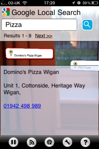
There are POIs available nearby – I just hadn’t looked at the getting started tutorial properly (I know…I’m one of those blokes that doesn’t read the manual). I’m liking the search box in the realview but the POI icon itself is a bit flaky and judders about a bit too much – I suspect their recommendation of using iPhone 4 is down to the gyroscope aiding with that, which the 3GS doesn’t have. But as you can see from the screenshot, it does the basics and I would imagine one can customise the look with your own CSS. Now…let’s hope their documentation is clear and helpful and not simply written by some Tefal headed genii in a Georgia Tech Lab…

Screenshot of Argon AR Browser

Screenshot of Argon AR Browser

Mobile Web Roundup

The Mobile Web

Well…I’ve been travelling around the interweb, reading – or simply adding to Instapaper for later and trying to get round to reading – lots of lovely articles, blog posts and suchlike on the current happenings around the Mobile Web. As you’ll well know (seeing as you’re reading this) the Mobile Web is a hot topic at the moment, so I thought I’d highlight some of the things I’m reading up on right now.

The Opera Mobile Web Optimisation Guide

The guys at Opera are superb when it comes to talking and teaching about web development techniques and the current state of the web. I’ve enjoyed listening and talking to both Patrick Lauke and Bruce Lawson in the last few months and Bruce has taken his talk around this and built it into a handy guide, available on the Opera Developers website. Bruce talks about the options available when looking to deliver your content to mobile devices and gives loads of really useful advice and tips on stuff to do, stuff to avoid and delivers a really nice outline on why CSS Media Queries are so powerful and can help you build mobile-aware, adaptive websites that don’t have to check which browser the content is being delivered to but checks the device settings themselves (think “display resolution”). I strongly encourage you to check this guide out if you haven’t before.

http://dev.opera.com/articles/view/the-mobile-web-optimization-guide/

Combining meta viewport and media queries

Following on with the CSS Media Queries angle, this article on quirksmode gives you a full walkthrough of how to combine <meta name=”viewport” content=”width=device-width”> with media queries to enable your website to resize to fit any display. It tells you what these do, why you should use them and gives the whole technique, with helpful screenshots. Excellent.

http://www.quirksmode.org/blog/archives/2010/09/combining_meta.html

Rethinking the Mobile Web

This is a truly great set of slides that Bryan Rieger of Yiibu recently delivered at the Over The Air event at Imperial College, London. Here Bryan gives us an outline of device usage, mobile browsers and – echoing Patrick’s & Bruce’s message – the options available to us when it comes to making mobile friendly websites (and apps – we can’t ignore those). Bryan puts a damn good point across that maybe we should design our sites for mobile devices FIRST, then add in the capability for the site to adapt for desktop. It’s a different way of approaching the whole creation and I’m really into that way of thinking.

http://www.slideshare.net/bryanrieger/rethinking-the-mobile-web-by-yiibu

The Mobile Web is NOT The Next Big Thing

Haha…now to end with something more leftfield :) This article, written by web designer John O’Nolan takes a playful swipe at those people that trot out the whole “Next Big Thing” line. John gives us an entertaining look at the evolution of the web on mobile and does put a nice perspective on things. What’s even better is that some of the thoughtful comments round out the whole thing to make a nicely smart piece on viewing the state of the mobile web.

http://john.onolan.org/the-mobile-web-is-not-the-next-big-thing/

So, a few things there for you to have a look at and digest. We’ll be seeing this talked about more and more I suspect. Cheers! M