During the CETIS Conference today (Feb 22nd), I showed a few graphs, plots and other visualisations that show the results of text mining around 7500 blog posts, mostly from 2011 and into early 2012. These were crawled by the RWTH Aachen University “Mediabase“.
There are far too many to show here and each of three analyses has its separate auto-generated output, which is linked to below. Each of these outlines key aspects of the method and headline statistics. I am quite aware that it is bad practice just to publish a load of visualisations without either an explicit or implicit story. If this bothers you, you might want to stop now, or visit my short piece “East and West: two worlds of technology enhanced learning“, which uses the first method outlined below but is not such a “bag of parts”. If you want to weave your own story… read on!
Stage 1: Dominant Themes
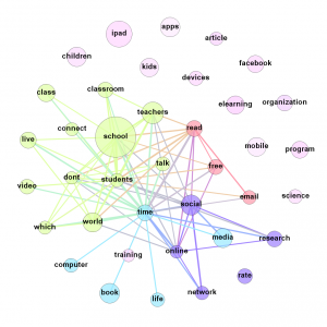
The starting point is simply to look at the dominant themes in blog posts from 2011 and early 2012 through the lens of frequent terms used. Common words with little significance (stop words) are removed and similar words are aggregated (e.g. learn, learner, learning). This set of blog posts is then split into two sets: those from CETIS and those from a broadly representative set of Ed Tech blogs. The frequent terms are then filtered into those that are statistically more significant in the CETIS set and those that are statistically more significant in the Ed Tech set.
The results of doing this are: “Comparison: CETIS Blogging vs EdTech Bloggers Generally (Jan 2011-Feb 2012)”

Co-occurrence Pattern - Ed Tech Blogger Frequent Terms. (see the "results" link above for explanation and more...)
Stage 2: Emerging and Declining Themes
Stage 2a: Finding Rising and Falling Terms
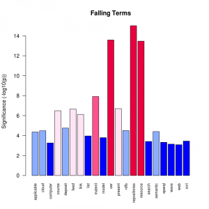
In this case, I home in on CETIS blogs only, but go back further in time: to January 2009. The blog posts are split into two sets: one contains posts from the last 6 months and the other contains posts since the end of January 2009. The distribution of terms appearing in each set is compared to find those which are statistically significant in the change, taking into account the sample size. This process identifies four classes of term: terms that appear anew in recent months, terms that rose from very low frequencies, those that rose from moderate or higher frequencies and those that fell (or vanished).
The results of doing this are: “Rising and Falling Terms – CETIS Blogs Jan 31 2012“. This has a VERY LARGE number of plots, many of which can be skipped over but are of use when trying to dig deeper. This auto-generated report also contains links to the relevant blog posts and ratings for “novelty” and “subjectivity”.

Significant Falling Terms
Stage 2b: Visualising Changes Over Time
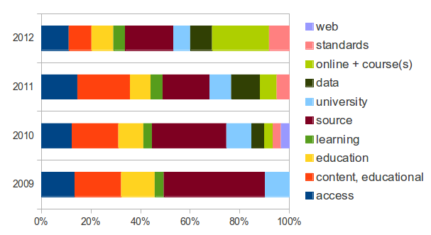
Various terms were chosen from Stage 2a and the changes in time rendered using the (in-) famous “bubble chart”. Although these should not be taken too seriously since the quantity of data per time step is rather small, these allow for quite a lot of experimentation with a range of related factors: term frequency, number of documents containing the term, positive/negative sentiment in posts containing the term. Four separate charts were created for CETIS blogs from 2009-2012: Rising, Established, Falling and Familiar (dominant terms from Stage 1). The dominant non-CETIS terms are also available, but only for 2011.
Final Words
Due to some problems with the blog crawler, a number of blogs could not be processed or had incompletely extracted postings so this is not truly representative. The results are not expected to change dramatically but there will be some terms appearing and some disappearing when these issues are fixed. This posting will be altered and the various auto-generated reports will be re-generated in due course.
The R code used, and results from using the same methods on conference abstracts/papers are available from my GitHub. This site also includes some notes on the technicalities of the methods used (i.e. separate from the way these were actually coded).
