Following on from David’s post on Getting Useful Data out of Prod and its linked data store this post shows a couple of examples of creating programme level maps.
David and I have spent a bit of time over the past week going through some of Martin Hawksey’s ideas, working out what we felt were useful queries to use with the linked data store, and creating some simple how to guides. As someone who is not at all familiar with writing queries, we reckoned if I could it, then just about anyone could ![]()
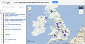
To prove that this does all work below is a screen shot of map of the JISC Curriculum Design Projects including links to their individual PROD entry pages and to their Design Studio pages (which includes links to outputs/further information for each project).

Curriculum Design Projects map
You can view the interactive version by following this link.
We found a few issues when we were trying things out. As well as deciding on what mapper template to use, I found things to be a bit temperamental when cutting and pasting data between sheets. In fact at one point I had to download a google spreadsheet containing the data I needed to my desktop and then cut and paste data from it back into the template spreadsheet, as I couldn’t seem to cut and paste data from sheets within the template. However, I have now got it all down to a matter of tens of minutes minutes instead of what felt like tens of hours.
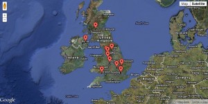
Whilst were were working on this, Wilbert Kraan also reminded us of work he had been doing with Sgvizler using data from PROD to create visualisations (including maps). Here’s another map example, again of the Curriculum Design programme.

Curriculum Design projects map (sgvizler)
If you follow this link, you can see the map and the query used to generate it.
If you wanted to create a map for another programme e.g. Curriculum Delivery, then you would just change the name in this line of the query:
?Link prod:programme “Curriculum Design” to
?Link prod:programme “Curriculum Delivery”
which would give you a map showing the Curriculum Delivery projects.
As we were exploring these approaches, and particularly when I was doubting my sanity and my ability to undertake simple cut and paste actions, we did have a number of “is this really all worth it?” moments. But on the whole, we think that it is. As well as providing us with another example of how we can re-present data in PROD (other examples are available here and here), it does give another example of how having openly available (linked) data allows for this kind of data manipulation.
Once you have a query, the sgvizler approach is very quick, however you do need to have server hosting facilities to use it (Wilbert has used his own). We are discussing if it is worth us setting up something a bit more permanent for our own uses. The google KML template approach (based on Martin’s work), doesn’t need any server side set up, just a google account. Although creating maps is a bit more time consuming at moment, imho, it gives slightly more attractive results in terms of map layout.
We’ll be doing some more experimentation over the coming weeks, but in the meantime if you want to have a play, then just follow the how to guide and we’d love to hear your thoughts and see any examples you come up with.
Pingback: David’s Blog » Getting data out of PROD and its triplestore
Congratulations for persevering with the Google template idea (and the joys of Google Spreadsheets- I always have problems with copy and paste).
Going down a dedicated KML template would certainly be my recommendation. The PROD site already renders the same data in different formats (HTML, RDF) so I it wouldn’t take much to add KML (perhaps a link of the query results page).
It’s also worthwhile remembering that linked data is well … only as good as the data. I’m sure Wilbert will chuck an AA roadmap at me if I mention this again, but not all the project lead institutions currently automatically generate a set of co-ordinates. For example, if I query the ‘open education’ strand you get 51 results and if I do the same query with institution locations I get 29 (This is particularly an issue with the OER strand because some of the leads were Subject Centres which aren’t recorded in the JISC Monitor Unit data. One of the serendipitous outputs of the OER Visualisation project is a list of unresolved locations which Wilbert can add).
Martin
Hi Martin
Totally take your point about the data. In the process of doing this we unearthed a few more rogue institutions, so Wilbert has been updating, so I’m sure he’s delighted you have a few more to add to his list:-) But unless we actually start playing with the data, we won’t find out these things.
S
Very true, exploration is a great way to achieve validation
Pingback: Enhanced programme maps « JISC Curriculum Design & Delivery