Cetis Analytics Series Volume 2: Engaging with Analytics

Our first set of papers around analytics in education has been published, and with nearly 17,000 downloads, it would seem that there is an appetite for resources around this topic. We are now moving onto phase of our exploration of analytics and accompanying this will be a range of outputs including some more briefing papers and case studies. Volume 1 took a high level view of the domain, volume 2 will take a much more user centred view including a number of short case studies sharing experiences of a range of early adopters who are exploring the potential of taking a more analytics based approach.

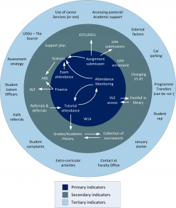
The first case study features Jean Mutton, Student Experience Project Manager, at the University of Derby. Jean shares with us how her journey into the world of analytics started and how and where she and the colleagues across the university she has been working with, see the potential for analytics to have an impact on improving the student experience.

University of Derby, student engagement factors

University of Derby, student engagement factors

The case study is available to download here.

We have a number of other case studies identified which we’ll be publishing over the coming months, however we are always looking for more examples. So if you are working with analytics have some time to chat with us, we’d love to hear from you and share your experiences in this way too. Just leave a comment or email me (s.macneill@strath.ac.uk).

What can I do with my educational data? (#lak13)

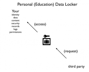
Following on from yesterday’s post, another “thought bomb” that has been running around my brain is something far closer to the core of Audrey’s “who owns your educational data?” presentation. Audrey was advocating the need for student owned personal data lockers (see screen shot below). This idea also chimes with the work of the Tin Can API project, and closer to home in the UK the MiData project. The latter is more concerned with more generic data around utility, mobile phone usage than educational data, but the data locker concept is key there too.

Screen shot of Personal Education Data Locker (Audrey Watters)

Screen shot of Personal Education Data Locker (Audrey Watters)

As you will know dear reader, I have turned into something of a MOOC-aholic of late. I am becoming increasingly interested in how I can make sense of my data, network connections in and across the courses I’m participating in and, of course, how I can access and use the data I’m creating in and across these “open” courses.

I’m currently not very active member of the current LAK13 learning analytics MOOC, but the first activity for the course is, I hope, going to help me frame some of the issues I’ve been thinking about in relation to my educational data and in turn my personal learning analytics.

Using the framework for the first assignment/task for LAK13, this is what I am going to try and do.

1. What do you want to do/understand better/solve?

I want to compare what data about my learning activity I can access across 3 different MOOC courses and the online spaces I have interacted in on each and see if I can identify any potentially meaningful patterns, networks which would help me reflective and understand better, my learning experiences. I also want to explore see how/if learning analytics approaches could help me in terms of contributing to my personal learning environment (PLE) in relation to MOOCs, and if it is possible to illustrate the different “success” measures from each course provider in a coherent way.

2. Defining the context: what is it that you want to solve or do? Who are the people that are involved? What are social implications? Cultural?

I want to see how/if I can aggregate my data from several MOOCs in a coherent open space and see what learning analytics approaches can be of help to a learner in terms of contextualising their educational experiences across a range of platforms.

This is mainly an experiment using myself and my data. I’m hoping that it might start to raise issues from the learner’s perspective which could have implications for course design, access to data, and thoughts around student created and owned eportfolios/and or data lockers.

3. Brainstorm ideas/challenges around your problem/opportunity. How could you solve it? What are the most important variables?

I’ve already done some initial brain storming around using SNA techniques to visualise networks and connections in the Cloudworks site which the OLDS MOOC uses. Tony Hirst has (as ever) pointed the way to some further exploration. And I’ll be following up on Martin Hawksey’s recent post about discussion group data collection .

I’m not entirely sure about the most important variables just now, but one challenge I see is actually finding myself/my data in a potentially huge data set and finding useful ways to contextualise me using those data sets.

4. Explore potential data sources. Will you have problems accessing the data? What is the shape of the data (reasonably clean? or a mess of log files that span different systems and will require time and effort to clean/integrate?) Will the data be sufficient in scope to address the problem/opportunity that you are investigating?

The main issue I see just now is going to be collecting data but I believe there some data that I can access about each MOOC. The MOOCs I have in mind are primarily #edc (coursera) and #oldsmooc (OU). One seems to be far more open in terms of potential data access points than the other.

There will be some cleaning of data required but I’m hoping I can “stand on the shoulders of giants” and re-use some google spreadsheet goodness from Martin.

I’m fairly confident that there will be enough data for me to at least understand the problems around the challenges for letting learners try and make sense of their data more.

5. Consider the aspects of the problem/opportunity that are beyond the scope of analytics. How will your analytics model respond to these analytics blind spots?

This project is far wider than just analytics as it will hopefully help me to make some more sense of the potential for analytics to help me as a learner make sense and share my learning experiences in one place that I chose. Already I see Coursera for example trying to model my interactions on their courses into a space they have designed – and I don’t really like that.

I’m thinking much more about personal aggregation points/ sources than the creation of actual data locker. However it maybe that some existing eportfolio systems could provide the basis for that.

As ever I’d welcome any feedback/suggestions.

Prototyping my Cloudworks profile page

Week 5 in #oldsmooc has been all about prototyping. Now I’ve not quite got to the stage of having a design to prototype so I’ve gone back to some of my earlier thoughts around the potential for Cloudworks to be more useful to learners and show alternative views of community, content and activities. I really think that Cloudworks has potential as a kind of portfolio/personal working space particularly for MOOCs.

As I’ve already said, Cloudworks doesn’t have a hierarchical structure, it’s been designed to be more social and flexible so its navigation is somewhat tricky, particularly if you are using it over a longer time frame than say a one or two day workshop. It relies on you as a user to tag and favourite clouds and cloudscapes, but even then when you’re involved in something like a mooc that doesn’t really help you navigate your way around the site. However cloudworks does have an open API and as I’ve demonstrated you can relatively easily produce a mind map view of your clouds which makes it a bit easier to see your “stuff”. And Tony Hirst has shown how using the API you can start to use visualisation techniques to show network veiws of various kinds.

In a previous post I created a very rough sketch of how some of Tony’s ideas could be incorporated in to a user’s profile page.

Potential Cloudworks Profile page

Potential Cloudworks Profile page

As part of the prototyping activity I decide to think a bit more about this and use Balsamiq (one of the tools recommended to us this week) to rough out some ideas in a bit more detail.

The main ideas I had were around redesigning the profile page so it was a bit more useful. Notifications would be really useful so you could clearly see if anything had been added to any of your clouds or clouds you follow – a bit like Facebook. Also one thing that does annoy me is the order of the list of my clouds and cloudscapes – it’s alphabetical. But what I really want at the top of the list is either my most recently created or most active cloud.

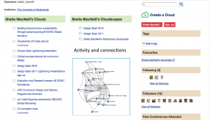
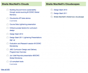
In the screenshot below you can see I have an extra click and scroll to get to my most recent cloud via the clouds list. What I tend to do is a bit of circumnavigation via my oldsmooc cloudscape and hope I have add my clouds it it.

Screen shot of my cloud and cloudscape lists

Screen shot of my cloud and cloudscape lists

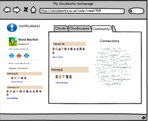
I think the profile page could be redesigned to make use of the space a bit more (perhaps lose the cloud stream, because I’m not sure if that is really useful or not as it stands), and have some more useful/useble views of my activity. The three main areas I thought we could start grouping are clouds, cloudscapes (and they are already included) and add a community dimension so you can start to see who you are connecting with.

My first attempt:

screen shot of my first Cloudworks mock up

screen shot of my first Cloudworks mock up

Now but on reflection – tabs not a great idea and to be honest they were in the tutorial so I that’s probably why I used them :-)

But then I had another go and came up something slightly different. Here is a video where I explain my thinking a bit more.

cloudworks profile page prototype take 2 from Sheila MacNeill on Vimeo.

Some initial comments from fellow #oldsmooc-ers included:

and you can see more comments in my cloud for the week as well as take 1 of the video.

This all needs a bit more thought – particularly around what is actually feasible in terms of performance and creating “live” visualisations, and indeed about what would actually be most useful. And I’ve already been in conversation with Juliette Culver the original developer of Cloudworks about some of the more straight forward potential changes like the re-ordering of cloud lists. I do think that with a bit more development along these lines Cloudworks could become a very important part of a personal learning environment/portfolio.

Ghosts in the machine? #edcmooc

Following on from last week’s post on the #edcmooc, the course itself has turned to explore the notion of MOOCs in the context of utopian/dystopian views of technology and education. The questions I raised in the post are still running through my mind. However they were at a much more holistic than personal level.

This week, I’ve been really trying to think about things from my student (or learner) point of view. Are MOOCs really changing the way I engage with formal education systems? On the one hand yes, as they are allowing me (and thousands of others) to get a taste of courses from well established institutions. At a very surface level who doesn’t want to say they’ve studied at MIT/Stanford/Edinburgh? As I said last week, there’s no fee so less pressure in one sense to explore new areas and if they don’t suit you, there’s no issue in dropping out – well not for the student at this stage anyway. Perhaps in the future, through various analytical methods, serial drop outs will be recognised by “the system” and not be allowed to join courses, or have to start paying to be allowed in.

But on the other hand, is what I’m actually doing really different than what I did at school and when I was an undergraduate or was a student on “traditional’ on line, distance courses. Well no, not really. I’m reading selected papers and articles, watching videos, contributing to discussion forums – nothing I’ve not done before, or presented to me in a way that I’ve not seen before. The “go to class” button on the Coursera site does make me giggle tho’ as it’s just soo American and every time I see it I hear a disembodied American voice. But I digress.

The element of peer review for the final assignment for #edcmooc is something I’ve not done as a student, but it’s not a new concept to me. Despite more information on the site and from the team this week I’m still not sure how this will actually work, and if I’ll get my certificate of completion for just posting something online or if there is a minimum number of reviews I need to get. Like many other fellow students the final assessment is something we have been concerned about from day 1, which seemed to come as a surprise to some of the course team. During the end of week 1 google hang out, the team did try to reassure people, but surely they must have expected that we were going to go look at week 5 and “final assessment” almost before anything else? Students are very pragmatic, if there’s an assessment we want to know as soon as possible the where,when, what, why, who,how, as soon as possible. That’s how we’ve been trained (and I use that word very deliberately). Like thousands of others, my whole education career from primary school onwards centred around final grades and exams – so I want to know as much as I can so I know what to do so I can pass and get that certificate.

That overriding response to any kind of assessment can very easily over-ride any of the other softer (but just as worthy) reasons for participation and over-ride the potential of social media to connect and share on an unprecedented level.

As I’ve been reading and watching more dystopian than utopian material, and observing the general MOOC debate taking another turn with the pulling of the Georgia Tech course, I’ve been thinking a lot of the whole experimental nature of MOOCs. We are all just part of a huge experiment just now, students and course teams alike. But we’re not putting very many new elements into the mix, and our pre-determined behaviours are driving our activity. We are in a sense all just ghosts in the machine. When we do try and do something different then participation can drop dramatically. I know that I, and lots of my fellow students on #oldsmooc have struggled to actually complete project based activities.

The community element of MOOCs can be fascinating, and the use of social network analysis can help to give some insights into activity, patterns of behaviour and connections. But with so many people on a course is it really possible to make and sustain meaningful connections? From a selfish point of view, having my blog picked up by the #edcmooc news feed has greatly increased my readership and more importantly I’m getting comments which is more meaningful to me than hits. I’ve tried read other posts too, but in the first week it was really difficult to keep up, so I’ve fallen back to a very pragmatic, reciprocal approach. But with so much going on you need to have strategies to cope, and there is quite a bit of activity around developing a MOOC survival kit which has come from fellow students.

As the course develops the initial euphoria and social web activity may well be slowing down. Looking at the twitter activity it does look like it is on a downwards trend.
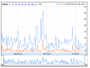
#edcmooc Twitter activity diagram

#edcmooc Twitter activity diagram

Monitoring this level of activity is still a challenge for the course team and students alike. This morning my colleague Martin Hawskey and I were talking about this, and speculating that maybe there are valuable lessons we in the education sector can learn from the commercial sector about managing “massive” online campaigns. Martin has also done a huge amount of work aggregating data and I’d recommend looking at his blogs. This post is a good starting point.

Listening to the google hang out session run by the #edcmooc team they again seemed to have under estimated the time sink reality of having 41,000 students in a course. Despite being upfront about not being everywhere, the temptation to look must be overwhelming. This was also echoed in the first couple of weeks of #oldsmooc. Interestingly this week there are teaching assistants and students from the MSc course actively involved in the #edcmooc.

I’ve also been having a play with the data from the Facebook group. I’ve had a bit of interaction there, but not a lot. So despite it being a huge group I don’t get the impression, that apart from posting links to blogs for newsfeed, there is a lot of activity or connections. Which seems to be reflected in the graphs created from the data.
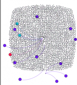
#edc Facebook group friends connections

#edc Facebook group friends connections


This is a view based on friends connections. NB it was very difficult for a data novice like me to get any meaningful view of this group, but I hope that this gives the impression of the massive number of people and relative lack of connections.

There are a few more connections which can be drawn from the interactions data, and my colleagye David Sherlock manage create a view where some clusters are emerging – but with such a huge group it is difficult to read that much into the visualisation – apart from the fact that there are lots of nodes (people).
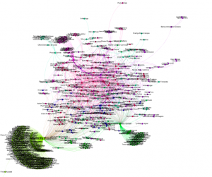
#edcmooc Facebook group interactions

#edcmooc Facebook group interactions


I don’t think any of this is unique to #edcmooc. We’re all just learning how to design/run and participate at this level. Technology is allowing us to connect and share at a scale unimaginable even 10 years ago, if we have access to it. NB there was a very interesting comment on my blog about us all being digital slaves.

Despite the potential affordances of access at scale it seems to me we are increasingly just perpetuating an existing system if we don’t take more time to understand the context and consequences of our online connections and communities. I don’t need to connect with 40,000 people but I do want to understand more about how, why and how I could/do. That would be a really new element to add to any course, not just MOOCs (and not something that’s just left to a course specifically about analytics). Unless that happens my primary driver will be that “completion certificate”. In this instance, and many others, to get that I don’t really need to make use of the course community. So I’m just perpetuating an existing where I know how to play the game, even if it’s appearance is somewhat disguised.
#oldsmooc_w3 Cloudworks challenge

It’s half way through week three of #oldsmooc, and once again I have been distracted from the actual course by the possiblities (and opportunities) that a bit of tweaking to Cloudworks could offer. One of the comments Tony Hirst made last week about the practicalities of including some of the network visualisation experiments he had been working on was that of caching and time for real-time diagrams to appear on a user page. Good point, well made, as they say – I don’t think this is insurmountable but it’s not going to be the focus of this week’s post, I’ll come back to it again. But I do think that this is exactly the type of user centred feature that any “new and exciting” (cos of course none of them are “as dull and boring” as the platforms we already have) mooc platform” should be trying to incorporate.

This week’s data challenge was much simplier really and you can see the twitter chain of events in this storify.

[View the story “#oldsmooc_w3 Cloudworks challenge” on Storify]

Once again Tony came up trumps and created a lovely visualisation, but as my last tweet said, was this maybe a bit too much? And as Tony himself asked earlier -what does another view “buy you”? In this case, where there is a essentially a growing list of four different types of “things” maybe just an simpler alternative view (without all the connections) would be more helpful? As the list grows it would be helpful to be able to quickly search for example the tools. This page is undoubtedly a useful resource and as such a bit of time in ensuring that is displayed in ways that help people use/contribute and sustain it is surely worth while. I’d be interested in any other suggestions people may have.

I’m now going to do some more of the actual course work and try to respond to this.

#oldsmooc week 2 – Context and personal learning spaces

Well I have survived week 1 of #oldsmooc and collected my first online badge for doing so -#awesome. My last post ended with a few musings about networks and visualisation.

I’m also now wondering if a network diagram of cloudscape (showing the interconnectedness between clouds, cloudscapes and people) would be helpful ? Both in terms of not only visualising and conceptualising networks but also in starting to make more explicit links between people, activities and networks. Maybe the mindmap view is too linear? Think I need to speak to @psychemedia and @mhawskey . . .

I’ve been really pleased that Tony Hirst has taken up my musings and has been creating some wonderful visualisations of clouds, cloudscapes and followers. So I should prefix prefix this post by saying that this has somewhat distracted me from the main course activities over the past few days. However I want to use this post to share some of my thoughts re these experiments in relation to the context of my learning journey and the potential for Cloudworks to help me (and others) contextualise their learning, activities, networks, and become a powerful personal learning space/ environment.

Cloudworks seems to be a bit like marmite – you either love or hate it. I have to admit I have a bit of a soft spot for it mainly because I have had a professional interest in its development.(I also prefer vegemite but am partial to marmite now and again). I’ve also used it before this course and have seen how it can be useful. In someways it kind of like twitter, you have to use it to see the point of using it. I’ve also fully encouraged the development of its API and its open source version Cloud Engine.

A short bit of context might be useful here too. Cloudworks was originally envisaged as a kind of “flickr for learning designs”, a social repository if you like. However as it developed and was used, it actually evolved more into an aggregation space for ideas, meetings, conferences. The social element has always been central. Of course making something social, with tagging, favouring etc, does mean that navigation isn’t traditional and is more “exploratory” for the user. This is the first time (that I know of anyway) it has actually been used as part of a “formal” course.

As part of #oldsmooc, we (the leaners) are being encouraged to use Cloudworks for sharing our learning and activities. As I’m doing a bit more on the course, I’m creating clouds, adding them to my own #oldsmooc and other cloudscapes, increasingly favouriting and following other’s clouds/cloudscapes. I’m starting to find that concept of having one place where my activity is logged and I am able to link to other spaces where I create content (such as this blog) is becoming increasingly attractive. I can see how it could really help me get a sense of my learning journey as I process through the course, and the things that are useful/of interest to me. In other words, it’s showing potential to be my personal aggregation point, and a very useful (if not key) part of my personal learning environment. But the UI as it stands is still a bit clunky. Which is where the whole visualisation thing started.

Now Tony has illustrated how it possible to visualise the connections between people, content, activities, what think would be really useful would be an incorporation of these visualisations into a newly designed profile page. Nick Frear has already done an alpha test to show these can be embedded into Cloudworks.

A move from this:

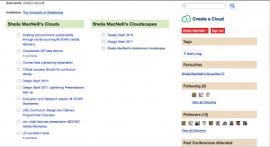
My Cloudworks profile page

My Cloudworks profile page

To something kind of like this:

Potential Cloudworks Profile page

Potential Cloudworks Profile page

Excuse the very crude graphic cut and paste but I hope you get the idea. There’s lots of space there to move things around and make it much more user friendly and useful.

Ideally when I (or any other user) logged into our profile page, our favourite spaces and people could easily been seen, and we could have various options to see and explore other network views of people/and our content and activities. Could these network views start to give learners a sense of Dave Cormier’s rhizomatic learning; and potentially a great level of control and confidence in exploring the chaotic space which any MOOC creates?

The social “stuff” and connections is all there in Cloudworks, it just needs a bit of re-jigging. If the UI could be redesigned to incorporate these ideas , then I for one would be very tempted to use cloud works for any other (c)MOOC I signed up for. I also need to think a lot more about how to articulate this more clearly and succinctly, but I’d be really interested in other views.

Cloud gazing, maps and networks – some thoughts on #oldsmooc so far

So my 2013 mooc adventures have started with #oldsmooc, the OU (UK) open course on learning design. As this mooc has evolved from a number or projeccts in the JISC Currriculum Design programme (notably OULDI) and has benefitted from a small additional amount JISC funding to get it up and running.

As with any mooc (particularly one that is based on constructionist pedagogies (or a cMooc), the initial experience can be a bit overwhelming and confusing. My heart went out to all the team last week when the technical gremlins came out in full force for the live overview/introduction to the course, and then Cloudworks had to have a “essential maintanance” on Thursday morning which was the official start date of the coures. However, these minor hiccups have been sorted and the chaos course has well and truly begun.

The course is utilsing a number of different online spaces for communication, course information and sharing including, email, google groups and hangouts, bibsonomy, twitter, a website and cloudworks – not a VLE insight. As I was exploring the course outline and various sites last week I have to confess that it did cross my mind that just having everything in one place might make things a lot easier for participants. Yes, dear reader I did have a yearning for a VLE, but that quickly passed. I remembered that even in #moocmooc where they did use one, I actually ended up hardly using it and most of my “learning” and activities took place via my own personal learning network, which in that instance was pretty much twitter and my blog.

I’m relatively fortunate as I have used most of online spaces being utilised by the course before, but there is quite a learning curve and with so much activity it is really easy to feel lost and unsure. These feelings of confusion and isolation are not unique to this course, I experienced the same with the #moocmooc course last year. It does take confidence on both a personal and professional level to put yourself “out there” and start to share/comment work with others (which is one of the main activities for week 1). With so many different online communication channels being used it also requires quite a level of digital literacy to navigate between the various areas. (Bonnie Stewart has written a great blog post about inherent digital literacies and networking which discusses these issues in a far more detailed and coherent way). Importantly, as a learner you need to have quite a high a level of confidence to work out just what are going to be the most effective channels for you to use.

As with anything “massive” you just can’t keep up with everything so, imho the having the confidence to be able to not try and do everything/ read every post is crucial too. Not only in terms of having any chance of completing the course but also for your own sanity. I have a feeling that I might be like lots of the participants on the course, despite knowing the suggested time allocation for the course ( up to 10 hours a week), my motivation, work and life in general will probably get in the way of me actually dedicating that amount of time each week, so I have to be pragmatic to get the most out of the effort I put in. (Just trying to figure out what is the minimum I can do to get some badges?:-) )

Finding the “right” technologies/online spaces for MOOCs is a bit like looking for the holy grail. Everything falls short in some areas, and a lot does come down to personal preferences. That said I do think it is important to allow for experimentation – both for course designers and for students. The former can get a feel for what actually does work in terms of their overall “design” and learning objectives, and for the latter there is nothing like learning by doing. In this case when the course is about learning design, first hand experience should be helpful when thinking about technologies to use in your own courses. My list of things I really don’t/do like is growing and more importantly the context of when I do/don’t like using them.

For many participants, this is the first time they will have used, or indeed come across Cloudworks. Again I am fortunate as I have used Cloudworks before. I have found it really useful but getting into it can be slightly confusing. The logic of individual clouds being part of wider collections of clouds called cloudscapes is fine. At the moment it is hard to keep up with and find the sheer number of clouds and cloudscapes being created, never mind trying to remember to favourite and follow ones you are interested in and add your clouds to overarching clouds. I don’t know if it is the influence of last week’s Star Gazing Live, but I think (and I was glad to see I’m not alone in this, Jane Challinor has blogged about it too) what might be needed is another map or way of understanding/finding/navigating our way through the ever expanding skyline in Cloudworks. A more visual cloud map instead of star map if you like.

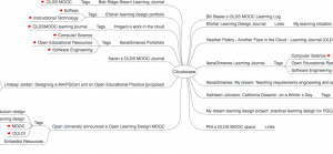
Naviagting Cloudworks as it grows is a challenge. The current navigation is pretty much list based just now, but not everything is (or could be ) easily accessible from the front page. As I was looking through various clouds yesterday, I was reminded of a wee experiment my colleague David Sherlock and I did a couple of years ago with the (at that point recently released) Cloudworks API. We were able to create a mindmap of a cloudscape, and I’m just wondering if this view might be useful to help people make sense of some of the OLDS Mooc cloudscapes,including their own. David has kindly dug out the code and here’s an example base on the main OLDS MOOC cloudscape. Click this link to see the mind map (NB this uses a flash front end so if you’re on a mobile device it won’t display properly.) The screen shot gives an indication of the mind map view.

Screenshot of mindmap view of a cloudscape

Screenshot of mindmap view of a cloudscape

To try it yourself put http://labs.cetis.org.uk/cloudworks/?cloudscape=2417 into your browser, and if change the “=2417” to whatever the ID of the cloudscape you want to view is e.g. my oldsmooc cloudscape looks like this, the “2417” has just been changed to “2567”.

I know the Cloudworks developers were quite keen on this idea back then, maybe this is something that can be explored again. After reading and watching Bonnie’s post about the the power of networks in moocs, I’m also now wondering if a network diagram of cloudscape (showing the interconnectedness between clouds, cloudscapes and people) would be helpful ? Both in terms of not only visualising and conceptualising networks but also in starting to make more explicit links between people, activities and networks. Maybe the mindmap view is too linear? Think I need to speak to @psychemedia and @mhawskey . . . Now I better get back to the actual course.

eAssessment Scotland – focus on feedback

Professor David Boud got this year’s eAssessment Scotland Conference off to a great start with his “new conceptions of feedback and how they might be put into practice” keynote presentation by asking the fundamental question ‘”what is feedback?”

David’s talk centred on what he referred to as the “three generations of feedback”, and was a persuasive call to arms to educators to move from the “single loop ” or “control system” industrial model of feedback to a more open adaptive system where learners play a central and active role.

In this model, the role of feedback changes from being passive to one which helps to develop students allowing them to develop their own judgement, standards and criteria. Capabilities which are key to success outside formal education too. The next stage from this is to create feedback loops which are pedagogically driven and considered from the start of any course design process. Feedback becomes part of the whole learning experience and not just something vaguely related to assessment.

In terms of technology, David did give a familiar warning that we shouldn’t enable digital systems to allow us to do more “bad feedback more efficiently”. There is a growing body of research around developing the types of feedback loops David was referring to. Indeed the current JISC Assessment and Feedback Programme is looking at exactly the issues brought up in the keynote, and is based on the outcomes of previously funded projects such as REAP and PEER. And the presentation from the interACT project I went to immediately after the keynote, gave an excellent overview of how JISC funding is allowing the Centre for Medical Education in Dundee to re-engineering its assessment and feedback systems to “improve self, peer and tutor dialogic feedback”.

During the presentation the team illustrated the changes to their assessment /curriculum design using an assessment time line model developed as part of another JISC funded project, ESCAPE, by Mark Russell and colleagues at the University of Hertfordshire.

Lisa Gray, programme manager for the Assessment and Feedback programme, then gave an overview of the programme including a summary of the baseline synthesis report which gives a really useful summary of the issues the projects (and the rest of the sector ) are facing in terms of changing attitudes, policy and practice in relation to assessment and feedback. These include:
*formal strategy/policy documents lagging behind current development
*educational principles are rarely enshrined in strategy/policylearners are not often actively enaged in developing practice
*assessment and feedback practice doesn’t reflect the reality of working life
*admin staff are often left out of the dialogue
*traditional forms of assessment still dominate
*timeliness of feedback are still an issue.

More information on the programme and JISCs work in the assessment domain is available here.

During the lunch break I was press-ganged/invited to take part in the live edutalk radio show being broadcast during the conference. I was fortunate to be part of a conversation with Colin Maxwell (@camaxwell), lecturer at Carnegie College, where we discussed MOOCs (see Colin’s conference presentation) and feedback. As the discussion progressed we talked about the different levels of feedback in MOOCs. Given the “massive” element of MOOCs how and where does effective feedback and engagement take place? What are the afordances of formal and informal feedback? As I found during my recent experience with the #moocmooc course, social networks (and in particular twitter) can be equally heartening and disheartening.

I’ve also been thinking more about the subsequent twitter analysis Martin has done of the #moocmooc twitter archive. On the one hand, I think these network maps of twitter conversations are fascinating and allow the surfacing of conversations, potential feedback opportunities etc. But, on the other, they only surface the loudest participants – who are probably the most engaged, self directed etc. What about the quiet participants, the lost souls, the ones most likely to drop out? In a massive course, does anyone really care?

Recent reports of plagiarism, and failed attempts at peer assessment in some MOOCs have added to the debate about the effectiveness of MOOCs. But going back to David Boud’s keynote, isn’t this because some courses are taking his feedback mark 1, industrial model, and trying to pass it off as feedback mark 2 without actually explaining and engaging with students from the start of the course, and really thinking through the actual implications of thousands of globally distributed students marking each others work?

All in all it was a very though provoking day, with two other excellent keynotes from Russell Stannard sharing his experiences of using screen capture to provide feedback, and Cristina Costa on her experiences of network feedback and feeding forward. You can catch up on all the presentations and join in the online conference which is running for the rest of this week at the conference website.

Analytics and #moocmooc

This is my final post on my experiences of the #moocmooc course that ran last week, and I want to share a few of my reflections on the role of analytics (and in this case learning analytics), primarily from my experiences as a learner on the course. I should point out that I have no idea about the role of analytics from the course teams point of view, but I am presuming that they have the baseline basics of enrollment numbers and login stats from the Canvas LMS. But in this instance there were no obvious learner analytics available from the system. So, as a learner, in such an open course where you interact in a number of online spaces, how do you get a sense of your own engagement and participation?

There are some obvious measures, like monitoring your own contributions to discussion forums. But to be honest do we really have the time to do that? I for one am quite good at ignoring any little nagging voices saying in my head saying “you haven’t posted to the discussion forum today” :-) A little automation would probably go a long way there. However, a lot of actual course activity didn’t take place within the “formal” learning environment, instead it happened in other spaces such as twitter, storify, google docs, YouTube, blogs etc. Apart from being constantly online, my phone bleeping every now again notifying me of retweets, how did I know what was happening and how did that help with engagement and motivation?

I am fortunate, mainly due to my colleague Martin Hawskey that I have a few analytics tricks that I was able to utilise which gave me a bit of an insight into my, and the whole class activity.

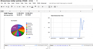
One of Martins’ most useful items in his bag of tricks is his hashtag twitter archive. By using his template, you can create an archive in google docs which stores tweets and through a bit of social network analysis magic also gives an overview of activity – top tweeters, time analysis etc. It’s hard to get the whole sheet into a screen grab hopefully the one below gives you and idea. Follow the link and click on the “dashboard” tab to see more details.

Dashboard from #moocmooc twitter archive

From this archive you can also use another one of Martin’s templates to create a vizualisation of the interactions of this #hashtag network.

Which always looks impressive, and does give you a sense of the “massive” part of a MOOC, but it is quite hard to actually make real any sense of;-)

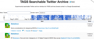
However Martin is not one to rest on his SNA/data science laurels and his latest addition, a searchable twitter archive, I feel was much more useful from a learner’s (and actually instructors) perspective.

Again it has time/level of tweets information, this time clearly presented at the top of the sheet. You can search by key word and/or twitter handle. A really useful way to find those tweets you forgot to favourite! Again here is a screenshot just as a taster, but try it out to get the full sense of it.

#moocmooc searchable twitter arcive

#moocmooc searchable twitter arcive

Also from an instructor/course design point of view you, from both of these templates you can see time patterns emerging which could be very useful for a number of reasons – not least managing your own time and knowing when to interact to connect with the most number of learners.

Another related point about timing relates to the use of free services such as storify. Despite us all being “self directed, and motivated” it’s highly likely that if an assignment is due in at 6pm – then at 5.50 the service is going to be pretty overloaded. Now this might not be a problem, but it could be and so it worth bearing in mind when designing courses and suggesting submission times and guidance for students.

I also made a concerted effort to blog each day about my experiences, and once I was able to use another one of Martin’s templates – social sharing, to track the sharing of my blogs on various sites. I don’t have a huge blog readership but I was pleased to see that I was getting a few more people reading my posts. But what was really encouraging (as any blogger knows) was the fact that I was getting comments. I know I don’t need any software to let me know that, and in terms of engagement and participation, getting comments is really motivating. What is nice about this template is that it stores the comments and the number other shares (and where they are), allowing you get more of an idea of where and how your community are sharing resources. I could see my new #moocmooc community were engaging with my engagement – warm, cosy feelings all round!

So through some easy to set up and share templates I’ve been able to get a bit more of an insight into my activity, engagement and participation. MOOCs can be overwhelming, chaotic, disconcerting, and give learners many anxieties about being unconnected in the vast swirl of connectedness. A few analtyics can help ease some of these anxieties, or at least give another set of tools to help make sense, catch up, reflect on what is happening.

For more thoughts on my experiences of the week you can read my other posts.

*Day 1 To MOOC or not to MOOC?
*Day 2 Places where learning takes place
*Day 3 Massive Participation but no-one to talk to
*Day 4 Moocmooc day 4
*Day 5 Designing a MOOC – moocmooc day 5

Some thoughts on web analytics uisng our work on analytics

As I’ve mentioned before, CETIS are in the middle of a piece of work for JISC around analytics in education (our Analytics Reconnoitre project). You may have noticed a number of blog posts from myself and colleagues around various aspects of analytics in education. We think this is a “hot topic” but is it? Can our analytics help us to gauge interest?

CETIS, like many others, is increasingly using Google Analytics to monitor traffic on our website. We are also lucky to have in Martin Hawksey, a resident google spreadsheet genius. Since Martin has come to work with us, we have been looking at ways we can use some of his “stuff” to help us develop our communications work, and gain more of an understanding of how people interact with our overall web presence.

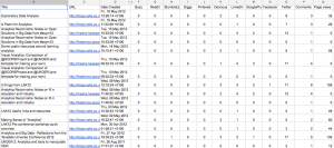
As part of the recent CETIS OER visualisation project, Martin has explored ways of tracking social sharing of resources. Using this technique Martin has adapted one of his spreadsheet so that it not only takes in google analytics from our CETIS blog posts, but also combines the number of shares a post is getting from these social sharing sites: Buzz, Reddit, Stumbleupon, Diggs, Pinterest, Delicious, Google+, Facebook and Twitter. By adding the the rss feed from our Analytics topic area, we get a table like this which combines the visit and comments information with the number of shares a post gets on each of the sharing sites.

social sharing stats for JISC CETIS analytics topic feed

(NB Martin’s blog is not hosted on our CETIS server so we can’t automagically pull his page view info in this way which is why there is a 0 value in the page view column for his posts, but I think we can safely say that he gets quite a few page views)

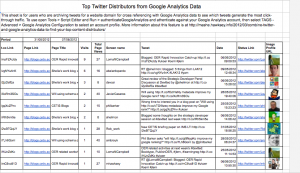
From this table it is apparent that Twitter is the main way our posts are being shared. Linkedin comes in second with delicious and google+ also generating a few “shares”. The others get virtually no traffic. We already knew that twitter is a key amplification tool for us, and again Martin’s magic has allowed us to create a view of the top click throughs from Twitter on our blog posts.

JISC CETIS Top twitter distributers

We could maybe be accused of playing the system, as you can see a number of our top re-tweeters are staff members – but if we can’t promote our own stuff, then we can hardly expect anyone else to!

But I digress, back to the main point. We can now get an overview of traffic on a particular topic area, and see not only the number of visits and comments it is getting but also where else it is being shared. We can then start to make comparisons across topic areas.

This is useful on a number of levels beyond basic web stats. Firstly, it gives us another view on how our audience shares and values our posts. I think we can say that if someone book marks a post, they do place some value on it. I would hesitate to start to quantify what that value is, but increasingly we are being asked about ROI so it is something we need to consider. Similarly with re-tweets, if something is re-tweeted they people want to share that resource and so feel that it is of value to their twitter network. I don’t see a lot of bot retweets in the my network. It also allows us to share and evaluate more information not only internally, but also with our funders (and through posts like this) our community.

It also raises some questions wider questions about resource sharing and web analytics in general. Martin raised this issue last year with this post which sparked this reply from me. The questions I raised there are still on my mind, and increasingly as I explore this more in the context of CETIS, I think I am beginning to see more evidence of the habits and practice of our community.

Twitter is a useful dissemination channel, and increasingly a key way for peer sharing of information. The use of other social sharing sites, would appear to be not so much. Tho’ I was surprised to see relatively high numbers for linked in. Again this might be down to the “professional” nature of linked in – or the fact that I am an unashamed social media tart, and repost all my blog posts in linked in too :-) We also have sharing buttons on the bottom of our posts which have very obvious buttons for twitter, linked in and Facebook.

In terms of other social sharing sites, are these just more a question of people’s own work practices and digital literacies? Are these spaces seen as more private? Or is it just that people still don’t really use them that much, did the delicious debacle affect our trust in such sites? Should we encourage more sharing by having more obvious buttons for the other sites listed in the table? And more importantly should JISC and its funded services and projects be looking towards these sites for more measures of impact and engagement? Martin’s work illustrates how you can relatively easily combine data from different sources, and now there are some templates available there really isn’t a huge time cost to adapt them, but are they gathering the relevant data? Do we need to actively encourage more use of social sharing sites? I’d be really interested to hear of any thoughts/ experiences other have of any of these issues.