Is how I would sum up the speakers at the Social Network Analysis session at #cetis12.
I started the session by giving a very brief overview of SNA and tried to highlight why I think it is important, particularly to an organisation such as CETIS, who stakes quite a bit of of its reputation on its ability to network (see this post for some more of my thoughts around this). Using SNA we are now able to actually see and share our existing connections and, potentially any gaps.
I am always inspired by (and slightly in awe of) the work of both Tony and Martin in visualising communities, however I am always aware of the skills gap between their levels of competency and my own. So, I also wanted to raise the issue of “just in time/just enough” tools. Sometimes a quick snap shot of activity is really effective and all that’s needed. There’s also the issue of interpretation and common understandings.
Whilst visualisations can in many cases illustrate complex connections more eloquently than words, there are also cases, particularly around more complex visualisations where some common understandings of the models being used to create the visualisations and the data sources are required. A case in point was Adam Cooper’s opening presentation at the conference where he showed some examples of text mining and analysis of CETIS blog post. This provoked quite a bit of chin stroking twitter back-channel activity. I think this illustrats some of potential dangers around presenting what can appear to be an objective view of things which is based on subjective data. As I knew more about the data Adam’s presentation raised lots of really interesting questions for me, but another danger of social media is that twitter is often not the best medium to have an informed discussion.
Martin Hawskey’s (a man quite possibly on a mission to take over the world via google spreadsheets) presentation opened up the session from just SNA to a wider data discussion by highlighting some examples of data journalism, which have very effectively combined visualisation techniques and contextualisation. Martin then took us through some of the work he has recently been doing for JISC and CETIS in visualising activity around the UK OER projects.
Tony Hirst, aka the gephi wizard, then gave us a masterclass on data visualisation techniques, showing us how visualisations can provide “at a glance or macroscopic” views of huge datasets; which he encapsulated by the d3i model – data,information, intelligence, insight. As well as a sharing variety of examples from MPs expenses to Formula 1 racing to Brian Kelly, Tony has also been working with Alan Cann (University of Leicester) to visualise connections between students using Google+. Unfortunately Alan couldn’t be attend the session in person but he did share this video about their work. I’m looking forward to hearing more about this use of SNA in a real teaching and learning context.
Amber Thomas followed with a very balanced presentation “Lies, damed lies and pretty pictures” which gave a very balanced and but still thought provoking view on how we should be thinking about using the network and data analysis techniques. My colleague David Sherlock has blogged some thoughts on Amber’s presentation too. Amber highlighted some key tactics which included:
*reducing our fear of numbers
*being generous with our data ( and remembering who actually owns the data)
*combining data and effort to work faster /more effectively across the sector
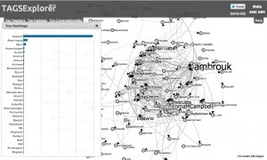
We then had some live analysis of data being driven via the conference #cetis12 hashtag – again what one man can do with a spreadsheet is quite amazing! You can see the results in the CETIS 12 TAGSExplorer.
More information on the session, and links to all the presentations are available by following this link.
