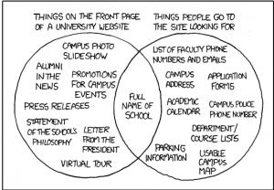
is pretty much summed up by the genius of xckd in this cartoon
and was the focus of one of the plenary talks at this weeks #iwmw12 conference given by Professor Ferdinand von Prondzynski, Principal, Robert Gordon University. The gist of Fredrick’s talk centred on the contradiction in Universities of the innovative role they play in terms of creating, developing and using technology and the apparent lack of creativity and user focus when it comes to using technology for communication purposes.
Do you find the corporate comms emails you receive a bit like former Soviet block communications full of “interesting” facts on 5 year plans etc? I hadn’t really made that connection before but I did find myself smiling along in agreement with that analogy. However it was University home pages which were the main bugbear and the focus of Fredrick’s talk. News, too many links, scrolling pages, all were taken to task.
I think it is fair to say that most University home pages are quite busy spaces, but telling that to a bunch of institutional web managers . . . well it was almost a Donald Clarke, ALT-C moment ![]() However I think it was useful to highlight the schizophrenic nature of universities and how that is reflected in home pages. Fredrick pointed out that big companies/corporations seem to be much better at simplifying their home pages, however they have a much clearer corporate identity.
However I think it was useful to highlight the schizophrenic nature of universities and how that is reflected in home pages. Fredrick pointed out that big companies/corporations seem to be much better at simplifying their home pages, however they have a much clearer corporate identity.
What is the key focus of a University and so it’s home page? Research? Teaching and learning? Information for prospective students? Everyone wants their “bit” on the front page, despite what stats might tell us about no-one actually reading the news sections, if Professor X has just got a gizillion pounds for their research project, they, and the institutional marketing team will probably want something about that visible on the front page. And, as was pointed out in the Q&A session, university web sites are usefully managed and created by very small teams with little or no budgets and in that sense actually do a pretty remarkable job compared with commercial websites.
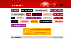
During the conference I was introduce to this alternative homepage for students at LSE.

LSE cloud
Great idea isn’t it – these are the web spaces the students want to access quickly. But of course not that useful for prospective students.
So what can be done? Well as Fredrick did admit, communication is the key. But the communication and future developments should be based on real stats and analysis of site use and not just someone’s personal preference.

Just a quick response – are you familiar with Gerry McGovern’s Top Tasks approach? This is being used/mandated in local government and also drives the forthcoming new government site – see https://www.gov.uk/, look familiar?
There is a lot of statistics and analysis on the Government Digital Service blog about their use of the approach. It’s also being used in the US with some higher education websites. I’ll be writing more about this theme at #iwmw12 shortly.
I don’t know if Ferdinand is aware of Gerry’s Top Tasks, but aspects of his talk certainly rang the same bell.
Thanks Ann and will look out for your post too.
Sheila
Wow! Have you seen Strathclyde’s home page? It’s been updated since I last looked. And guess what’s slap bang in the middle of the page? Research and News. On the plus side, it doesn’t scroll
Thanks Lorna – I wonder if Professor von Prondzynski would approve?
I’ve ripped off Gerry McGovern’s survey technique to good effect a fair few times. A very useful addition to web analytics data and proved particularly popular with our service units. Well worth investigating.
I’ve blogged anything he’s done that I’ve felt relevant to HE web management at Edinburgh for the past 3 or so years:
http://usability-ed.blogspot.co.uk/search/label/Gerry%20McGovern
Thanks Neil, very useful link to you blog too.
Sheila
I think part of the problem is there is not a lot of structure in the online side of university websites. More focus and understanding needs to be on what the visitor to the website is actually looking for. Easier said than done sometimes, but very doable with the right plan and structure in place.
Nice article and I love the home page example, appeals to my sense of directness. Just a comment though that most websites are not accessed through their homepages now that search engines, social media and RSS have taken off. There are some figures mentioned on this page http://storify.com/noahchestnut/where-is-the-traffic-homepages-or-story-pages but I cannot find the source of this claim.
@Russell:
Gerry McGovern wrote along similar lines back in 2010:
http://giraffeforum.com/wordpress/2010/04/18/the-decline-of-the-homepage/
It prompted me to review stats on our university website and to be honest I couldn’t find evidence to really back up what he was saying:
http://usability-ed.blogspot.co.uk/2010/05/homepage-design-and-purpose-mcgovern-vs.html
Hi Sheila
Im doing my dissertation on recruiting prospective students and what info they would like. The image you have used is something Im looking for. Did you make that yourself? Would it be ok for me to publish it within my project, please let me know if you have other information. Thanks
Hi Dee
As it says in the text -the image is via xkcd – link when you click on it.
Sheila