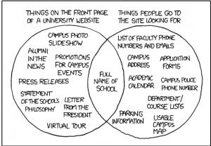
is pretty much summed up by the genius of xckd in this cartoon
and was the focus of one of the plenary talks at this weeks #iwmw12 conference given by Professor Ferdinand von Prondzynski, Principal, Robert Gordon University. The gist of Fredrick’s talk centred on the contradiction in Universities of the innovative role they play in terms of creating, developing and using technology and the apparent lack of creativity and user focus when it comes to using technology for communication purposes.
Do you find the corporate comms emails you receive a bit like former Soviet block communications full of “interesting” facts on 5 year plans etc? I hadn’t really made that connection before but I did find myself smiling along in agreement with that analogy. However it was University home pages which were the main bugbear and the focus of Fredrick’s talk. News, too many links, scrolling pages, all were taken to task.
I think it is fair to say that most University home pages are quite busy spaces, but telling that to a bunch of institutional web managers . . . well it was almost a Donald Clarke, ALT-C moment ![]() However I think it was useful to highlight the schizophrenic nature of universities and how that is reflected in home pages. Fredrick pointed out that big companies/corporations seem to be much better at simplifying their home pages, however they have a much clearer corporate identity.
However I think it was useful to highlight the schizophrenic nature of universities and how that is reflected in home pages. Fredrick pointed out that big companies/corporations seem to be much better at simplifying their home pages, however they have a much clearer corporate identity.
What is the key focus of a University and so it’s home page? Research? Teaching and learning? Information for prospective students? Everyone wants their “bit” on the front page, despite what stats might tell us about no-one actually reading the news sections, if Professor X has just got a gizillion pounds for their research project, they, and the institutional marketing team will probably want something about that visible on the front page. And, as was pointed out in the Q&A session, university web sites are usefully managed and created by very small teams with little or no budgets and in that sense actually do a pretty remarkable job compared with commercial websites.
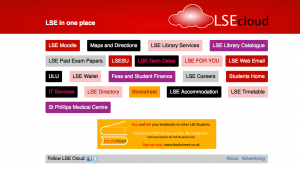
During the conference I was introduce to this alternative homepage for students at LSE.

LSE cloud
Great idea isn’t it – these are the web spaces the students want to access quickly. But of course not that useful for prospective students.
So what can be done? Well as Fredrick did admit, communication is the key. But the communication and future developments should be based on real stats and analysis of site use and not just someone’s personal preference.
