This is my final post on my experiences of the #moocmooc course that ran last week, and I want to share a few of my reflections on the role of analytics (and in this case learning analytics), primarily from my experiences as a learner on the course. I should point out that I have no idea about the role of analytics from the course teams point of view, but I am presuming that they have the baseline basics of enrollment numbers and login stats from the Canvas LMS. But in this instance there were no obvious learner analytics available from the system. So, as a learner, in such an open course where you interact in a number of online spaces, how do you get a sense of your own engagement and participation?
There are some obvious measures, like monitoring your own contributions to discussion forums. But to be honest do we really have the time to do that? I for one am quite good at ignoring any little nagging voices saying in my head saying “you haven’t posted to the discussion forum today” ![]() A little automation would probably go a long way there. However, a lot of actual course activity didn’t take place within the “formal” learning environment, instead it happened in other spaces such as twitter, storify, google docs, YouTube, blogs etc. Apart from being constantly online, my phone bleeping every now again notifying me of retweets, how did I know what was happening and how did that help with engagement and motivation?
A little automation would probably go a long way there. However, a lot of actual course activity didn’t take place within the “formal” learning environment, instead it happened in other spaces such as twitter, storify, google docs, YouTube, blogs etc. Apart from being constantly online, my phone bleeping every now again notifying me of retweets, how did I know what was happening and how did that help with engagement and motivation?
I am fortunate, mainly due to my colleague Martin Hawskey that I have a few analytics tricks that I was able to utilise which gave me a bit of an insight into my, and the whole class activity.
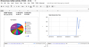
One of Martins’ most useful items in his bag of tricks is his hashtag twitter archive. By using his template, you can create an archive in google docs which stores tweets and through a bit of social network analysis magic also gives an overview of activity – top tweeters, time analysis etc. It’s hard to get the whole sheet into a screen grab hopefully the one below gives you and idea. Follow the link and click on the “dashboard” tab to see more details.

From this archive you can also use another one of Martin’s templates to create a vizualisation of the interactions of this #hashtag network.
Who’s leading the twitter conversation at
#moocmooc@slamteacher@rosemarysewart@jessifer hawksey.info/tagsexplorer/?… twitter.com/mhawksey/statu…— Martin Hawksey (@mhawksey) August 16, 2012
Which always looks impressive, and does give you a sense of the “massive” part of a MOOC, but it is quite hard to actually make real any sense of;-)
However Martin is not one to rest on his SNA/data science laurels and his latest addition, a searchable twitter archive, I feel was much more useful from a learner’s (and actually instructors) perspective.
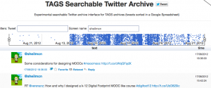
Again it has time/level of tweets information, this time clearly presented at the top of the sheet. You can search by key word and/or twitter handle. A really useful way to find those tweets you forgot to favourite! Again here is a screenshot just as a taster, but try it out to get the full sense of it.

#moocmooc searchable twitter arcive
Also from an instructor/course design point of view you, from both of these templates you can see time patterns emerging which could be very useful for a number of reasons – not least managing your own time and knowing when to interact to connect with the most number of learners.
Another related point about timing relates to the use of free services such as storify. Despite us all being “self directed, and motivated” it’s highly likely that if an assignment is due in at 6pm – then at 5.50 the service is going to be pretty overloaded. Now this might not be a problem, but it could be and so it worth bearing in mind when designing courses and suggesting submission times and guidance for students.
I also made a concerted effort to blog each day about my experiences, and once I was able to use another one of Martin’s templates – social sharing, to track the sharing of my blogs on various sites. I don’t have a huge blog readership but I was pleased to see that I was getting a few more people reading my posts. But what was really encouraging (as any blogger knows) was the fact that I was getting comments. I know I don’t need any software to let me know that, and in terms of engagement and participation, getting comments is really motivating. What is nice about this template is that it stores the comments and the number other shares (and where they are), allowing you get more of an idea of where and how your community are sharing resources. I could see my new #moocmooc community were engaging with my engagement – warm, cosy feelings all round!
So through some easy to set up and share templates I’ve been able to get a bit more of an insight into my activity, engagement and participation. MOOCs can be overwhelming, chaotic, disconcerting, and give learners many anxieties about being unconnected in the vast swirl of connectedness. A few analtyics can help ease some of these anxieties, or at least give another set of tools to help make sense, catch up, reflect on what is happening.
For more thoughts on my experiences of the week you can read my other posts.
*Day 1 To MOOC or not to MOOC?
*Day 2 Places where learning takes place
*Day 3 Massive Participation but no-one to talk to
*Day 4 Moocmooc day 4
*Day 5 Designing a MOOC – moocmooc day 5
