A simpler sourcing maturity assessment approach

Knowing how to procure your IT services, software and hardware is a vital function in any organisation. Assessing one’s maturity in this aspect can be complex, which is why SURF developed a simpler approach.

There are a number of perspectives to take on IT and its place in an organisation, but for further and higher education institutions, the procurement or sourcing of services – in the widest sense of the word ‘services’ – may be among the most important ones. With the ongoing move to cloud provisioning, determining where a particular service is going to come from and how it is managed is crucial.

A number of approaches to measure and improve an organisation’s maturity in this area exist, but, as Bert van Zomeren points out in the EUNIS paper that presents the SURF Sourcing Maturity Assessment Approach, these are quite complex. They can be so sophisticated that organisations hire consultancies that it do it for them. The SURF method doesn’t go quite as deep as those exercises, but is a much easier first step.

The heart of the approach is simple: a champion identifies the key stakeholders in the organisation with regard to the sourcing process, each of the stakeholders fills out the questionnaire, the results are analysed, the stakeholders meet, and appropriate adjustments to the process are agreed upon.

As in many of these approaches, the questions in the questionnaire describe an ideal situation, and respondents are asked to rank their organisation on how closely they think their organisation resembles that ideal on a scale. Some of these ideals may be uncontroversial, but it is certainly possible that others do provoke debate – adapting processes to suit services, rather than the other way round, for example. Still, such a debate can be a valuable input into the wider maturation process.

I’ve just translated the questionnaire into English, and it has been made available as a combination Google form and spreadsheet. To test it yourself, you need to sign into Google drive, put the form and spreadsheet into your drive, then make copies. The spreadsheet has two sheets: one that gathers the data and another that turns the data into a crude, but extensible report.

It’d probably be a good idea to read van Zomeren and Levinson’s short EUNIS paper before you start. There is a much more extensive guide to the approach in Dutch as well, but we thought we’d gather some feedback first before translating that as well. A guide of that sort will almost certainly be necessary in order to use the simpler sourcing maturity assessment approach in anger at an institution.

What could a GPS for learner journeys look like?

Last weekend, a motley crew of designers, students, developers, business and government people came together in Edinburgh to prototype designs and apps to help learners manage their journeys. With help, I built a prototype that showed how curriculum and course offering data can be combined with e-portfolios to help learners find their way.

The first official Scottish government data jam, facilitated by Snook and supported by TechCube, is part of a wider project to help people navigate the various education and employment options in life, particularly post 16. The jam was meant to provide a way to quickly prototype a wide range of ideas around the learner journey theme.

While many other teams at the jam built things like a prototype social network, or great visualisations to help guide learners through their options, we decided to use the data that was provided to help see what an infrastructure could look like that supported the apps the others were building.

In a nutshell, I wanted to see whether a mash-up of open data in open standard formats could help answer questions like:

  • Where is the learner in their journey?
  • Where can we suggest they go next?
  • What can help them get there?
  • Who can help or inspire them?

Here’s a slide deck that outlines the results. For those interested in the nuts and bolts read on to learn more about how we got there.

Where is the learner?

To show how you can map where someone is on their learning journey, I made up an e-portfolio. Following an excellent suggestion by Lizzy Brotherstone of the Scottish Government, I nicked a story about ‘Ryan’ from an Education Scotland website on learner journeys. I recorded his journey in a Mahara e-portfolio, because it outputs data in the standard LEAP2a format- I could have used PebblePad as well for the same reason.

I then transformed the LEAP2a XML into very rough but usable RDF using a basic stylesheet I made earlier. Why RDF? Because it makes it easy for me to mash up the portfolios with other datasets; other data formats would also work. The made-up curriculum identifiers were added manually to the RDF, but could easily have been taken from the LEAP2a XML with a bit more time.

Where can we suggest they go next?

I expected that the Curriculum for Excellence would provide the basic structure to guide Ryan from his school qualifications to a college course. Not so, or at least, not entirely. The Scottish Qualifications Framework gives a good idea of how courses relate in terms of levels (i.e. from basic to a PhD and everything in between), but there’s little to join subjects. After a day of head scratching, I decided to match courses to Ryan’s qualifications by level and comparing the text of titles. We ought to be able to do better than that!

The course data set was provided to us was a mixture of course descriptions from the Scottish Qualifications Authority, and actual running courses offered by Scottish colleges all in one CSV file. During the jam, Devon Walshe of TechCube made a very comprehensive data set of all courses that you should check out, but too late for me. I had a brief look at using XCRI feeds like the ones from Adam Smith college too, but went with the original CSV in the end. I tried using LOD Refine to convert the CSV to RDF, but it got stuck on editing the RDF harness for some reason. Fortunately, the main OpenRefine version of the same tool worked its usual magic, and four made-up SQA URIs later, we were in business.

This query takes the email of Ryan as a unique identifier, then finds his qualification subjects and level. That’s compared to all courses from the data jam course data set, and whittled down to those courses that match Ryan’s qualifications and are above the level he already has.

The result: too many hits, including ones that are in subjects that he’s unlikely to be interested in.

So let’s throw in his interests as well. Result: two courses that are ideal for Ryan’s skills, but are a little above his level. So we find out all the sensible courses that can take him to his goal.

What can help them get there?

One other quirk about the curriculum for excellence appears to be that there are subject taxonomies, but they differ per level. Intralect implemented a very nice one that can be used to tag resources up to level 3 (we think). So Intralect’s Janek exported the vocabulary in two CSV files, which I imported in my triple store. He then built a little web service in a few hours that takes the outcome of this query, and returns a list of all relevant resources in the Intralibrary digital repository for stuff that Ryan has already learned, but may want to revisit.

Who can help or inspire them?

It’s always easier to have someone along for the journey, or to ask someone who’s been before you. That’s why I made a second e-portfolio for Paula. Paula is a year older than Ryan, is from a different, but nearby school, and has done the same qualifications. She’s picked the same qualification as a goal that we suggested to Ryan, and has entered it as a goal on her e-portfolio. Ryan can get it touch with her over email.

This query takes the course suggested to Ryan, and matches it someone else’s stated academic goal, and reports on what she’s done, what school she’s from, and her contact details.

Conclusion

For those parts of the Curriculum for Excellence for which experiences and outcomes have been defined, it’d be very easy to be very precise about progression, future options, and what resources would be particularly helpful for a particular learner at a particular part of the journey. For the crucial post 16 years, this is not really possible in the same way right now, though it’s arguable that its all the more important to have solid guidance at that stage.

Some judicious information architecture would make a lot more possible without necessarily changing the syllabus across the board. Just a model that connects subject areas across the levels, and school and college tracks would make more robust learner journey guidance possible. Statements that clarify which course is an absolute pre-requisite for another, and which are suggested as likely or preferable would make it better still.

We have the beginnings of a map for learner journeys, but we’re not there yet.

Other than that, I think agreed identifiers and data formats for curriculum parts, electronic portfolios or transcripts and course offerings can enable a whole range of powerful apps of the type that others at the data jam built, and more. Thanks to standards, we can do that without having to rely on a single source of truth or a massive system that is a single point of failure.

Find out all about the other great hacks on the learner journey data jam website.

All the data and bits of code I used are available on github
VLE commodification is complete as Blackboard starts supporting Moodle and Sakai

Unthinkable a couple of years ago, and it still feels a bit April 1st: Blackboard has taken over the Moodlerooms and NetSpot Moodle support companies in the US and Australia. Arguably as important is that they have also taken on Sakai and IMS luminary Charles Severance to head up Sakai development within Blackboard’s new Open Source Services department. The life of the Angel VLE Blackboard acquired a while ago has also been extended.

For those of us who saw Blackboard’s aggressive acquisition of commercial competitors WebCT and Angel, and seen the patent litigation they unleashed against Desire 2 Learn, the idea of Blackboard pledging to be a good open source citizen may seem a bit … unsettling, if not 1984ish.

But it has been clear for a while that Blackboard’s old strategy of ‘owning the market’ just wasn’t going to work. Whatever the unique features are that Blackboard has over Moodle and Sakai, they aren’t enough to convince every institution to pay for the license. Choosing between VLEs was largely about price and service, not functionality. Even for those institutions where price and service were not an issue, many departments had sometimes not entirely functional reasons for sticking with one or another VLE that wasn’t Blackboard.

In other words, the VLE had become a commodity. Everyone needs one, and they are fairly predictable in their functionality, and there is not that much between them, much as I’ve outlined in the past.

So it seems Blackboard have wisely decided to switch focus from charging for IP to becoming a provider of learning tool services. As Blackboard’s George Kroner noted, “It does kinda feel like @Blackboard is becoming a services company a la IBM under Gerstner

And just as IBM has become quite a champion of Open Source Software, there is no reason to believe that Blackboard will be any different. Even if only because the projects will not go away, whatever they do to the support companies they have just taken over. Besides, ‘open’ matters to the education sector.

Interoperability

Blackboard had already abandoned extreme lock-in by investing quite a bit in open interoperability standards, mostly through the IMS specifications. That is, users of the latest versions of Blackboard can get their data, content and external tool connections out more easily than in the past- it’s no longer as much of a reason to stick with them.

Providing services across the vast majority of VLEs (outside of continental Europe at least) means that Blackboard has even more of an incentive to make interoperability work across them all. Dr Chuck Severance’s appointment also strongly hints at that.

This might need a bit of watching. Even though the very different codebases, and a vested interest in openness, means that Blackboard sponsored interoperability solutions – whether arrived at through IMS or not – are likely to be applicable to other tools, this is not guaranteed. There might be a temptation to cut corners to make things work quickly between just Blackboard Learn, Angel, Moodle 1.9/2.x and Sakai 2.x.

On the other hand, the more pressing interoperability problems are not so much between the commodified VLEs anymore, they are between VLEs and external learning tools and administrative systems. And making that work may just have become much easier.

The Blackboard press releases on Blackboard’s website.
Dr Chuck Severance’s post on his new role.

Approaches to building interoperability and their pros and cons

System A needs to talk to System B. Standards are the ideal to achieve that, but pragmatics often dictate otherwise. Let’s have a look at what approaches there are, and their pros and cons.

When I looked at the general area of interoperability a while ago, I observed that useful technology becomes ubiquitous and predictable enough over time for the interoperability problem to go away. The route to get to such commodification is largely down to which party – vendors, customers, domain representatives – is most powerful and what their interests are. Which describes the process very nicely, but doesn’t help solve the problem of connecting stuff now.

So I thought I’d try to list what the choices are, and what their main pros and cons are:

A priori, global
Also known as de jure standardisation. Experts, user representatives and possibly vendor representatives get together to codify whole or part of a service interface between systems that are emerging or don’t exist yet; it can concern either the syntax, semantics or transport of data. Intended to facilitate the building of innovative systems.
Pros:

  • Has the potential to save a lot of money and time in systems development
  • Facilitates easy, cheap integration
  • Facilitates structured management of network over time

Cons:

  • Viability depends on the business model of all relevant vendors
  • Fairly unlikely to fit either actually available data or integration needs very well

A priori, local
i.e. some type of Service Oriented Architecture (SOA). Local experts design an architecture that codifies syntax, semantics and operations into services. Usually built into agents that connect to each other via an ESB.
Pros:

  • Can be tuned for locally available data and to meet local needs
  • Facilitates structured management of network over time
  • Speeds up changes in the network (relative to ad hoc, local)

Cons:

  • Requires major and continuous governance effort
  • Requires upfront investment
  • Integration of a new system still takes time and effort

Ad hoc, local
Custom integration of whatever is on an institution’s network by the institution’s experts in order to solve a pressing problem. Usually built on top of existing systems using whichever technology is to hand.
Pros:

  • Solves the problem of the problem owner fastest in the here and now.
  • Results accurately reflect the data that is actually there, and the solutions that are really needed

Cons:

  • Non-transferable beyond local network
  • Needs to be redone every time something changes on the local network (considerable friction and cost for new integrations)
  • Can create hard to manage complexity

Ad hoc, global
Custom integration between two separate systems, done by one or both vendors. Usually built as a separate feature or piece of software on top of an existing system.
Pros:

  • Fast point-to-point integration
  • Reasonable to expect upgrades for future changes

Cons:

  • Depends on business relations between vendors
  • Increases vendor lock-in
  • Can create hard to manage complexity locally
  • May not meet all needs, particularly cross-system BI

Post hoc, global
Also known as standardisation, consortium style. Service provider and consumer vendors get together to codify a whole service interface between existing systems; syntax, semantics, transport. The resulting specs usually get built into systems.
Pros:

  • Facilitates easy, cheap integration
  • Facilitates structured management of network over time

Cons:

  • Takes a long time to start, and is slow to adapt
  • Depends on business model of all relevant vendors
  • Liable to fit either available data or integration needs poorly

Clearly, no approach offers instant nirvana, but it does make me wonder whether there are ways of combining approaches such that we can connect short term gain with long term goals. I suspect if we could close-couple what we learn from ad hoc, local integration solutions to the design of post-hoc, global solutions, we could improve both approaches.

Let me know if I missed anything!

ArchiMate modelling bash outcomes

What’s more effective than taking two days out and focus on a new practice with peers and experts?

Following the JISC’s FSD programme, an increasing number of UK Universities started to use the ArchiMate Enterprise Architecture modelling language. Some people have had some introductions to the language and its uses, others even formal training in it, others still visited colleagues who were slightly further down the road. But there was a desire to take the practice further for everyone.

For that reason, Nathalie Czechowski of Coventry University took the initiative to invite anyone with an interest in ArchiMate modelling (not just UK HE), to come to Coventry for a concentrated two days together. The aims were:

1) Some agreed modelling principles

2) Some idea whether we’ll continue with an ArchiMate modeller group and have future events, and in what form

3) The models themselves

With regard to 1), work is now underway to codify some principles in a document, a metamodel and an example architecture. These principles are based on the existing Coventry University standards and the Twente University metamodel, and the primary aim of them is to facilitate good practice by enabling sharing of, and comparability between, models from different institutions.

With regard to 2), the feeling of the ‘bash participants was that it was well worth sustaining the initiative and organise another bash in about six months’ time. The means of staying in touch in the mean time have yet to be established, but one will be found.

As to 3), a total of 15 models were made or tweaked and shared over the two days. Varying from some state of the art, generally applicable samples to rapidly developed models of real life processes in universities, they demonstrate the diversity of the participants and their concerns.

All models and the emerging community guidelines are available on the FSD PBS wiki.

Jan Casteels also blogged about the event on Enterprise Architect @ Work

Enterprise Architecture throws out bath water, saves baby in the nick of time

Enterprise architecture started as a happily unreconstituted techy activity. When that didn’t always work, a certain Maoist self-criticism kicked in, with an exaltation of “the business” above all else, and taboos on even thinking about IT. Today’s Open Group sessions threatened to take that reaction to its logical extreme. Fortunately, it didn’t quite end up that way.

The trouble with realising that getting anywhere with IT involves changing the rest of the organisation as well, is that it gets you out of your assigned role. Because the rest of the organisation is guaranteed to have different perspectives on how it wants to change (or not), what the organisation’s goals are and how to think about its structure, communication is likely to be difficult. Cue frustration on both sides.

That can be addressed by going out of your way to go to “the business”, talk it’s language, worry about its concerns and generally go as native as you can. This is popular to the point of architects getting as far away from dirty, *dirty* IT as possible in the org chart.

So when I saw the sessions on “business architecture”, my heart sank. More geeks pretending to be suits, like a conference hall full of dogs trying to walk on their hind legs, and telling each other how it’s the future.

When we got to the various actual case reports in the plenary and business transformation track, however, EA self-negation is not quite what’s happening in reality. Yes, speaker after speaker emphasised the need to talk to other parts of the organisation in their own language, and the need to only provide relevant information to them. Tom Coenen did a particularly good job of stressing the importance of listening while the rest of the organisation do the talking.

But, crucially, that doesn’t negate that – behind the scenes – architects still model. Yes, for their own sake, and solely in order to deliver the goals agreed with everyone else, but even so. And, yes, there are servers full of software artefacts in those models, because they are needed to keep the place running.

This shouldn’t be surprising. Enterprise architects are not hired to decide what the organisation’s goals are, what its structure should be or how it should change. Management does that. EA can merely support by applying its own expertise in its own way, and worry about the communication with the rest of the organisation both when requirements go in and a roadmap comes out (both iteratively, natch).

And ‘business architecture’? Well, there still doesn’t appear to be a consensus among the experts what it means, or how it differs from EA. If anything, it appears to be a description of an organisation using a controlled vocabulary that looks as close as possible to non-domain specific natural language. That could help with intra-disciplinary communication, but the required discussion about concepts and the word to refer to them makes me wonder whether having a team who can communicate as well as they can model might not be quicker and more precise.

Bare bones TOGAF

Do stakeholder analysis. Cuddle the uninterested powerful ones, forget about the enthusiasts without power. Agree goal. Deliver implementable roadmap. The rest is just nice-to-have.

That was one message from today’s slot on The Open Group’s Architecture Framework (TOGAF) at the Open Group’s quarterly meeting in Amsterdam. In one session, two self-described “evil consultants” ran a workshop on how to extract most value from an Enterprise Architecture (EA) to institutional change.

While they agreed about the undivided primacy of keeping the people with power happy when doing EA, the rest of their approach differed more markedly.

Dave Hornford zero-ed in mercilessly on the do-able roadmap as the centre of the practice. But before that, find those all-powerful stakeholders and get them to agree on the organisational vision and its goal. If there is no agreement: celebrate. You’ve just saved the organised an awful lot of money in an expensive and unimplementable EA venture.

Once past that hurdle, Dave contended that the roadmap should identify what the organisation really needs – which may not always be sensible or pretty.

Jason Uppal took a slightly wider view, by focussing on the balance between quick wins and how to EA the norm in an organisation.

The point about ‘quick wins’ is that both ‘quick’ and ‘win’ are relative. It is possible to go after a long term value proposition with a particular change, as long as you have a series of interim solutions that provide value now. Even if you throw them away again later. And the first should preferably have no cost.

That way, EA can become part of the organisation’s practice: by providing value. This does pre-suppose that the EA practice is neither a project, nor a programme- just a practice.

An outline of the talks on the Open Group’s website

Linked Data meshup on a string

I wanted to demo my meshup of a triplised version of CETIS’ PROD database with the impressive Linked Data Research Funding Explorer on the Linked Data meetup yesterday. I couldn’t find a good slot, and make my train home as well, so here’s a broad outline:

The data

The Department for Business Innovation and Skills (BIS) asked Talis if they could use the Linked Data Principles and practice demonstrated in their work with data.gov.uk to produce an application that would visualise some grant data. What popped out was a nice app with visuals by Iconomical, based on a couple of newly available data sets that sit on Talis’ own store for now.

The data concerns research investment in three disciplines, which are illustrated per project, by grant level and number of patents, as they changed over time and plotted on a map.

CETIS have PROD; a database of JISC projects, with a varying amount of information about the technologies they use, the programmes they were part of, and any cross links between them.

The goal

Simple: it just ought to be possible to plot the JISC projects alongside the advanced tech of the Research Funding Explorer. If not, than at least the data in PROD should be augmentable with the data that drives the Research Funding Explorer.

Tools

Anything I could get my hands on, chiefly:

The recipe

For one, though PROD pushes out Description Of A Project (DOAP, an RDF vocabulary) files per project, it doesn’t quite make all of its contents available as linked data right now. The D2R toolkit was used to map (part of) the contents to known vocabs, and then make the contents of a copy of PROD available through a SPARQL interface. Bang, we’re on the linked data web. That was easy.

Since I don’t have access to the slick visualisation of the Research Funding Explorer, I’d have to settle for augmenting PROD’s data. This is useful for two reasons: 1) PROD has rather, erm, variable institutional names. Synching these with canonical names from a set that will go into data.gov.uk is very handy. 2) PROD doesn’t know much about geography, but Talis’ data set does.

To make this work, I made a SPARQL query that grabs basic project data from PROD, and institutional names and locations from the Talis data set, and visualises the results.

Results

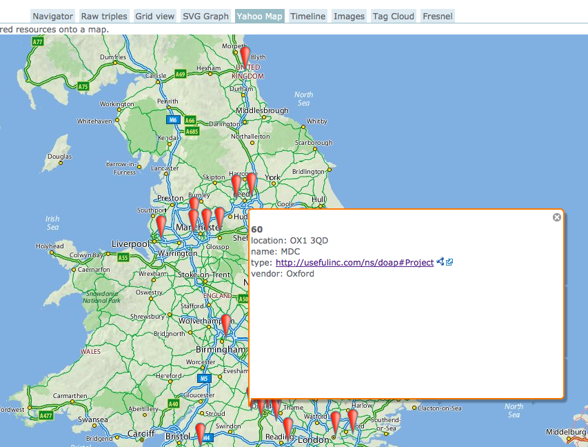
A partial map of England, Wales and southern Scotland with markers indicating where projects took place
An excerpt of PROD project data, augmented with proper institutional names and geographic positions from Talis’ Research Grant Explorer, visualised in OpenLink RDF browser.

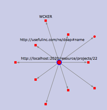
A star shaped overview of various attributes of a project, with the name property highlighted
Zooming in on a project, this time to show the attributes of a single project. Still in OpenLink RDF browser.

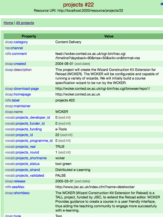
A two column list of one project's attributes and their values
A project in D2R’s web interface; not shiny, but very useful.

From blagging a copy of the SQL tables from the live PROD database to the screen shots above took about two days. Opening up the live server straight to the web would have cut that time by more than half. If I’d have waited for the Research Grant Explorer data to be published at data.gov.uk, it’d have been a matter of about 45 minutes.

Lessons learned

Opening up any old database as linked data is incredibly easy.

Cross-searching multiple independent linked data stores can be surprisingly difficult. This is why a single SPARQL endpoint across them all, such as the one presented by uberblic‘s Georgi Kobilarov yesterday, is interesting. There are many other good ways to tackle the problem too, but whichever approach you use, making your linked data available as simple big graphs per major class of thing (entity) in your dataset helps a lot. I was stymied somewhat by the fact that I wanted to make use of data that either wasn’t published properly yet (Talis’ research grant set), or wasn’t published at all (our own PROD triples).

A bit of judicious SPARQLing can alleviate a lot of inconsistent data problems. This is salient to a recent discussion on twitter around Brian Kelly’s Linked Data challenge. One conclusion was that it was difficult, because the data was ‘bad’. IMHO, this is the web, so data isn’t really bad, just permanently inconsistent and incomplete. If you’re willing to put in some effort when querying, a lot can be rectified. We, however, clearly need to clean up PROD’s data to make it easier on everyone.

SPARQL-panning for gold in multiple datastores (or even feeds or webpages) is way too much fun to seem like work. To me, anyway.

What’s next

What needs to happen is to make all the contents of PROD and related JISC project information available as proper linked data. I can see three stages for this:

  1. We clean up the PROD data a little more at source, and load it into the Data Incubator to polish and debate the database to triple mapping. Other meshups would also be much easier at that point.
  2. We properly publish PROD as linked data either on a cloud platform such as Talis’, or else directly from our own server via D2R or OpenLink Virtuoso. Simal would be another great possibility for an outright replacement of PROD, if it’s far enough along at that point.
  3. JISC publishes the public part of its project information as Linked Data, and PROD just augments (rather than replicates) it.