Subject coding is changing from JACS3 to HECoS; here’s what’s different

From UCAS applications to HESA returns, and from league tables to the academic technology approval scheme, degree programmes and modules are classified by subject. JACS3 does that job now, but HECoS will do it in the future. Here are the main differences.

After many years of use, the Joint Academic Coding System (JACS) that’s pervasive in UK Higher Education data sets ran into some limits: it was running out of codes in some subject areas, and it was being used for many more purposes than it was originally designed to support.

That’s why the Higher Education Data and Information Improvement Programme (HEDIIP) commissioned CETIS, in collaboration with APS and Aspire, to consult with the sector on a replacement of the vocabulary. The result of that work is the Higher Education Coding of Subjects (HECoS) vocabulary. HECoS has now reached the penultimate stage in that a release candidate is out for consultation, as are proposals for the governance and adoption of the scheme.

The whole vocabulary can be seen on our tematres development site, and reports on the development of HECoS, as well as the proposals for governance and adoption are available from the consultation site.

Here are the main differences between JACS3 and HECoS in a nutshell, though;

One flat list, no hierarchies, and no memorable codes

This is easily the biggest and most noticeable change. HECoS itself is just a list of terms without any implied or given groupings. That doesn’t mean groupings and hierarchies aren’t important, quite the contrary: different organisations have different uses for subject information, and that means they can group subjects differently.

In a way, that follows on from what’s already happening with JACS3 in practice. The definition of what subjects constitutes biological sciences, for example, already differs between JACS3, HEFCE and what a typical university is likely to be able to offer. Different drivers and different contexts lead these organisations to group subjects differently, and HECoS is designed to enable different groupings to exist side by side, whilst still sharing the same subject terms.

HECoS with many hierarchies

A consequence of the approach is that the familiar JACS3 codes (“L3xx” is anything sociological etc.) are no longer valid. From the perspective of HECoS “sociolinguistics” will therefore have no defined link with “sociology”, which is why the code for the former is “101016” –or a URI that encodes that number such as http://hecos.hediip.ac.uk/terms/101016– and the code for the latter is “100505”.

For ease of navigation, however, HECoS will come with some common groupings. There is a “sociology group” that has both “sociolinguistics” and “sociology” in it. This is just to help people find terms, and nodes like “sociology group” cannot be used to classify a degree programme or module.

Terms are based on demonstrated use, need and distinguishability

While JACS was reviewed periodically, it hasn’t always had formal acceptance criteria either for the terms that were already in there, or for newly proposed ones. HECoS does have a proposal for it, which has already been applied in the development of the current draft.

The criteria for the first cut were, in short:

  1. is the term in JACS3?
  2. is there evidence of use of the term in HESA data returns?
  3. is the term’s definition and scope sufficiently clear and comprehensive to allow classification?
  4. is the term reliably distinguishable from other terms?

The first criterion comes out of a recognition that JACS has imposed a structure and created its own reality over the years. That’s a good thing, and worth preserving for time series analysis reasons alone. The second criterion addresses an issue that has bedevilled JACS for a while: many terms were sound in theory, but barely or never used in practice. This creates confusion and often makes coding unreliable: what good is a term if it groups one degree programme in one institution? For that reason, we looked at whether a term has at least two degree programmes in at least two institutions in HESA student data returns.

The third criterion has to do with the way some JACS terms were defined: some were incomplete –e.g. “history by topic” without specifying what that topic was– or where not sufficiently complete to determine what was in or out. The final criterion of distinguishability is related to that: we examined the HESA returns for consistency of coding. If the spread of similar degree programmes over several terms indicated that people were struggling to distinguish between terms, we’ve rearranged terms so that they follow the groupings that were obvious in the data as closely as possible. We’ve also started to test any such changes with sorting exercises to ensure that people can indeed distinguish between four related terms.

A commonly administered change process

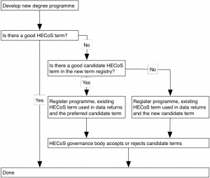
Just like JACS evolved over the years, so will HECoS. The difference is that we are proposing to regularise the change and allow it to follow a predictable path. The main mechanism for that would be a registry for new terms. The diagram outlines how a new subject term can be discovered, or entered for consideration for inclusion, or discovery by others.

newTermProcess

The proposed criteria for accepting a new term into HECoS proper are similar the ones used for the first draft: a term has to be demonstrably in use, or fill a need, and be distinguishable by non-specialists. In each case, though, the HECoS governance body, which is designed to represent the whole sector, will have the ultimate say on which terms will be accepted or retired, and how often these changes will happen.

What could a GPS for learner journeys look like?

Last weekend, a motley crew of designers, students, developers, business and government people came together in Edinburgh to prototype designs and apps to help learners manage their journeys. With help, I built a prototype that showed how curriculum and course offering data can be combined with e-portfolios to help learners find their way.

The first official Scottish government data jam, facilitated by Snook and supported by TechCube, is part of a wider project to help people navigate the various education and employment options in life, particularly post 16. The jam was meant to provide a way to quickly prototype a wide range of ideas around the learner journey theme.

While many other teams at the jam built things like a prototype social network, or great visualisations to help guide learners through their options, we decided to use the data that was provided to help see what an infrastructure could look like that supported the apps the others were building.

In a nutshell, I wanted to see whether a mash-up of open data in open standard formats could help answer questions like:

  • Where is the learner in their journey?
  • Where can we suggest they go next?
  • What can help them get there?
  • Who can help or inspire them?

Here’s a slide deck that outlines the results. For those interested in the nuts and bolts read on to learn more about how we got there.

Where is the learner?

To show how you can map where someone is on their learning journey, I made up an e-portfolio. Following an excellent suggestion by Lizzy Brotherstone of the Scottish Government, I nicked a story about ‘Ryan’ from an Education Scotland website on learner journeys. I recorded his journey in a Mahara e-portfolio, because it outputs data in the standard LEAP2a format- I could have used PebblePad as well for the same reason.

I then transformed the LEAP2a XML into very rough but usable RDF using a basic stylesheet I made earlier. Why RDF? Because it makes it easy for me to mash up the portfolios with other datasets; other data formats would also work. The made-up curriculum identifiers were added manually to the RDF, but could easily have been taken from the LEAP2a XML with a bit more time.

Where can we suggest they go next?

I expected that the Curriculum for Excellence would provide the basic structure to guide Ryan from his school qualifications to a college course. Not so, or at least, not entirely. The Scottish Qualifications Framework gives a good idea of how courses relate in terms of levels (i.e. from basic to a PhD and everything in between), but there’s little to join subjects. After a day of head scratching, I decided to match courses to Ryan’s qualifications by level and comparing the text of titles. We ought to be able to do better than that!

The course data set was provided to us was a mixture of course descriptions from the Scottish Qualifications Authority, and actual running courses offered by Scottish colleges all in one CSV file. During the jam, Devon Walshe of TechCube made a very comprehensive data set of all courses that you should check out, but too late for me. I had a brief look at using XCRI feeds like the ones from Adam Smith college too, but went with the original CSV in the end. I tried using LOD Refine to convert the CSV to RDF, but it got stuck on editing the RDF harness for some reason. Fortunately, the main OpenRefine version of the same tool worked its usual magic, and four made-up SQA URIs later, we were in business.

This query takes the email of Ryan as a unique identifier, then finds his qualification subjects and level. That’s compared to all courses from the data jam course data set, and whittled down to those courses that match Ryan’s qualifications and are above the level he already has.

The result: too many hits, including ones that are in subjects that he’s unlikely to be interested in.

So let’s throw in his interests as well. Result: two courses that are ideal for Ryan’s skills, but are a little above his level. So we find out all the sensible courses that can take him to his goal.

What can help them get there?

One other quirk about the curriculum for excellence appears to be that there are subject taxonomies, but they differ per level. Intralect implemented a very nice one that can be used to tag resources up to level 3 (we think). So Intralect’s Janek exported the vocabulary in two CSV files, which I imported in my triple store. He then built a little web service in a few hours that takes the outcome of this query, and returns a list of all relevant resources in the Intralibrary digital repository for stuff that Ryan has already learned, but may want to revisit.

Who can help or inspire them?

It’s always easier to have someone along for the journey, or to ask someone who’s been before you. That’s why I made a second e-portfolio for Paula. Paula is a year older than Ryan, is from a different, but nearby school, and has done the same qualifications. She’s picked the same qualification as a goal that we suggested to Ryan, and has entered it as a goal on her e-portfolio. Ryan can get it touch with her over email.

This query takes the course suggested to Ryan, and matches it someone else’s stated academic goal, and reports on what she’s done, what school she’s from, and her contact details.

Conclusion

For those parts of the Curriculum for Excellence for which experiences and outcomes have been defined, it’d be very easy to be very precise about progression, future options, and what resources would be particularly helpful for a particular learner at a particular part of the journey. For the crucial post 16 years, this is not really possible in the same way right now, though it’s arguable that its all the more important to have solid guidance at that stage.

Some judicious information architecture would make a lot more possible without necessarily changing the syllabus across the board. Just a model that connects subject areas across the levels, and school and college tracks would make more robust learner journey guidance possible. Statements that clarify which course is an absolute pre-requisite for another, and which are suggested as likely or preferable would make it better still.

We have the beginnings of a map for learner journeys, but we’re not there yet.

Other than that, I think agreed identifiers and data formats for curriculum parts, electronic portfolios or transcripts and course offerings can enable a whole range of powerful apps of the type that others at the data jam built, and more. Thanks to standards, we can do that without having to rely on a single source of truth or a massive system that is a single point of failure.

Find out all about the other great hacks on the learner journey data jam website.

All the data and bits of code I used are available on github

Doing analytics with open source linked data tools

Like most places, the University of Bolton keeps its data in many stores. That’s inevitable with multiple systems, but it makes getting a complete picture of courses and students difficult. We test an approach that promises to integrate all this data, and some more, quickly and cheaply.

Integrating a load of data in a specialised tool or data warehouse is not new, and many institutions have been using them for a while. What Bolton is trying in its JISC sponsored course data project is to see whether such a warehouse can be built out of Linked Data components. Using such tools promises three major advantages over existing data warehouse technology:

It expects data to be messy, and it expects it to change. As a consequence, adding new data sources, or coping with changes in data sources, or generating new reports or queries should not be a big deal. There are no schemas to break, so no major re-engineering required.

It is built on the same technology as the emergent web of data. Which means that increasing numbers of datasets – particularly from the UK government – should be easily thrown into the mix to answer bigger questions, and public excerpts from Bolton’s data should be easy to contribute back.

It is standards based. At every step from extracting the data, transforming it and loading it to querying, analysing and visualising it, there’s a choice of open and closed source tools. If one turns out not to be up to the job, we should be able to slot another in.

But we did spend a day kicking the tires, and making some initial choices. Since the project is just to pilot a Linked Enterprise Data (LED) approach, we’ve limited ourselves to evaluate just open source tools. We know there plenty of good closed source options in any of the following areas, but we’re going to test the whole approach before deciding on committing to license fees.

Data sources

D2RQ

Google Refine logo

Before we can mash, query and visualise, we need to do some data extraction from the sources, and we’ve come down on two tools for that: Google Refine and D2RQ. They do slightly different jobs.

Refine is Google’s power tool for anyone who has to deal with malformed data, or who just wants to transform or excerpt from format to another. It takes in CSV or output from a range of APIs, and puts it in table form. In that table form, you can perform a wide range of transformations on the data, and then export in a range of formats. The plug-in from DERI Galway, allows you to specify exactly how the RDF – the linked data format, and heart of the approach – should look when exported.

What Refine doesn’t really do (yet?) is transform data automatically, as a piece of middleware. All your operations are saved as a script that can be re-applied, but it won’t re-apply the operations entirely automagically. D2RQ does do that, and works more like middleware.

Although I’ve known D2RQ for a couple of years, it still looks like magic to me: you download, unzip it, tell it where your common or garden relational database is, and what username and password it can use to get in. It’ll go off, inspect the contents of the database, and come back with a mapping of the contents to RDF. Then start the server that comes with it, and the relational database can be browsed and queried like any other Linked Data source.

Since practically all relevant data in Bolton are in a range of relational databases, we’re expecting to use D2R to create RDF data dumps that will be imported into the data warehouse via a script. For a quick start, though, we’ve already made some transforms with Refine. We might also use scripts such as Oxford’s XCRI XML to RDF transform.

Storage, querying and visualisation

Callimachus project logo

We expected to pick different tools for each of these functions, but ended up choosing one, that does it all- after a fashion. Callimachus is designed specifically for rapid development of LED applications, and the standard download includes a version of the Sesame triplestore (or RDF database) for storage. Other triple stores can also be used with Callimachus, but Sesame was on the list anyway, so we’ll see how far that takes us.

Callimachus itself is more of a web application on top that allows quick visualisations of data excerpts- be they straight records of one dataset or a collection of data about one thing from multiple sets. The queries that power the Callimachus visualisations have limitations – compared to the full power of SPARQL, the linked data query language – but are good enough to knock up some pages quickly. For the more involved visualisations, Callimachus SPARQL 1.1 implementation allows the results a query to be put out as common or garden JSON, for which many different tools exist.

Next steps

We’ve made some templates already that pull together course information from a variety of sources, on which I’ll report later. While that’s going on, the main other task will be to set up the processes of extracting data from the relational databases using D2R, and then loading it into Callimachus using timed scripts.

PROD; a practical case for Linked Data

Georgi wanted to know what problem Linked Data solves. Mapman wanted a list of all UK universities and colleges with postcodes. David needed a map of JISC Flexible Service Delivery projects that use Archimate. David Sherlock and I got mashing.

Linked Data, because of its association with Linked Open Data, is often presented as an altruistic activity, all about opening up public data and making it re-usable for the benefit of mankind, or at least the tax-payers who facilitated its creation. Those are a very valid reasons, but they tend to obscure the fact that there are some sound selfish reasons for getting into the web of data as well.

In our case, we have a database of JISC projects and their doings called PROD. It focusses on what JISC-CETIS focusses on: what technologies have been used by these projects, and what for. We also have some information on who was involved with the projects, and were they worked, but it doesn’t go much beyond bare names.

In practice, many interesting questions require more information than that. David’s need to present a map of JISC Flexible Service Delivery projects that use Archimate is one of those.

This presents us with a dilemma: we can either keep adding more info to PROD, make ad-hoc mash-ups, or play in the Linked Data area.

The trouble with adding more data is that there is an unending amount of interesting data that we could add, if we had infinite resources to collect and maintain it. Which we don’t. Fortunately, other people make it their business to collect and publish such data, so you can usually string something together on the spot. That gets you far enough in many cases, but it is limited by having to start from scratch for virtually every mashup.

Which is where Linked Data comes in: it allows you to link into the information you want but don’t have.

For David’s question, the information we want is about the geographical position of institutions. Easily the best source for that info and much more besides is the dataset held by the JISC’s Monitoring Unit. Now this dataset is not available as Linked Data yet, but one other part of the Linked Data case is that it’s pretty easy to convert a wide variety of data into RDF. Especially when it is as nicely modelled as the JISC MU’s XML.

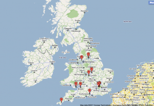
All universities with JISC Flexible Delivery projects that use Archimate. Click for the google map

All universities with JISC Flexible Delivery projects that use Archimate. Click for the google map

Having done this once, answering David’s question was trivial. Not just that, answering Mapmans’ interesting question on a list of UK universities of colleges with postcodes was a piece of cake too. That answer prompted Scott and Tony’s question on mapping UCAS and HESA codes, which was another five second job. As was my idle wonder whether JISC projects by Russell group universities used Moodle more or less than those led by post ’92 institutions (answer: yes, they use it more).

Russell group led JISC projects with and without Moodle

Russell group led JISC projects with and without Moodle

Post 92 led JISC projects with or without Moodle

Post '92 led JISC projects with or without Moodle

And it doesn’t need to stop there. I know about interesting datasets from UKOLN and OSSWatch that I’d like to link into. Links from the PROD data to the goodness of Freebase.com and dbpedia.org already exist, as do links to MIMAS’ names project. And each time such a link is made, everyone else (including ourselves!) can build on top of what has already been done.

This is not to say that creating Linked Data out of PROD was for free, nor that no effort is involved in linking datasets. It’s just that the effort seems less than with other technologies, and the return considerably more.

Linked Data also doesn’t make your data automatically usable in all circumstances or bug free. David, for example, expected to see institutions on the map that do use the Archimate standard, but not necessarily as a part of a JISC project. A valid point, and a potential improvement for the PROD dataset. It may also have never come to light if we hadn’t been able to slice and dice our data so readily.

An outline with recipes and ingredients is to follow.

How to meshup eportfolios, learning outcomes and learning resources using Linked Data, and why

After a good session with the folks from the Achievement Standards Network (ASN), and earlier discussions with Link Affiliates, I could see the potential of linking LEAP2a portfolios with ASN curriculum information and learning resources. So I implemented a proof of concept.

Fortunately, almost all the information required is already available as RDF: the ASN makes its machine readable curricula available in that format, and Zotero (my bibliography tool of choice) happily puts out its data in RDF too. What still needed to be done was the ability to turn LEAP2a eportfolios into RDF.

That took some doing, but since LEAP2a is built around the IETF Atom newsfeed format, there were at least some existing XSL transformations to build on. I settled on the one included in the open source OpenLink Virtuoso data management server, since that’s what I used for the subsequent Linked Data meshing too. Also, the OpenLink Virtuoso Atom-to-RDF XSLT came out of their ‘sponger’ middleware layer, which allows you to treat all kinds of structured data as if they were RDF datasources. That means that it ought to be possible to built a wee LEAP2a sponger cartridge around my leap2rdf.xslt, which then allows OpenLink Virtuoso to treat any LEAP2a portfolio as RDF.

The result still has limitations: the leap2rdf.xslt only works on LEAP2a records with the new, proper namespace, and it only works well on those records that use URIs, but not those that use Compact URIs (CURIEs). Fixing these things is perfectly possible, but would take two or three more days that I didn’t have.

So, having spotted my ponds of RDF triples and filled one up, it’s time to go fishing. But for what and why?

Nigel Ward and Nick Nicholas of Link Affiliates have done an excellent job in explaining the why of machine readable curriculum data, so I’ve taken the immediate advantages that they identified, and illustrated them with noddy proof-of-concept hows:

1. Learning resources can be easily and unambiguously tagged with relevant learning outcomes.
For this one, I made a query that looks up a work (Robinson Crusoe) in my Zotero bibliographic database and gets a download link for it, then checks whether the work supports any known learning outcomes (in my own 6-lines-of-RDF repository), and then gets a description of that learning outcome from the ASN. You can see the results in CSV.

It ought to have been possible to use a bookmarking service for the learning resource to learning outcome mapping, but hand writing the equivalent of

‘this book’ ‘aligns to’ ‘that learning outcome’

seemed easier :-)

2. A student’s progress can be easily and unambiguously mapped to the curriculum.
To illustrate this one, I’ve taken Theophilus Thistledown’s LEAP2a example portfolio, and added some semi-appropriate Californian K-12 learning outcomes from the ASN against the activities Theophilus recorded in his portfolio. (Anyone can add such ASN statements very easily and legally within the scope of the LEAP2a specification, by the way) I then RDFised the lot with my leap2rdf XSLT.

I queried the resulting RDF portfolio to see what learning outcomes were supported by one particular learning activity, and I then got descriptions of each of these learning outcomes from the ASN, and also got a list of other learning outcomes that belong to the same curriculum standard. That is, related learning outcomes that Theophilus could still work on. This is what the SPARQL looks like, and the results can be seen here. Beware that a table is not the most helpful way of presenting this information- a line and a list would be better.

3. Lesson plans and learning paths to be easily and unambiguously mapped to the curriculum.
This is what I think of as the classic case: I’ve taken an RDFised, ASN enhanced LEAP2a eportfolio, and looked for the portfolio owner’s name, any relevant activities that had a learning outcome mapped against them, then fished out the identifier of that learning outcome and a description of same from the ASN. Here’s the SPARQL, and there’s the result in CSV.

Together, these give a fairly good of what Robinson Crusoe was up to, according to the Californian K-12 curriculum, and gives a springboard for further exploration of things like comparison of the learning outcomes he aimed for then with later statements of the same outcome or the links between the Californian outcomes with those of other jurisdictions.

4. The curriculum can drive content discovery: teachers and learners want to find online resources matching particular curriculum outcomes they are teaching.
While sitting behind his laptop, Robinson might be wondering whether he can get hold of some good learning resources for the learning activities he’s busy with. This query will look at his portfolio for activities with ASN learning outcomes and check those outcomes against the outcome-to-resource mapping repository I mentioned earlier. It will then look up some more information about the resources from the Zotero bibliographic database, including a download link- like so

The nice thing is that this approach should scale up nicely all the way from my six lines of RDF to a proper repository.

5. Other e-learning applications can be configured to use the curriculum structure to share information.
A nice and simple example could be a tool that lets you discover other learners with the same learning outcome as a goal in their portfolio. This sample query looks through both Theophilus and Robinson’s eportfolios, identifies any ASN learning outcomes they have in common, and then gets some descriptions of that outcome from the ASN, with this result.

Lessons learned

Of all the steps in this and other meshups, deriving decent RDF from XML is easily the hardest and most time consuming. Deriving RDF from spreadsheets or databases seems much easier, and once you have all your source data in RDF, the rest is easy.

Even using the distributed graph pattern I described in a previous post, querying across several datasets can still be a bit slow and cumbersome. As you may have noticed if you follow the sample query links, uriburner.com (the hosted version of OpenLink Virtuoso) will take it’s time in responding to a query if it hasn’t got a copy of all relevant datasets downloaded, parsed and stored. Using a SPARQL endpoint on your own machine clearly makes a lot of sense.

Perhaps more importantly, all the advantages of machine readable curricula that Nigel and Nick outlined are pretty easily achievable. The queries and the basic tables they produce took me one evening. The more long term advantages Nigel and Nick point out – persistence of curricula, mapping different curricula to each other, and dealing with differences in learning outcome scope – are all equally do-able using the linked data stack.

Most importantly, though, are the meshups that no-one has dreamed of yet.

What’s next

For other people to start coming up with those meshups, though, some further development needs to happen. For one, the leap2rdf.xslt needs to deal with a greater variety of LEAP2a eportfolios. A bookmark service that lets you assert simple triples with tags, and expose those triples as RDF with URIs (rather than just strings) would be great. The query results could look a bit nicer too.

The bigger deal is the data: we need more eportfolios to be available in either LEAP2a or LEAP2r formats as a matter of course, and more curricula need be described using the ASN.

Beyond that, the trickier question is who will do the SPARQL querying and how. My sense is that the likeliest solution is for people to interact with the results of pre-fabbed SPARQL queries, which they can manipulate a bit using one or two parameters via some nice menus. Perhaps all that the learners, teachers, employers and others will really notice is more relevant, comprehensive and precisely tailored information in convenient websites or eportfolio systems.

Resources

The leap2rdf.xslt is also available here. Please be patient with its many flaws- improvements are very welcome.

Meshing up a JISC e-learning project timeline, or: It’s Linked Data on the Web, stupid

Inspired by the VirtualDutch timeline, I wondered how easy it would be to create something similar with all JISC e-learning projects that I could get linked data for. It worked, and I learned some home truths about scalability and the web architecture in the process.

As Lorna pointed out, UCL’s VirtualDutch timeline is a wonderful example of using time to explore a dataset. Since I’d already done ‘place’ in my previous meshup, I thought I’d see how close I could get with £0.- and a few nights tinkering.

The plan was to make a timeline of all JISC e-learning projects, and the developmental and affinity relations between them that are recorded in CETIS’ PROD database of JISC projects. More or less like Scott Wilson and I did by hand in a report about the toolkits and demonstrators programme. This didn’t quite work; SPARQLing up the data is trivial, but those kinds of relations don’t fit well into the widely used Simile timeline from both a technical and usability point of view. I’ll try again with some other diagram type.

What I do have is one very simple, and one not so simple timeline for e-learning projects that get their data from the intensely useful rkb explorer Linked Data knowledge base of JISC projects and my own private PROD stash:

Recipe for the simple one

  • Go to the SPARQL proxy web service
  • Tell it to ask this question
  • Tell the proxy to ask that question of the RKB by pointing it at the RKB SPARQL endpoint (http://jisc.rkbexplorer.com/sparql/), and order the results as CSV
  • Copy the URL of the CSV results page that the proxy gives you
  • Stick that URL in a ‘=ImportData(“{yourURL}”)’ function inside a fresh Google Spreadsheet
  • Insert timeline gadget into Google spreadsheet, and give it the right spreadsheet range
  • Hey presto, one timeline coming up:
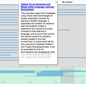
Screenshot of the simple mashup- click to go to the live meshup

Screenshot of the simple mashup- click to go to the live meshup

Recipe for the not so simple one

For this one, I wanted to stick a bit more in the project ‘bubbles’, and I also wanted the links in the bubbles to point to the PROD pages rather than the RKB resource pages. Trouble is, RKB doesn’t know about data in PROD, and for some very sound reasons I’ll come to in a minute, won’t allow the pulling in of external datasets via SPARQL’s ‘FROM’ operator either. All other SPARQL endpoints in the web that I know of that allow FROM couldn’t handle my query- they either hung or conked out. So I did this instead:

  • Download and install your own SPARQL endpoint (I like Leigh Dodds’ simple but powerful Twinkle)
  • Feed it this query
  • Copy and paste the results into a spreadsheet and fiddle with concatenation
  • Hoist spreadsheet into Google docs
  • Insert timeline gadget into Google spreadsheet, and give it the right spreadsheet range
  • Hey presto, a more complex timeline:
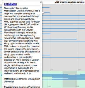
Click to go to the live meshup

Click to go to the live meshup

It’s Linked Data on the Web, stupid

When I first started meshing up with real data sets on the web (as opposed to poking my own triple store), I had this inarticulate idea that SPARQL endpoints were these magic oracles that we could ask anything about anything. And then you notice that there is no federated search facility built into the language. None. And that the most obvious way of querying across more than one dataset – pulling in datasets from outside via SPARQL’s FROM – is not allowed by many SPARQL endpoints. And that if they do allow FROM, they frequently cr*p out.

The simple reason behind all this is that federated search doesn’t scale. The web does. Linked Data is also known as the Web of Data for that reason- it has the same architecture. SPARQL queries are computationally expensive at the best of times, and federated SPARQL queries would be exponentially so. It’s easy to come up with a SPARQL query that either takes a long time, floors a massive server (or cloud) or simply fails.

That’s a problem if you think every server needs to handle lots of concurrent queries all the time, especially if it depends on other servers on a (creaky) network to satisfy those queries. By contrast, chomping on the occasional single query is trivial for a modern PC, just like parsing and rendering big and complex html pages is perfectly possible on a poky phone these days. By the same token, serving a few big gobs of (RDF XML) text that sits at the end of a sensible URL is an art that servers have perfected over the past 15 years.

The consequence is that exposing a data set as Linked Data is not so much a matter of installing a SPARQL endpoint, but of serving sensibly factored datasets in RDF with cool URLs, as outlined in Designing URI Sets for the UK Public Sector (pdf). That way, servers can easily satisfy all comers without breaking a sweat. That’s important if you want every data provider to play in Linked Data space. At the same time, consumers can ask what they want, without constraint. If they ask queries that are too complex or require too much data, then they can either beef up their own machines, or live with long delays and the occasional dead SPARQL engine.

Linked Data meshup on a string

I wanted to demo my meshup of a triplised version of CETIS’ PROD database with the impressive Linked Data Research Funding Explorer on the Linked Data meetup yesterday. I couldn’t find a good slot, and make my train home as well, so here’s a broad outline:

The data

The Department for Business Innovation and Skills (BIS) asked Talis if they could use the Linked Data Principles and practice demonstrated in their work with data.gov.uk to produce an application that would visualise some grant data. What popped out was a nice app with visuals by Iconomical, based on a couple of newly available data sets that sit on Talis’ own store for now.

The data concerns research investment in three disciplines, which are illustrated per project, by grant level and number of patents, as they changed over time and plotted on a map.

CETIS have PROD; a database of JISC projects, with a varying amount of information about the technologies they use, the programmes they were part of, and any cross links between them.

The goal

Simple: it just ought to be possible to plot the JISC projects alongside the advanced tech of the Research Funding Explorer. If not, than at least the data in PROD should be augmentable with the data that drives the Research Funding Explorer.

Tools

Anything I could get my hands on, chiefly:

The recipe

For one, though PROD pushes out Description Of A Project (DOAP, an RDF vocabulary) files per project, it doesn’t quite make all of its contents available as linked data right now. The D2R toolkit was used to map (part of) the contents to known vocabs, and then make the contents of a copy of PROD available through a SPARQL interface. Bang, we’re on the linked data web. That was easy.

Since I don’t have access to the slick visualisation of the Research Funding Explorer, I’d have to settle for augmenting PROD’s data. This is useful for two reasons: 1) PROD has rather, erm, variable institutional names. Synching these with canonical names from a set that will go into data.gov.uk is very handy. 2) PROD doesn’t know much about geography, but Talis’ data set does.

To make this work, I made a SPARQL query that grabs basic project data from PROD, and institutional names and locations from the Talis data set, and visualises the results.

Results

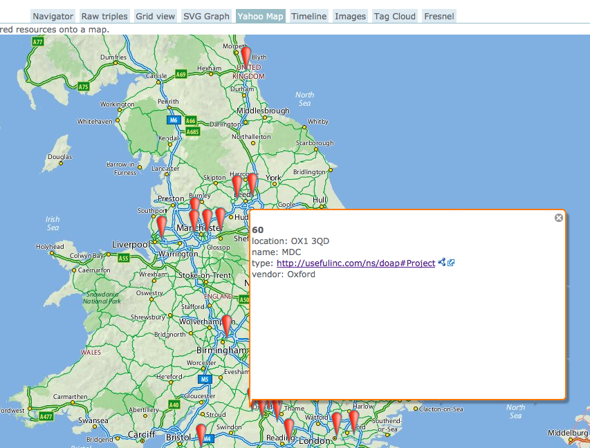
A partial map of England, Wales and southern Scotland with markers indicating where projects took place
An excerpt of PROD project data, augmented with proper institutional names and geographic positions from Talis’ Research Grant Explorer, visualised in OpenLink RDF browser.

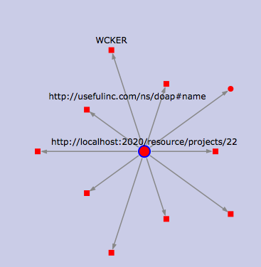
A star shaped overview of various attributes of a project, with the name property highlighted
Zooming in on a project, this time to show the attributes of a single project. Still in OpenLink RDF browser.

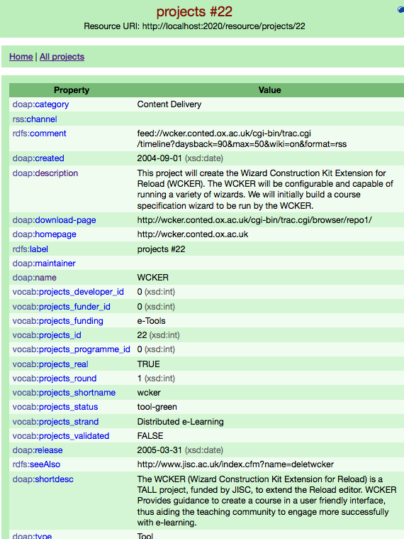
A two column list of one project's attributes and their values
A project in D2R’s web interface; not shiny, but very useful.

From blagging a copy of the SQL tables from the live PROD database to the screen shots above took about two days. Opening up the live server straight to the web would have cut that time by more than half. If I’d have waited for the Research Grant Explorer data to be published at data.gov.uk, it’d have been a matter of about 45 minutes.

Lessons learned

Opening up any old database as linked data is incredibly easy.

Cross-searching multiple independent linked data stores can be surprisingly difficult. This is why a single SPARQL endpoint across them all, such as the one presented by uberblic‘s Georgi Kobilarov yesterday, is interesting. There are many other good ways to tackle the problem too, but whichever approach you use, making your linked data available as simple big graphs per major class of thing (entity) in your dataset helps a lot. I was stymied somewhat by the fact that I wanted to make use of data that either wasn’t published properly yet (Talis’ research grant set), or wasn’t published at all (our own PROD triples).

A bit of judicious SPARQLing can alleviate a lot of inconsistent data problems. This is salient to a recent discussion on twitter around Brian Kelly’s Linked Data challenge. One conclusion was that it was difficult, because the data was ‘bad’. IMHO, this is the web, so data isn’t really bad, just permanently inconsistent and incomplete. If you’re willing to put in some effort when querying, a lot can be rectified. We, however, clearly need to clean up PROD’s data to make it easier on everyone.

SPARQL-panning for gold in multiple datastores (or even feeds or webpages) is way too much fun to seem like work. To me, anyway.

What’s next

What needs to happen is to make all the contents of PROD and related JISC project information available as proper linked data. I can see three stages for this:

  1. We clean up the PROD data a little more at source, and load it into the Data Incubator to polish and debate the database to triple mapping. Other meshups would also be much easier at that point.
  2. We properly publish PROD as linked data either on a cloud platform such as Talis’, or else directly from our own server via D2R or OpenLink Virtuoso. Simal would be another great possibility for an outright replacement of PROD, if it’s far enough along at that point.
  3. JISC publishes the public part of its project information as Linked Data, and PROD just augments (rather than replicates) it.