What does “Analytics” Mean? (or is it just another vacuuous buzz word?)

“Analytics” certainly is a buzz word in the business world and almost impossible to avoid at any venue where the relationship between technology and post-compulsory education is discussed, from bums-on-seats to MOOCs. We do bandy words like analytics or cloud computing around rather freely and it is so often the case with technology-related hype words that  they are used by sellers of snake oil or old rope to confuse the ignorant and by the careless to refer vaguely to something that seems to be important.

Cloud computing is a good example. While it is an occasionally useful umbrella term for a range of technologies, techniques and IT service business models, it masks differences that matter in practice. Any useful thinking about cloud must work on a more clear understanding of the kinds of cloud computing service delivery level and the match to the problem to be solved. To understand the very real benefits of cloud computing, you need to understand the distinct offerings; any discussion that just refers to cloud computing is likely to be vacuuous.  These distinctions are discussed in a CETIS briefing paper on cloud computing.

But is analytics like cloud computing, is the word itself useful? Can a useful and clear meaning, or even a definition, of analytics be determined?

I believe the answer is “yes” and the latest paper in our Analytics Series, which is entitled “What is Analytics? Definition and Essential Characteristics” explores the background and discusses previous work on defining analytics before proposing a definition. It then extends this to a consideration of what it means to be analytical as opposed to being just quantitative. I realise that the snake oil and old rope salesmen will not be interested in this distinction; it is essentially a stance against uncritical use of “analytics”.

There is another way in which I believe the umbrella terms of cloud computing and analytics differ. Whereas cloud computing  becomes meaningful by breaking it down and using terms such as “software as a service”, I am not convinced that a similar approach is applicable to analytics. The explanation for this may be that cloud computing  is bound to hardware and software, around which different business models become viable, whereas analytics is foremost about decisions, activity and process.

Terms for kinds of analytics, such as “learning analytics”, may be useful to identify the kind of analytics that a particular community is doing but to define such terms is probably counter-productive (although working definitions may be very useful to allow the term to be used in written or oral communications). One of the problems with definitions is the boundaries they draw. Where would learning analytics and business analytics have boundary in an educational establishment? We could probably agree that some cases of analytics were on one side or the other but not all cases. Furthermore, analytics is a developing field that certainly has not covered all that is possible and is very immature in many industries and public sector bodies. This is likely to mean revision of definitions is necessary, which rather defeats the object.

Even the use of nouns, necessary though it may be in some circumstances, can be problematical. If we both say “learning analytics”, are we talking about the same thing? Probably not, because we are not really talking about a thing but about processes and practices. There is a danger that newcomers to something described as “learning analytics” will construct quite a narrow view of “learning analytics is ….” and later declaim that learning analytics doesn’t work or that learning analytics is no good because it cannot solve problem X or Y. Such blinkered sweeping statements are a warning sign that opportunities will be missed.

Rather than say what business analytics, learning analytics, research analytics, etc is, I think we should focus on the applications, the questions and the people who care about these things. In other words, we should think about what analytics can and cannot help us with, what it is for, etc. This is reflected in most of the titles in the CETIS Analytics Series, for example our recently-published paper entitled “Analytics for Learning and Teaching“. The point being made about avoiding definitions of kinds of analytics is expanded upon in “What is Analytics? Definition and Essential Characteristics“.

The full set of papers in the series is available from the CETIS Publications site.

Modelling Social Networks

Social network analysis has become rather popular over the last five (or so) years; the proliferation of different manifestations of the social web has propelled it from being a relatively esoteric method in the social sciences to become something that has touched many people, if only superficially. The network visualisation – not necessarily a social network, e.g. Chris Harrison’s internet map – has become a symbol of the transformation in connectivity and modes of interaction that modern hardware, software and infrastructure has brought.

This is all very well, but I want more than network visualisations and computed statistics such as network density or betweenness centrality. The alluring visualisation that is the sociogram tends to leave me rather non-plussed.

How I often feel about the sociogram

How I often feel about the sociogram

Now, don’t get me wrong: I’m not against this stuff and I’m not attacking the impressive work of people like Martin Hawksey or Tony Hirst, the usefulness of tools like SNAPP or recent work on the Open University (UK) SocialLearn data using the NAT tool. I just want more and I want an approach which opens up the possibility of model building and testing, of hypothesis testing, etc. I want to be able to do this to make more sense of the data.

Warning:
this article assumes familiarity with Social Network Analysis.

Tools and Method

Several months ago, I became rather excited to find that exactly this kind of approach – social network modelling – has been a productive area of social science research and algorithm development for several years and that there is now a quite mature package called “ergm” for R. This package allows its user to propose a model for small-scale social processes and to evaluate the degree of fit to an observed social network. The mathematical formulation involves an exponential to calculate probability hence the approach is known as “Exponential Random Graph Models” (ERGM). The word “random” captures the idea that the actual social network is only one of many possibilities that could emerge from the same social forces, processes, etc and that this randomness is captured in the method.

I have added some what I have found to be the most useful papers and a related book to a Mendeley group; please consult these for an outline of the historical development of the ERGM method and for articles introducing the R package.

The essential idea is quite simple, although the algorithms required to turn it into a reality are quite scary (and I don’t pretend to understand enough to do proper research using the method). The idea is to think about some arguable and real-world social phenomena at a small scale and to compute what weightings apply to each of these on the basis of a match between simulations of the overall networks that could emerge from these small-scale phenomena and a given observed network. Each of the small-scale phenomena must be expressed in a way that a statistic can be evaluated for it and this means it must be formulated as a sub-graph that can be counted.
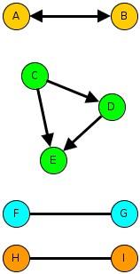
Example sub-graphs that illustrate small-scale social process.

Example sub-graphs that illustrate small-scale social process.

The diagram above illustrates three kinds of sub-graph that match three different kinds of evolutionary force on an emerging network. Imagine the arrows indicate something like “I consider them my friend”, although we can use the same formalism for less personal kinds of tie such as “I rely on” or even the relation between people and resources.

  • The idea of mutuality is captured by the reciprocal relationships between A and B. Real friendship networks should be high in mutuality whereas workplace social networks may be less mutual.
  • The idea of transitivity is captured in the C-D-E triangle. This might be expressed as “my friend’s friend is my friend”.
  • The idea of homophily is captured in the bottom pair of subgraphs, which show preference for ties to the same colour of person. Colour represents any kind of attribute, maybe a racial label for studies of community polarisation or maybe gender, degree subject, football team… This might be captured as “birds of a feather fly together”.

One of the interesting possibilities of social network modelling is that it may be able to discover the likely role of different social processes, which we cannot directly test, with qualitatively similar outcomes. For example, both homophily and transitivity favour the formation of cohesive groups. A full description of research using ERGMs to deal with this kind of question is “Birds of a Feather, or Friend of a Friend? Using Exponential Random Graph Models to Investigate Adolescent Social Networks” (Goodreau, Kitts & Morris): see the Mendeley group.

A First Experiment

In the spirit of active learning, I wanted to have a go. This meant using relatively easily-available data about a community that I knew fairly well. Twitter follower networks are fashionable and not too hard to get, although the API is a bit limiting, so I wrote some R to crawl follower/friends and create a suitable data structure for use with the ERGM package.

Several evenings later I concluded that a network defined as followers of the EC-TEL 2012 conference was unsuitable. The problem seems to be that the network is not at all homogeneous while at the same time there are essentially no useful person attributes to use; the location data is useless and the number of tweets is not a good indicator of anything. Without some quantitative or categorical attribute you are forced to use models that assume homogeneity. Hence nothing I tried was a sensible fit.

Lesson learned: knowledge of person (vertex) attributes is likely to be important.

My second attempt was to consider the Twitter network between CETIS staff and colleagues in the JISC Innovation Group. In this case, I know how to assign one attribute that might be significant: team membership.

Without looking at the data, it seems reasonable to hypothesise as follows:

  1. We might expect a high density network since:
    • Following in Twitter is not an indication of a strong tie; it is a low cost action and one that may well persist due to a failure to un-follow.
    • All of the people involved work directly or indirectly (CETIS) for JISC and within the same unit so we might expect.
  2. We might expect a high degree of mutuality since this is a professional peer network in a university/college setting.
  3. The setting and the nature of Twitter may lead to a network that does not follow organisational hierarchy.
  4. We might expect teams to form clusters with more in-team ties than out-of-team ties. i.e. a homphily effect.
  5. There is no reason to believe any team will be more sociable than another.
  6. Since CETIS was created primarily to support the eLearning Team we might expect there to be a preferential mixing-effect.
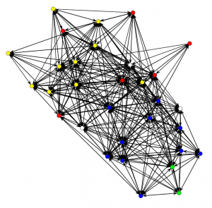
CETIS and JISC Innovation Group Twitter follower network. Colours indicate the team and arrows show the "follows" relationship in the direction of the arrow.

CETIS and JISC Innovation Group Twitter follower network. Colours indicate the team and arrows show the "follows" relationship in the direction of the arrow.

Nonplussed? What of the hypotheses?

Well… I suppose it is possible to assert that this is quite a dense network that seems to show a lot of mutuality and, assuming the Fruchterman-Reingold layout algorithm hasn’t distorted reality, which shows some hints at team cohesiveness and a few less-connected individuals. I think JISC management should be quite happy with the implications of this picture, although it should be noted that there are some people who do not use Twitter and that this says nothing about what Twitter mediates.

A little more attention to the visualisation can reveal a little more. The graph below (which is a link to a full-size image) was created using Gephi with nodes coloured according to team again but now sized according to the eigenvector centrality measure (area proportional to centrality), which gives an indication of the influence of that person’s communications within the given network.
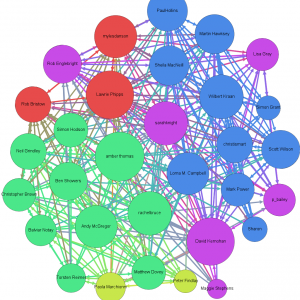
Visualising the CETIS and JISC Innovation network with centrality measures.

Visualising the CETIS and JISC Innovation network with centrality measures. The author is among those who do not tweet.

This does, at least, indicate who is most, least and middling in centrality. Since I know most of these people, I can confirm there are no surprises.

Trying out several candidate models in order to try to decide on the previously enumerated hypotheses (and some others omitted for brevity) leads to the following tentative conclusions, i.e. to a model that appeared to be consistent with the observed network. “Appeared to be consistent” means that my inexperienced eye considered that there was acceptable goodness of fit between a range of statistics computed on the observed network and ensembles of networks simulated using the given model and best-fit parameters.

Keeping the same numbering as the hypotheses:

  1. ERGM isn’t needed to judge network density but the method does show the degree to which connections can adequately be put down to pure chance.
  2. There is indeed a large positive coefficient for mutuality, i.e. that reciprocal “follows” are not just a consequence of chance in a relatively dense network.
  3. It is not possible to make conclusions about organisational hierarchy.
  4. There is a statistically significant greater density within teams. i.e. team homophily seems to be affecting the network. This seems to be strongest for the Digital Infrastructure team, then CETIS then the eLearning team but the standard errors are too large to claim this with confidence. The two other teams were considered too small to draw a conclusion
  5. None of CETIS, the eLearning team or the Digital Infrastructure team seem to be more sociable. The two other teams were considered too small to draw a conclusion. This is known as a “main effect”.
  6. There is no statistically significant preference for certain teams to follow each other. In the particular case of CETIS, this makes sense to an insider since we have worked closely with JISC colleagues across several teams.

One factor that was not previously mentioned but which turned out to be critical to getting the model to fit was individual effects. Not everyone is the same. This is the same issue as was outlined for the EC-TEL 2012 followers: heterogeneity. In the present case, however, only a minority of people stand out sufficiently to require individual-level treatment and so it is reasonable to say that, while these are necessary for goodness of fit, they are adjustments. To be specific, there were four people who were less likely to follow and another four who were less likely to be followed. I will not reveal the names but suffice to say that, surprising though the results was at first, it is explainable for the people in CETIS.

A Technical Note

This is largely for anyone who might play with the R package. The Twitter rules prevent me from distributing the data but I am happy to assist anyone wishing to experiment (I can provide csv files of nodes and edges, a .RData file containing a network object suitable for use with the ERGM package or the Gephi file to match the picture above).

The final model I settled on was:

twitter.net ~ edges +
sender(base=c(-4,-21,-29,-31)) +
receiver(base=c(-14,-19,-23,-28)) +
nodematch("team", diff=TRUE, keep=c(1,3,4)) +
mutual

This means:

  • edges = > the random chance that A follows B unconditionally on anything.
  • sender => only these four vertices are given special treatment in terms of their propensity to follow.
  • receiver => special treatment for propensity to be followed.
  • nodematch => consider the team attribute for teams 1, 3 and 4 and use a different parameter for each team separately (i.e. differential homophily).
  • mutual => the propensity for a person to reciprocate being followed.

And for completeness the estimated model parameters for my last run. The parameter for “edges” indicates the baseline random chance and, if the other model elements are ignored, an estimate of -1.64 indicates that there is about a 16% chance of a randomly chosen A->B tie being present (the estimate = logit(p)). The interpretation of the other parameters is non-trivial but in general terms, a randomly chosen network containing a higher value statistic for a given sub-graph type will be more probable than one containing a lower value when the estimated parameter is positive and less probable when it is negative. The parameters are estimated such that the observed network has the maximum likelihood according to the model chosen.

                         Estimate Std. Error MCMC %  p-value
edges                     -1.6436     0.1580      1  < 1e-04 ***
sender4                   -1.4609     0.4860      2 0.002721 **
sender21                  -0.7749     0.4010      0 0.053583 .
sender29                  -1.9641     0.5387      0 0.000281 ***
sender31                  -1.5191     0.4897      0 0.001982 **
receiver14                -2.9072     0.7394      9  < 1e-04 ***
receiver19                -1.3007     0.4506      0 0.003983 **
receiver23                -2.5929     0.5776      0  < 1e-04 ***
receiver28                -2.5625     0.6191      0  < 1e-04 ***
nodematch.team.CETIS       1.9119     0.3049      0  < 1e-04 ***
nodematch.team.DI          2.6977     0.9710      1 0.005577 **
nodematch.team.eLearning   1.1195     0.4271      1 0.008901 **
mutual                     3.7081     0.2966      2  < 1e-04 ***
---
Signif. codes:  0 ‘***’ 0.001 ‘**’ 0.01 ‘*’ 0.05 ‘.’ 0.1 ‘ ’ 1

Outlook

The point of this was a learning experience; so what did I learn?

  1. It does seem to work!
  2. Size is an issue. Depending on the model used, a 30 node network can take several tens of seconds to either determine the best fit parameters or to fail to converge.
  3. Checking goodness of fit is not simple; the parameters for a proposed model are only determined for the statistics that are in the model and so goodness of fit testing requires consideration of other parameters. This can come down to “doing it by eye” with various plots.
  4. Proper use should involve some experimental design to make sure that useful attributes are available and that the network is properly sampled if not determined a-priori.
  5. There are some pathologies in the algorithms with certain kinds of model. These are documented in the literature but still require care.

The outlook, as I see it, is promising but the approach is far from being ready for “real users” in a learning analytics context. In the near term I can, however, see this being applied by organisations whose business involves social learning and as a learning science tool. In short: this is a research tool that is worthy of wider application.

This is an extended description of a lightning talk given at the inaugural SoLAR Flare UK event held on November 19th 2012. It may contain errors and omissions.

How to do Analytics Right…

There is, of course, no simple recipe, no cookie-cutter template and perfection is an unattainable… but there are some good examples.

The Signals Project at Perdue University is among the most celebrated examples of analytics in Higher Education at the moment so I was intrigued as to what the person behind it would have to say when I met him just prior to his presentation at the recent SURF Education Day (actually “Dé Onderwijsdagen 2012“; SURF is a similar organisation to JISC but in the Netherlands). This person is John Campbell and he is not at all the slightly exhausting (to dour Brits) kind of American IT leader, full of hyperbole and sweeping statement; his is a level-headed and grounded story. It is also a story from which I think we can draw some tips on how to do analytics right. These are my take-home thoughts.

Analytics = Actionable Intelligence

Anyone who has read my previous blog posts on analytics will know I’m rather passionate about “actionable insight” as a key point about analytics so I was naturally pleased to hear John’s similar take on the subject. We vigorously agreed that more reports is not what we need. If you can’t use the results of analysis to act differently it isn’t worth the effort. The corollary is that we should design systems around the people who need to take action.

Take a Multi-disciplinary Approach

Putting analytics into practice (at scale) is not “just” addressing IT or a statistical matters but requires domain knowledge of the area to be addressed and an understanding of the operational and cultural realities of the context of use. John stressed the varied team as a means to taking this kind of rounded approach. Important actors in this kind of team are people who understand how to influence change in organisational culture: politics.

You do still need good technical knowledge to avoid false insights, of course.

Take Account of “User” Psychology

The people who use the analytics – whether driving it or intended to be influenced by it – are the engine for change. This is really pointing out aspects of a multi-disciplinary approach; think soft systems, participatory design, and a team with some direct experience as a teacher/tutor/etc.

Signals has several examples, all elementary is some respects but significant by their presence:

  • teaching staff trigger the analysis and can over-ride the results (although rarely do);
  • it is emphasised to students that signals is NOT about grades but about engagement;
  • there are helpful suggestions given to students in addition to the traffic-light and, although these come from a repertoire, the teachers have a hand in targetting these.

Start Off Manually

OK, a process based on spreadsheets and people manually pushing and pulling data between databases and analysis software is not scalable but this can be an important stage. Is it really wise to start investing money and reputation in a big system before you have properly established what you really need, what your data quality can sustain, what works in practice?

This provides opportunity to move from research into practice, to properly adapt (rather than blindly adopt or superficially replicate) effective practice from elsewhere,etc. A manual start-off helps to expose limitations and risks (see next point).

KISS

The old adage “keep it simple stupid” (a modern vernacular expression of Occam’s razor) is not what John actually said, but he got close. Signals uses some well established and thoroughly mainstream statistical methods. It does not use the latest fancy predictive algorithms.

Why? Because fancy treatments would be like putting F1 tyres on a Citroen 2CV: worse than pointless. The data quality and a range of systematic biases* means that the simpler method and a traffic-light result is appropriate technology. John made it clear that quoting a percentage chance of drop-out (etc) is simply an indefensible level of precision given the data: red, amber and green with teacher over-ride is.

(*- VLE data, for example, does not mean the same across all courses/modules, teachers)

Be Part of a Community

OK… I liked this one because it is the kind of thing that JISC and CETIS has been promoting across all of their areas of work for many years. Making sense of what is possible, imagining and realising new ideas works so much better when ideas, experiences and reflections are shared.

This is why we were pleased to be part of the first SoLAR Flare UK event earlier this week and hope to be working with that community for some time.

Conclusion

Many have, and will, attempt to replicate the success of Signals in addressing student retention but not all will succeed. The points I mentioned above are indicative of an approach that worked in totality; a superficial attempt to replicate Signals will probably fail. This is about matching an appropriate level technology with organisational culture and context. It is innovation in socio-technical practice. So: doing analytics right is about holism directed towards action.

The views above include my own and not necessarily John Campbell’s.

Will Analytics transform Education?

Effective use of data is vital for success in today’s business world. In education, Analytics (or Learning Analytics) is becoming a hot topic, promising to disrupt and transform education and learning. I have written an article to address some current trends and issues on analytics in education for TEL-Map, a European funded support action project, intended to help stakeholders develop roadmaps and work towards actually implementing desired future for TEL in Europe, in which CETIS has been involved. In this overview article, I did a short detour to the business world for some examples of analytics, then I looked at how education has approached the phenomenon, explored some practices, and raised some concerns about the downside of this trend. The full article is available at the TEL-Map project portal – Learning Frontiers.

Student Progression: Smartcard Bursaries and the Students FIRST Project

Photo of a brass compassThe JISC funded Students FIRST Project has been improving the use of bursary schemes for purchasing learning materials and other services at the University of East London and Anglia Ruskin University, in conjunction with AMOSSHE and John Smith’s Booksellers.
Challenges

The Students FIRST project pulled together a group of technologies – financial information app, bursary on a smarcard, and social messaging tools (texting) – to help improve progression and retention. However, there were some challenges in this approach:

  • technologies, such as smartcard or mobile apps, may be used in a “scattergun” approach and need to be part of a strategic service delivery
  • staff can be unwilling to engage with new technologies; for example, because they don’t want to remember additional logins
  • staff must be trained in the use of any new technologies, but it can be difficult to find the resource to do so.

Benefits

Access to the bursary is staggered according to student progression; i.e. a student must progress to the second year of their studies in order to receive the second installment. Students can then purchase from a list of products specified by their institution, such as books, art materials, nursery fees, campus accommodation, etc. Almost 74% of students surveyed at one university found that the bursary was beneficial. Other benefits include:

  • establishing a clear link between the spend on books and academic achievement
  • a targeted bursary encourages students to achieve and progress
  • such a bursary also equalises opportunity across the student body; for example, one student said “I have access to books that otherwise I wouldn’t be able to own and progress further”.

Recommendations

A collaborative approach to this project was taken with a mix of educational and commercial providers and this gave the project team the opportunity to draw up guidance materials on working across different sectors. Recommendations include:

  • taking a service design approach can help you to understand student needs, expose failpoints in service delivery, and build collaborative relationships between departments/institutions and providers
  • sharing data between institutions can be a cause for concern, so consider alternatives such as using separate hard drives to store data
  • actively engage with technologies with which students are familiar, such as mobile apps, to encourage engagement.

Further Information

If you would like to find out more about this project, the following resources may help:

Student Retention: Student Dashboard at University of Southampton

Photo of a brass compassThe JISC funded Southampton Student Dashboard Project at the University of Southampton has been aggregating data from across a number of systems and presenting it in a single place, so that pastoral tutors can provide better informed support for students.

Challenges

Data held by institutions is not always easy to access. For example:

  • data held across a number of systems only offers a partial or disjointed view of information that may be relevant to staff and students
  • multiple systems require multiple log-ins; for example, Student Services at Southampton need to switch between four different applications in order to amalgamate student information
  • selecting the data that tutors might need to see on a dashboard can be contentious; for example information from Finance or Student Counselling services.

Benefits

In common with other projects that have focussed on using data to identify “at risk” students, the project team identified the following benefits:

  • providing a complete view of an institution’s student data enables staff to identify any early signs of problems and possible non-progression
  • improving access to data can encourage the organisational culture to be more innovative and transparent
  • by allowing a small set of data to be shown to pastoral tutors, it is expected that this will generate requests for more data to be included.

Recommendations

Encouraging people to open up access to data can be challenging. Issues of data access and organisational culture can be difficult to handle, so try to:

  • manage change carefully to ensure that all stakeholders are engaged, especially those who have power to implement change and those who have influence over opinion in the institution
  • identify champions in each group of stakeholders, who will help drive through changes
  • find out what data is held by each stakeholder and how it is accessed (some of it may be paper-based) as this can help determine how that data could be accessed in a dashboard; it can also expose information that some stakeholders didn’t even know existed.

Further Information

If you would like to find out more about this project, the following resources may help:

Big Data and Analytics in Education and Learning

With the growth of the internet, mobile technologies, multimedia, social media and the ever increasing Internet of Things, the data we can mine effectively as well as the types of information we can process from that data are evolving rapidly. In a recent report, McKinsey Global Institute estimated that the amount of data increase globally is roughly 40%. The term “Big data” has emerged to describe “datasets whose size is beyond the ability of typical database software tools to capture, store, manage and analyse” (McKinsey, 2011). Big data represents data sets that can no longer be easily managed or analysed with traditional or common data management tools, methods and infrastructures. According to Gartner, the challenges of Big data come from three dimensions:

Volume: means the increase in data volumes within enterprise systems will cause a storage issue and a massive analysis issue.

Variety: means different types of information from various sources are available and need to be analysed, including databases, documents, e-mail, video, still images, audio, financial transactions, etc.

Velocity: means both how fast data is being produced and how fast the data must be processed to meet demand. This involves streams of data, structured record creation, and availability for access and delivery. (Gartner, 2011)

These characteristics bring new challenges to traditional Business Intelligence (BI) and analytics and require new approaches, new software tools, and new skill sets to manage and extract value from new, complex, unstructured and voluminous data sources.

Big Data has made its way onto the Gartner Hype Cycle for 2011 for mainstream adoption in 2 to 5 years. According to Gartner, “By 2015, companies that have adopted big data and extreme information management will begin to outperform unprepared competitors by 20% in every available financial metric”. It is predictable that big data will provide new opportunities for data service providers, content/information publishers, and software companies to offer optimized services and platforms that help organizations make better business decisions. For example, Oracle has developed a comprehensive Big data strategy, which includes releasing Hadoop data-management software, a NoSQL database and R analytics. IBM has also unveiled InfoSphere BigInsights platform for big data analysis. Many governments, sectors and corporations have seen Big data as a key strategic business asset of the future development and have started to experiment with Big data technologies as a complementary or alternative form to traditional data management and analysis.

How will HE institutions address the opportunities and challenges for Big data in education? According to MGI Big Data report, Education in the US is the tenth largest data sector, which stores and manages approximately 267 petabytes of information. However, compared to other sectors, Education faces higher hurdles because of the lack of a data-driven mind-set and available data. With an increased focus on such issues as data-informed accountability and transparency, emphasising student retentions and academic achievements, teacher performance and added value and productivity in education, big data will play an important role in guiding education reform, helping institutions to develop business strategies and assisting educators to improve teaching and learning. Predictably, while all sectors are facing the challenges of making effective use big data, several general development trends for big data in education can be detected for the future, for example:

  • One of the key challenges for big data in education is to develop data informed mind–sets and to make sure that educational data are effectively managed and available for end users. It is clear that the use of Big data is different from traditional data mining, and it requires new approaches, new tools, and new skills to deliver the promise of BI and analytics. In order to optimise the use of big data, institutions will need not only to put the right talent and technology in place but must also structure their workflows and incentives to promote data informed decisions at all levels.
  • One of the real opportunities for big data in education is to integrate information from multiple data sources. This means working with significantly greater data sets to store and mine all the unstructured and structured data to which institutions have access. These will include scientific research, library resources and administrative information, as well as data sets collected via LMS platforms and other sources to help institutions make smart decisions that lead to real success on e.g. development strategies and organisation management, student recruitment, international markets and intelligent curricula.
  • A shift from data collecting to data connecting. The potential of big data and analytics in education is to connect the unstructured and structured data effectively to identify and leverage the real learning patterns that lead to student success. Mining unstructured and informal connections and information produced by students in this way, including blogs, social media networks, machine sensors and location-based data, will allow educators to uncover facts and patterns they weren’t able to recognise in the past.
  • A new way to manage and use much larger sets of real-time student data. The real-time, contextual data could be used to provide real-time intelligence about learners and their collective/connected learning environments and contribute to open-ended and student-directed learning. For example, mobile analytics can be used to take advantage of the contextual data including tracking learner attention, behaviour management, truancy, teacher performance evaluation and school dashboards, etc.

Big data related technologies and applications:

  • Cloud computing,
  • Linked data
  • Metadata
  • Mashup
  • Stream processing
  • Visualization
  • Google’s MapReduce and Google File System
  • MapReduce & Hadoop
  • InfoSphere &BigInsights

Further reading:

Big data: The next frontier for innovation, competition, and productivity. http://www.mckinsey.com/mgi/publications/big_data/pdfs/MGI_big_data_full_report.pdf

“Big data” prep: 5 things IT should do now. http://www.computerworld.com/s/article/9221055/_Big_data_prep_5_things_IT_should_do_now

Big Data and Education. http://blog.xplana.com/2011/08/big-data-and-education/

Hype Cycle for Emerging Technologies, 2011, http://www.gartner.com/DisplayDocument?ref=seo&id=1754719,

Penetrating the Fog: Analytics in Learning and Education. http://www.educause.edu/EDUCAUSE+Review/EDUCAUSEReviewMagazineVolume46/PenetratingtheFogAnalyticsinLe/235017

UKOER 2: Analytics and tools to manipulate OER

How are projects tracking the use of their OER? What tools are projects using to work with their OER collections? This is a post in the UKOER 2 technical synthesis series.

[These posts should be regarded as drafts for comment until I remove this note]

Analytics

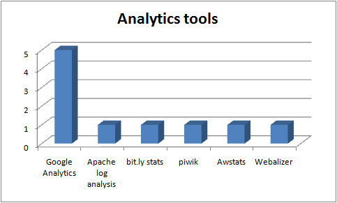
Analytics and tracking tools in use in the UKOER 2 programme

Analytics and tracking tools in use in the UKOER 2 programme

As part of their thinking around sustainability, it was suggested to projects that they consider how they would track and monitor the use of the open content they released.

Most projects have opted to rely on tracking functionality built into their chosen platform (were present). The tools listed in the graph above represent the content tracking or web traffic analysis tools being used in addition to any built in features of platforms.

Awstats, Webalizer and Piwik are all in (trial) use by the TIGER project.

Tools

Tools used to work with OER and OER feeds in the UKOER 2 programme

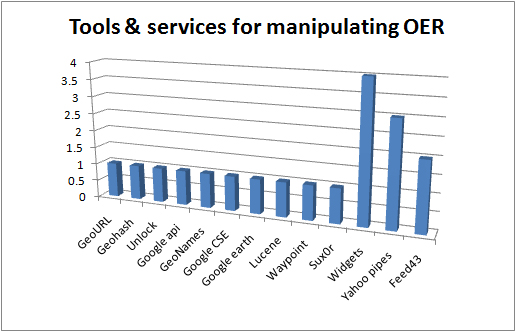
Tools used to work with OER and OER feeds in the UKOER 2 programme

These tools are being used by projects to work with collections of OER, typically by aggregating or processing rss feeds or other sources of metadata about OER. SOme of the tools are in use for indexing or mapping, others for filtering, and others to plug collections or search interfaces into a third-party platform. The tools are mostly in use in Strand C of the programme but widgets, yahoo pipes, and feed43 have a degree of wider use.

The listing in the above graph for widgets covers a number of technologies including some use of the W3C widget specification.
The Open Fieldwork project made extensive use of coordinate and mapping tools (more about this in a subsequent post)