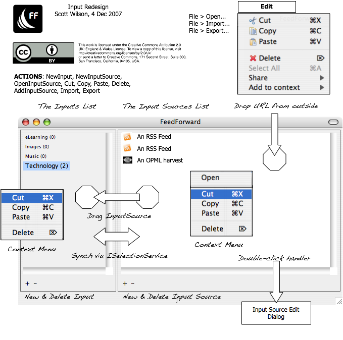
We’ve redesigned the inputs window, which is where users configure the “Inputs”, which are groups of feeds and other services (mail, OAI, SRU etc). This has to deal with a lot of complexity, and the UI was getting a bit claustrophobic. So here’s the new design:
