Well I have survived week 1 of #oldsmooc and collected my first online badge for doing so -#awesome. My last post ended with a few musings about networks and visualisation.
I’m also now wondering if a network diagram of cloudscape (showing the interconnectedness between clouds, cloudscapes and people) would be helpful ? Both in terms of not only visualising and conceptualising networks but also in starting to make more explicit links between people, activities and networks. Maybe the mindmap view is too linear? Think I need to speak to @psychemedia and @mhawskey . . .
I’ve been really pleased that Tony Hirst has taken up my musings and has been creating some wonderful visualisations of clouds, cloudscapes and followers. So I should prefix prefix this post by saying that this has somewhat distracted me from the main course activities over the past few days. However I want to use this post to share some of my thoughts re these experiments in relation to the context of my learning journey and the potential for Cloudworks to help me (and others) contextualise their learning, activities, networks, and become a powerful personal learning space/ environment.
Cloudworks seems to be a bit like marmite – you either love or hate it. I have to admit I have a bit of a soft spot for it mainly because I have had a professional interest in its development.(I also prefer vegemite but am partial to marmite now and again). I’ve also used it before this course and have seen how it can be useful. In someways it kind of like twitter, you have to use it to see the point of using it. I’ve also fully encouraged the development of its API and its open source version Cloud Engine.
A short bit of context might be useful here too. Cloudworks was originally envisaged as a kind of “flickr for learning designs”, a social repository if you like. However as it developed and was used, it actually evolved more into an aggregation space for ideas, meetings, conferences. The social element has always been central. Of course making something social, with tagging, favouring etc, does mean that navigation isn’t traditional and is more “exploratory” for the user. This is the first time (that I know of anyway) it has actually been used as part of a “formal” course.
As part of #oldsmooc, we (the leaners) are being encouraged to use Cloudworks for sharing our learning and activities. As I’m doing a bit more on the course, I’m creating clouds, adding them to my own #oldsmooc and other cloudscapes, increasingly favouriting and following other’s clouds/cloudscapes. I’m starting to find that concept of having one place where my activity is logged and I am able to link to other spaces where I create content (such as this blog) is becoming increasingly attractive. I can see how it could really help me get a sense of my learning journey as I process through the course, and the things that are useful/of interest to me. In other words, it’s showing potential to be my personal aggregation point, and a very useful (if not key) part of my personal learning environment. But the UI as it stands is still a bit clunky. Which is where the whole visualisation thing started.
Now Tony has illustrated how it possible to visualise the connections between people, content, activities, what think would be really useful would be an incorporation of these visualisations into a newly designed profile page. Nick Frear has already done an alpha test to show these can be embedded into Cloudworks.
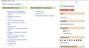
A move from this:

My Cloudworks profile page
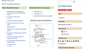
To something kind of like this:

Potential Cloudworks Profile page
Excuse the very crude graphic cut and paste but I hope you get the idea. There’s lots of space there to move things around and make it much more user friendly and useful.
Ideally when I (or any other user) logged into our profile page, our favourite spaces and people could easily been seen, and we could have various options to see and explore other network views of people/and our content and activities. Could these network views start to give learners a sense of Dave Cormier’s rhizomatic learning; and potentially a great level of control and confidence in exploring the chaotic space which any MOOC creates?
The social “stuff” and connections is all there in Cloudworks, it just needs a bit of re-jigging. If the UI could be redesigned to incorporate these ideas , then I for one would be very tempted to use cloud works for any other (c)MOOC I signed up for. I also need to think a lot more about how to articulate this more clearly and succinctly, but I’d be really interested in other views.