Badges? Certificates? What counts as succeeding in MOOCs?

Oops, I did it again. I’ve now managed to complete another MOOC. Bringing my completion rate of to a grand total of 3 (the non completion number is quite a bit higher but more on that later). And I now have 6 badges from #oldsmooc and a certificate (or “statement of accomplishment”) from Coursera.
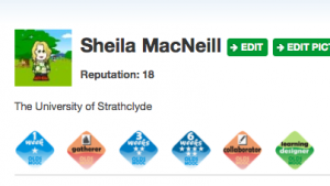
My #oldsmooc badges

My #oldsmooc badges

Screenshot of Coursera record of achievement

Screenshot of Coursera record of achievement


But what do they actually mean? How, if ever, will/can I use these newly gained “achievements”?

Success and how it is measured continues to be one of the “known unknowns” for MOOCs. Debate (hype) on success is heightened by the now recognised and recorded high drop out rates. If “only” 3,000 registered users complete a MOOC then it must be failing, mustn’t it? If you don’t get the certificate/badge/whatever then you have failed. Well in one sense that might be true – if you take completion to equate with success. For a movement that is supposed to be revolutionising the (HE) system, the initial metrics some of the big xMOOCs are measuring and being measured by are pretty traditional. Some of the best known success of recent years have been college “drop outs’, so why not embrace that difference and the flexibility that MOOCs offer learners?

Well possibly because doing really new things and introducing new educational metrics is hard and even harder to sell to venture capitalists, who don’t really understand what is “broken” with education. Even for those who supposedly do understand education e.g. governments find any change to educational metrics (and in particular assessments) really hard to implement. In the UK we have recent examples of this with Michael Gove’s proposed changes to GSCEs and in Scotland the introduction of the Curriculum for Excellence has been a pretty fraught affair over the last five years.

At the recent #unitemooc seminar at Newcastle, Suzanne Hardy told us how “empowered” she felt by not submitting a final digital artefact for assessment. I suspect she was not alone. Suzanne is confident enough in her own ability not to need a certificate to validate her experience of participating in the course. Again I suspect she is not alone. From my own experience I have found it incredibly liberating to be able to sign up for courses at no risk (cost) and then equally have no guilt about dropping out. It would mark a significant sea change if there was widespread recognition that not completing a course didn’t automatically equate with failure.

I’ve spoken to a number of people in recent weeks about their experiences of #oldsmooc and #edcmooc and many of them have in their own words “given up”. But as discussion has gone on it is apparent that they have all gained something from even cursory participation either in terms of their own thinking about possible involvement in running a MOOC like course, or about realising that although MOOCs are free there is still the same time commitment required as with a paid course.

Of course I am very fortunate that I work and mix with a pretty well educated bunch of people, who are in the main part really interested in education, and are all well educated with all the recognised achievements of a traditional education. They are also digital literate and confident enough to navigate through the massive online social element of MOOCs, and they probably don’t need any more validation of their educational worth.

But what about everyone else? How do you start to make sense of the badges, certificates you may or may not collect? How can you control the way that you show these to potential employers/Universities as part of any application? Will they mean anything to those not familiar with MOOCs – which is actually the vast majority of the population. I know there are some developments in California in terms of trying to get some MOOCs accredited into the formal education system – but it’s very early stages.

Again based on my own experience, I was quite strategic in terms of the #edcmooc, I wrote a reflective blog post for each week which I was then able to incorporate into my final artefact. But actually the blog posts were of much more value to me than the final submission or indeed the certificate (tho I do like the spacemen). I have seem an upward trend in my readership, and more importantly I have had lots of comments, and ping backs. I’ve been able to combine the experience with my own practice.

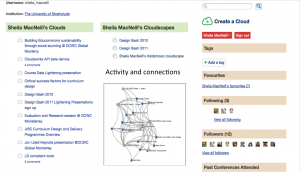
Again I’m very fortunate in being able to do this. In so many ways my blog is my portfolio. Which brings me a very convoluted way to my point in this post. All this MOOC-ery has really started me thinking about e-portfolios. I don’t want to use the default Coursera profile page (partly because it does show the course I have taken and “not received a certificate” for) but more importantly it doesn’t allow me to incorporate other non Coursera courses, or my newly acquired badges. I want to control how I present myself. This relates quite a lot to some of the thoughts I’ve had about using Cloudworks and my own educational data. Ultimately I think what I’ve been alluding to there is also the development of a user controlled e-portfolio.

So I’m off to think a bit more about that for the #lak13 MOOC. Then Lorna Campbell is going to start my MOOC de-programming schedule. I hope to be MOOC free by Christmas.
Prototyping my Cloudworks profile page

Week 5 in #oldsmooc has been all about prototyping. Now I’ve not quite got to the stage of having a design to prototype so I’ve gone back to some of my earlier thoughts around the potential for Cloudworks to be more useful to learners and show alternative views of community, content and activities. I really think that Cloudworks has potential as a kind of portfolio/personal working space particularly for MOOCs.

As I’ve already said, Cloudworks doesn’t have a hierarchical structure, it’s been designed to be more social and flexible so its navigation is somewhat tricky, particularly if you are using it over a longer time frame than say a one or two day workshop. It relies on you as a user to tag and favourite clouds and cloudscapes, but even then when you’re involved in something like a mooc that doesn’t really help you navigate your way around the site. However cloudworks does have an open API and as I’ve demonstrated you can relatively easily produce a mind map view of your clouds which makes it a bit easier to see your “stuff”. And Tony Hirst has shown how using the API you can start to use visualisation techniques to show network veiws of various kinds.

In a previous post I created a very rough sketch of how some of Tony’s ideas could be incorporated in to a user’s profile page.

Potential Cloudworks Profile page

Potential Cloudworks Profile page

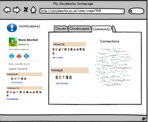
As part of the prototyping activity I decide to think a bit more about this and use Balsamiq (one of the tools recommended to us this week) to rough out some ideas in a bit more detail.

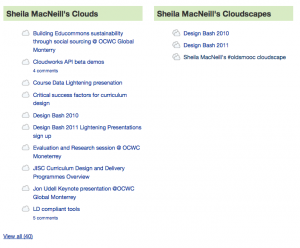
The main ideas I had were around redesigning the profile page so it was a bit more useful. Notifications would be really useful so you could clearly see if anything had been added to any of your clouds or clouds you follow – a bit like Facebook. Also one thing that does annoy me is the order of the list of my clouds and cloudscapes – it’s alphabetical. But what I really want at the top of the list is either my most recently created or most active cloud.

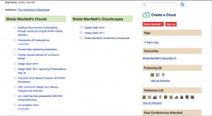
In the screenshot below you can see I have an extra click and scroll to get to my most recent cloud via the clouds list. What I tend to do is a bit of circumnavigation via my oldsmooc cloudscape and hope I have add my clouds it it.

Screen shot of my cloud and cloudscape lists

Screen shot of my cloud and cloudscape lists

I think the profile page could be redesigned to make use of the space a bit more (perhaps lose the cloud stream, because I’m not sure if that is really useful or not as it stands), and have some more useful/useble views of my activity. The three main areas I thought we could start grouping are clouds, cloudscapes (and they are already included) and add a community dimension so you can start to see who you are connecting with.

My first attempt:

screen shot of my first Cloudworks mock up

screen shot of my first Cloudworks mock up

Now but on reflection – tabs not a great idea and to be honest they were in the tutorial so I that’s probably why I used them :-)

But then I had another go and came up something slightly different. Here is a video where I explain my thinking a bit more.

cloudworks profile page prototype take 2 from Sheila MacNeill on Vimeo.

Some initial comments from fellow #oldsmooc-ers included:

and you can see more comments in my cloud for the week as well as take 1 of the video.

This all needs a bit more thought – particularly around what is actually feasible in terms of performance and creating “live” visualisations, and indeed about what would actually be most useful. And I’ve already been in conversation with Juliette Culver the original developer of Cloudworks about some of the more straight forward potential changes like the re-ordering of cloud lists. I do think that with a bit more development along these lines Cloudworks could become a very important part of a personal learning environment/portfolio.

Learning from our MOOC-stakes and sharing learning designs

It had to happen at some time, and not sure if it was karmic retribution or chaos theory, or plain old sod’s law that this week the first high profile MOOC collapse occurred with the pulling of Georgia Tech’s Fundamentals of Online EducationCoursera MOOC.

As many have already commented the route of the problem was the actual course design and implementation. From what I have seen on the twitter and blog-o-spheres, some very fundamental issues such as trying to promote group work without a clear reason as to why it was necessary coupled with technical problems with the chosen technology to facilitate the work general lack of guidance and support, all ask question of the underlying course design and quality assurance processes of (in this instance) Coursera MOOCs. But there are more fundamental questions to be asked about the actual design processes used by the staff involved.

As readers of this blog will know, I’m documenting my own “adventures in mooc-land” at the moment, and I’m in week 4 of #oldsmooc, which is all about learning design. This week is very much focused on the practicalities and planning stages of a design – be that a whole course or an individual activity. The week is led by Professor Diana Laurillard and Dr Nial Winters of the London Knowledge Lab with Dr and Steve Warburton from the University of London.

The week started with a webinar where Diana introduced the PPC (Pedagogical Patterns Collector). Designing for MOOCs were inevitably part of the discussion, and Diana raised some very pertinent points about the feasibility of MOOCS.

which led to these questions

Well it would seem that the design used by the Georgia tech course is one that shouldn’t be shared – or is that case? Elements of what they were suggested can (and have worked even in MOOCs). So can we actually turn this round and use this in a positive way?

I always get a slightly uneasy feeling when people talk about quality of learning materials, as I’m not convinced there are universal quality controls. What on the surface can look like a badly, designed artefact, can actually be used as part of a very successful (and high quality) learning experience -even if only to show people what not to do. Perhaps this is what Coursera need to do now is turn this thing around and be open so the whole community can learn from this experience. Already many, many experienced teachers have shared their views on what they would have done differently. How about using a tool like the PPC to share the original design and then let others re-design and share it? As George Siemens said so eloquently

“the gift of our participation is a valuable as the gift of an open course.”

The community can help you Coursera if you let it.

#oldsmooc week 2 – Context and personal learning spaces

Well I have survived week 1 of #oldsmooc and collected my first online badge for doing so -#awesome. My last post ended with a few musings about networks and visualisation.

I’m also now wondering if a network diagram of cloudscape (showing the interconnectedness between clouds, cloudscapes and people) would be helpful ? Both in terms of not only visualising and conceptualising networks but also in starting to make more explicit links between people, activities and networks. Maybe the mindmap view is too linear? Think I need to speak to @psychemedia and @mhawskey . . .

I’ve been really pleased that Tony Hirst has taken up my musings and has been creating some wonderful visualisations of clouds, cloudscapes and followers. So I should prefix prefix this post by saying that this has somewhat distracted me from the main course activities over the past few days. However I want to use this post to share some of my thoughts re these experiments in relation to the context of my learning journey and the potential for Cloudworks to help me (and others) contextualise their learning, activities, networks, and become a powerful personal learning space/ environment.

Cloudworks seems to be a bit like marmite – you either love or hate it. I have to admit I have a bit of a soft spot for it mainly because I have had a professional interest in its development.(I also prefer vegemite but am partial to marmite now and again). I’ve also used it before this course and have seen how it can be useful. In someways it kind of like twitter, you have to use it to see the point of using it. I’ve also fully encouraged the development of its API and its open source version Cloud Engine.

A short bit of context might be useful here too. Cloudworks was originally envisaged as a kind of “flickr for learning designs”, a social repository if you like. However as it developed and was used, it actually evolved more into an aggregation space for ideas, meetings, conferences. The social element has always been central. Of course making something social, with tagging, favouring etc, does mean that navigation isn’t traditional and is more “exploratory” for the user. This is the first time (that I know of anyway) it has actually been used as part of a “formal” course.

As part of #oldsmooc, we (the leaners) are being encouraged to use Cloudworks for sharing our learning and activities. As I’m doing a bit more on the course, I’m creating clouds, adding them to my own #oldsmooc and other cloudscapes, increasingly favouriting and following other’s clouds/cloudscapes. I’m starting to find that concept of having one place where my activity is logged and I am able to link to other spaces where I create content (such as this blog) is becoming increasingly attractive. I can see how it could really help me get a sense of my learning journey as I process through the course, and the things that are useful/of interest to me. In other words, it’s showing potential to be my personal aggregation point, and a very useful (if not key) part of my personal learning environment. But the UI as it stands is still a bit clunky. Which is where the whole visualisation thing started.

Now Tony has illustrated how it possible to visualise the connections between people, content, activities, what think would be really useful would be an incorporation of these visualisations into a newly designed profile page. Nick Frear has already done an alpha test to show these can be embedded into Cloudworks.

A move from this:

My Cloudworks profile page

My Cloudworks profile page

To something kind of like this:

Potential Cloudworks Profile page

Potential Cloudworks Profile page

Excuse the very crude graphic cut and paste but I hope you get the idea. There’s lots of space there to move things around and make it much more user friendly and useful.

Ideally when I (or any other user) logged into our profile page, our favourite spaces and people could easily been seen, and we could have various options to see and explore other network views of people/and our content and activities. Could these network views start to give learners a sense of Dave Cormier’s rhizomatic learning; and potentially a great level of control and confidence in exploring the chaotic space which any MOOC creates?

The social “stuff” and connections is all there in Cloudworks, it just needs a bit of re-jigging. If the UI could be redesigned to incorporate these ideas , then I for one would be very tempted to use cloud works for any other (c)MOOC I signed up for. I also need to think a lot more about how to articulate this more clearly and succinctly, but I’d be really interested in other views.

Cloud gazing, maps and networks – some thoughts on #oldsmooc so far

So my 2013 mooc adventures have started with #oldsmooc, the OU (UK) open course on learning design. As this mooc has evolved from a number or projeccts in the JISC Currriculum Design programme (notably OULDI) and has benefitted from a small additional amount JISC funding to get it up and running.

As with any mooc (particularly one that is based on constructionist pedagogies (or a cMooc), the initial experience can be a bit overwhelming and confusing. My heart went out to all the team last week when the technical gremlins came out in full force for the live overview/introduction to the course, and then Cloudworks had to have a “essential maintanance” on Thursday morning which was the official start date of the coures. However, these minor hiccups have been sorted and the chaos course has well and truly begun.

The course is utilsing a number of different online spaces for communication, course information and sharing including, email, google groups and hangouts, bibsonomy, twitter, a website and cloudworks – not a VLE insight. As I was exploring the course outline and various sites last week I have to confess that it did cross my mind that just having everything in one place might make things a lot easier for participants. Yes, dear reader I did have a yearning for a VLE, but that quickly passed. I remembered that even in #moocmooc where they did use one, I actually ended up hardly using it and most of my “learning” and activities took place via my own personal learning network, which in that instance was pretty much twitter and my blog.

I’m relatively fortunate as I have used most of online spaces being utilised by the course before, but there is quite a learning curve and with so much activity it is really easy to feel lost and unsure. These feelings of confusion and isolation are not unique to this course, I experienced the same with the #moocmooc course last year. It does take confidence on both a personal and professional level to put yourself “out there” and start to share/comment work with others (which is one of the main activities for week 1). With so many different online communication channels being used it also requires quite a level of digital literacy to navigate between the various areas. (Bonnie Stewart has written a great blog post about inherent digital literacies and networking which discusses these issues in a far more detailed and coherent way). Importantly, as a learner you need to have quite a high a level of confidence to work out just what are going to be the most effective channels for you to use.

As with anything “massive” you just can’t keep up with everything so, imho the having the confidence to be able to not try and do everything/ read every post is crucial too. Not only in terms of having any chance of completing the course but also for your own sanity. I have a feeling that I might be like lots of the participants on the course, despite knowing the suggested time allocation for the course ( up to 10 hours a week), my motivation, work and life in general will probably get in the way of me actually dedicating that amount of time each week, so I have to be pragmatic to get the most out of the effort I put in. (Just trying to figure out what is the minimum I can do to get some badges?:-) )

Finding the “right” technologies/online spaces for MOOCs is a bit like looking for the holy grail. Everything falls short in some areas, and a lot does come down to personal preferences. That said I do think it is important to allow for experimentation – both for course designers and for students. The former can get a feel for what actually does work in terms of their overall “design” and learning objectives, and for the latter there is nothing like learning by doing. In this case when the course is about learning design, first hand experience should be helpful when thinking about technologies to use in your own courses. My list of things I really don’t/do like is growing and more importantly the context of when I do/don’t like using them.

For many participants, this is the first time they will have used, or indeed come across Cloudworks. Again I am fortunate as I have used Cloudworks before. I have found it really useful but getting into it can be slightly confusing. The logic of individual clouds being part of wider collections of clouds called cloudscapes is fine. At the moment it is hard to keep up with and find the sheer number of clouds and cloudscapes being created, never mind trying to remember to favourite and follow ones you are interested in and add your clouds to overarching clouds. I don’t know if it is the influence of last week’s Star Gazing Live, but I think (and I was glad to see I’m not alone in this, Jane Challinor has blogged about it too) what might be needed is another map or way of understanding/finding/navigating our way through the ever expanding skyline in Cloudworks. A more visual cloud map instead of star map if you like.

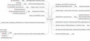
Naviagting Cloudworks as it grows is a challenge. The current navigation is pretty much list based just now, but not everything is (or could be ) easily accessible from the front page. As I was looking through various clouds yesterday, I was reminded of a wee experiment my colleague David Sherlock and I did a couple of years ago with the (at that point recently released) Cloudworks API. We were able to create a mindmap of a cloudscape, and I’m just wondering if this view might be useful to help people make sense of some of the OLDS Mooc cloudscapes,including their own. David has kindly dug out the code and here’s an example base on the main OLDS MOOC cloudscape. Click this link to see the mind map (NB this uses a flash front end so if you’re on a mobile device it won’t display properly.) The screen shot gives an indication of the mind map view.

Screenshot of mindmap view of a cloudscape

Screenshot of mindmap view of a cloudscape

To try it yourself put http://labs.cetis.org.uk/cloudworks/?cloudscape=2417 into your browser, and if change the “=2417” to whatever the ID of the cloudscape you want to view is e.g. my oldsmooc cloudscape looks like this, the “2417” has just been changed to “2567”.

I know the Cloudworks developers were quite keen on this idea back then, maybe this is something that can be explored again. After reading and watching Bonnie’s post about the the power of networks in moocs, I’m also now wondering if a network diagram of cloudscape (showing the interconnectedness between clouds, cloudscapes and people) would be helpful ? Both in terms of not only visualising and conceptualising networks but also in starting to make more explicit links between people, activities and networks. Maybe the mindmap view is too linear? Think I need to speak to @psychemedia and @mhawskey . . . Now I better get back to the actual course.

Quick review of the Larnaca Learning Design Declaration

Late last month the Larnaca Declaration on Learning Design was published. Being “that time of year” I didn’t get round to blogging about it at the time. However as it’s the new year and as the OLDS mooc is starting this week, I thought it would be timely to have a quick review of the declaration.

The wordle gives a flavour of the emphasis of the text.

Wordle of Larnaca Declaration on Learning Design

Wordle of Larnaca Declaration on Learning Design

First off, it’s actually more of a descriptive paper on the development of research into learning design, rather than a set of statements declaring intent or a call for action. As such, it is quite a substantial document. Setting the context and sharing the outcomes of over 10 years worth of research is very useful and for anyone interested in this area I would say it is definitely worth taking the time to read it. And even for an “old hand” like me it was useful to recap on some of the background and core concepts. It states:

“This paper describes how ongoing work to develop a descriptive language for teaching and learning activities (often including the use of technology) is changing the way educators think about planning and facilitating educational activities. The ultimate goal of Learning Design is to convey great teaching ideas among educators in order to improve student learning.”

One of my main areas of involvement with learning design has been around interoperability, and the sharing of designs. Although the IMS Learning Design specification offered great promise of technical interoperability, there were a number of barriers to implementation of the full potential of the specification. And indeed expectations of what the spec actually did were somewhat over-inflated. Something I reflected on way back in 2009. However sharing of design practice and designs themselves has developed and this is something at CETIS we’ve tried to promote and move forward through our work in the JISC Design for Learning Programme, in particular with our mapping of designs report, the JISC Curriculum Design and Delivery Programmes and in our Design bashes: 2009, 2010, 2011. I was very pleased to see the Design Bashes included in the timeline of developments in the paper.

James Dalziel and the LAMS team have continually shown how designs can be easily built, run, shared and adapted. However having one language or notation system is a still goal in the field. During the past few years tho, much of the work has been concentrated on understanding the design process and how to help teachers find effective tools (online and offline) to develop new(er) approaches to teaching practice, and share those with the wider community. Viewpoints, LDSE and the OULDI projects are all good examples of this work.

The declaration uses the analogy of the development of musical notation to explain the need and aspirations of a design language which can be used to share and reproduce ideas, or in this case lessons. Whilst still a conceptual idea, this maybe one of the closest analogies with universal understanding. Developing such a notation system, is still a challenge as the paper highlights.

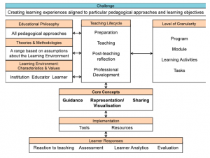
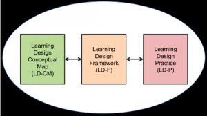
The declaration also introduces a Learning Design Conceptual Map which tries to “capture the broader education landscape and how it relates to the core concepts of Learning Design“.

Learning Design Conceptual Map

Learning Design Conceptual Map

These concepts including pedagogic neutrality, pedagogic approaches/theories and methodologies, teaching lifecycle, granularity of designs, guidance and sharing. The paper puts forward these core concepts as providing the foundations of a framework for learning design which combined with the conceptual map and actual practice provides a “new synthesis for for the field of learning design” and future developments.

Components of the field of Learning Design

Components of the field of Learning Design

So what next? The link between learning analytics and learning design was highlighted at the recent UK SoLAR Flare meeting. Will having more data about interaction/networks be able to help develop design processes and ultimately improving the learning experience for students? What about the link with OERs? Content always needs context and using OERs effectively intrinsically means having effective learning designs, so maybe now is a good time for OER community to engage more with the learning design community.

The Declaration is a very useful summary of where the Learning Design community is to date, but what is always needed is more time for practising teachers to engage with these ideas to allow them to start engaging with the research community and the tools and methodologies which they have been developing. The Declaration alone cannot do this, but it might act as a stimulus for exisiting and future developments. I’d also be up for running another Design Bash if there is enough interest – let me know in the comments if you are interested.

The OLDS MOOC is a another great opportunity for future development too and I’m looking forward to engaging with it over the next few weeks.

Some other useful resources
*Learning Design Network Facebook page
*PDF version of the Declaration
*CETIS resources on curriculum and learning design
*JISC Design Studio