Thoughts on a huge social media strategy

Whether you’re trying to flog wares, advertise consultancy skills or simply have a big ego; it seems that we all want to abuse social media for a cause. I find it interesting that we all choose to use different social media services and guess that our strategy depends on on many factors such as what it is we are sharing, the audiences we are trying to reach and ultimately the user base size of the social media service.

Yesterday Obama claimed the most popular Twitter and Facebook posts of all time with over 640 000 retweets and 3 million likes of a picture of him and his wife and it occurred to me that the two huge social media strategies; that of the U.S presidential candidates will be winding down.

With my social media strategy restricted to posting on Google Site’s and this very blog I thought it would be interesting to poke about and reflect on how the candidates things.  I found much analysis of both Obama’s and Romney’s campaign already exists; here are some things I found interesting:

Email still plays a huge role

Ed Hallen did an analysis of both candidates email campaigns. The strategies of both candidates are quite complex, but it is clear that email plays a huge roll and there seem to be some important themes to the strategy.

It matters who in the organisation sends the message.

Both campaigns restricted the times that messages appeared to come from the candidates themselves to more urgent emails. Other emails came from the VP-candidate or spouse.

Subject matters

Emails from the Democrat camp were often punchy with a semi colon, which Ed claims was a tested way making people more likely to read the message. On the other hand the Republican camp used relaxed one word subjects. ‘Hey’ being the most common

*  Know your audience

Having signed up to the lists, both camps know that they are preaching to the converted.  It seems the list were more likely to be used for issues such as fund raising then trying to get new votes.

Obama on Reddit

Both sides had the obvious online presence: Twitter, Facebook, Youtube, Google + and Linked in but I was shocked to see  Obama do an ‘Ask me Anything’ on my favourite news aggregation site 2 months ago; but in retrospect Reddit is the perfect choice.

Targeting an audience on the edge

Reddit often comes under attack for suffering from group think popular opinions voted to the top with disagreements being voted down and often deleted. The demographic of Reddit in the U.S. is young males who lean towards the Democrats. This meant Obama could essentially reaching out to an audience who already supported him but were in a demographic not likely. The groupthink mentality would mean that  arguments against his replies would not float to the top ( Plus his reference to internet memes gave him geek cred – Not Bad! ).

Social sites create their own analysis dashboards

While twitter was an obvious choice for both candidates I found it interesting that twitter worked with Topsy to create a dashboard to mine itself for data on the candidates and the topics surrounding them.  I felt this was a sign that the service knows just how important the data it holds is and was a clear message to the world that if you want to win your cause you have to try and play its game. Twitter wasn’t the only service doing this, Microsoft’s  example can be found here.

Mitt Romney on 4chan

(I kid)
Posted in Uncategorized

iTunesU for Games?

As those who followed the Game Group administration story earlier this year know, purchasing physical media for games is on the way out. This isn’t a recent thing, for many years PC gamers have had to install digital distribution systems to get their hands on the the latest games.

The most popular PC gaming distribution system is Steam. Steam is developed by the Valve Corporation who also develop a range of very successful games based on their in-house game engine, Source. Although Valve do not release sales figures, two years ago it was estimated by a rival company that Steam owned 70% of the digital distribution games market, we know that since then the service has grown in terms of audience, with just under 5 million people logging in to the service most days.

While Valve have supported game modding communities for a long time, they have recently turned their attention to schools with a very impressive set of free tools for education. The catch? You have to install their digital distribution and sign up to the “Steam for Schools Initiative”.

The tools:

  • Valve Learning with Portals

Valve offers free copies of Portal 2 and Portal 2 Puzzle for use in physics, maths, chemistry, language, design classes and offer lesson plans to available at http://www.learnwithportals.com/

  • Valve Filmmaker

There are lots of high profile film makers at Valve and the company are well known for their high quality ‘shorts’. Valve now offer their in house film making software to anybody that wants to give it a whirl for free. Videos are made inside of the game engine. You can take a peak of whats on offer here:

[youtube]http://www.youtube.com/watch?v=aTPysJyj7j4[/youtube]

  • Hammer

The Valve Hammer Editor is a free map editing suite tused to teach game design.

  • Steam workshop

Steam offers a hub for users to share and publish (and make profit on!) their creations in the tools. Proud of the Portal 2 level you made in a physics class? Share it!

Steam for Schools is an aggressive move by Valve, the tools that they are offering are very high quality from a high profile publisher. It surly tells us that Valve thinks that games and storytelling have a big part to play in education.

Some other stories of interest:

My First Ebook

When I purchase an item I like having a physical thing to hold and show for my purchase. There is something about my physical CD collection that my digital one does not capture; is it all those colourful cases, the fancy sleeve artwork, the smell of a new cd or am I just a hoarder? My addiction to the physical means I am often late to the party where purchasing digital versions of media content is concerned. When I do finally cave in and opt for my first digital taste of something I remember what it was and the exact reason I opted for digital over physical. My first digital CD was a limited print and only sold in physical form at U.S gigs . My first digital games came from a ‘pay what you want’ indie charity bundle.

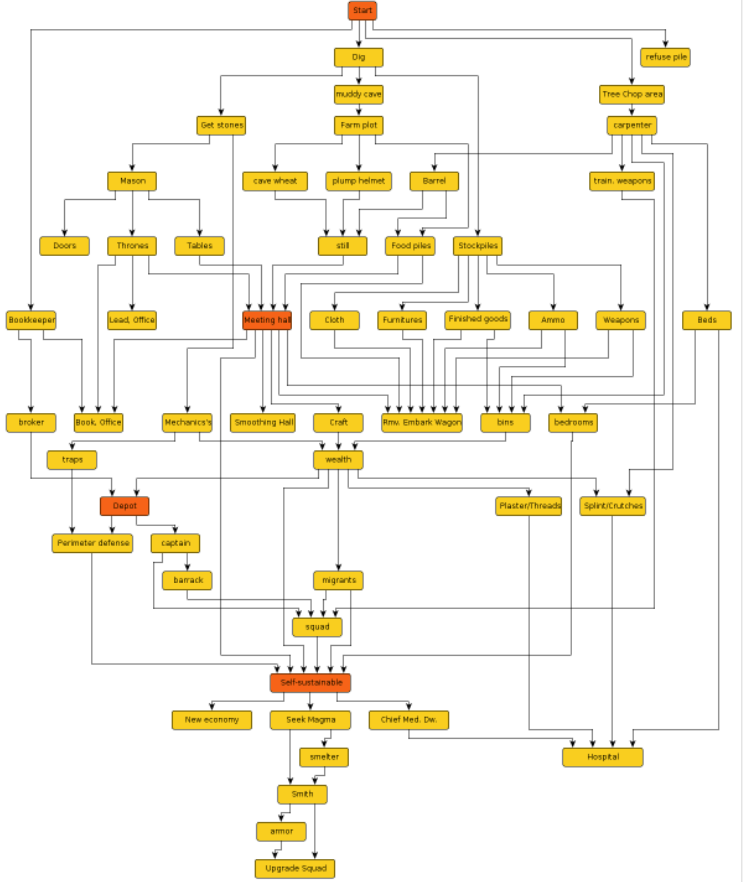
Yesterday I purchased a physical book, the book is called Getting started with Dwarf Fortress. For those that don’t know Dwarf Fortress is the 2nd greatest game ever (fact) and is free to download and play. It’s a very complex city building game where you manage a bunch of fortress building dwarfs while coping with many dangers such as goblins, vampires dwarfs, lack of beer and ‘the occasional rampant megabeast’. It’s a hard game with a high learning curve and ASCII graphics. My favourite thing about it is the sheer amount of things in the game. The below flowchart is a community creation to show a beginner what should be done in order to get started:

flow

The game is constantly updated and as a result this flowchart gets bigger and bigger!

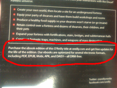
The problem with a physical book on a subject like Dwarf Fortress is that it can date quickly. While the book will be a great help for me in turning Atolkol into a successful Dwarf fortress I wonder how useful it will be two or three game updates down the line. Will the book have a short shelf life with the subject of the book being constantly updated? Reading the back of the book I spotted this about free updates:

imag0713

I headed over to forums and the author had this to say on the matter:

“Yes – it isn’t well explained on O’Reilly’s site, but O’R ebook customers will be alerted when the book is updated and able to grab a new copy. Other owners can, if they wish, “register” their book with O’R for $5 and also get the updates.

Print book will always be current to the version bought at the time of purchase. The current version is, basically the May releases of DF – so, exceptionally current“

This is a new concept to me; it could be common practice that I haven’t noticed, as I haven’t purchased an Ebook before. My shelf is full of text books on the same subject, not because I particularly love Java but because updates to it render old books useless. I like the idea of ‘patching books’ that a book can evolve along with its subject matter.

I checked out the Ebook and not only does it get updates, it is full of beautiful colourful pictures that don’t work very well in the black and white book. So now I have another digital media content first, my first Ebook.

Posted in Uncategorized

Sharing ideas in a distributed organisation

A good thing about working in JISC CETIS is being surrounded by the wide array of interests and ideas of its staff. A bad thing about working for JISC CETIS is with its distributed nature (and the fact everybody is always so busy!) it is always not possible to sit down and have a good natter about these interests.

Sheila recently blogged about social analytics and the way people share things. I enjoyed the post as I find resource sharing online a really interesting area. I increasingly find myself getting anxious about how I share things online and to which online persona ideas and resources are attached. I find myself carving out an online identity created of different levels of obscurity where I push my outputs up the levels as and when I feel more comfortable with them. I find it interesting that Christopher Poole’s latest social network allows you to work anonymously and then gives you the option to claim the work at a later date.

I left a comment on Sheila’s post and she replied back to me. First through a comment back on the post followed up by a quick skype chat. It occurred to me then that an online social structure that has worked very well for me has been the JISC CETIS blogs. An environment of regular blogging and commenting allows ideas to be shared and grow through the distributed organisation.

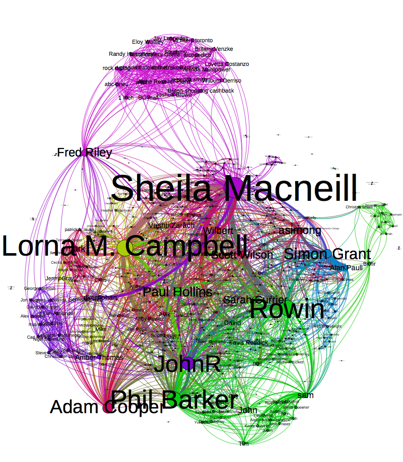
Over the past week or so I’ve been collecting data for a report and struggling with a way to analyse it. I came up with a method of turning networks I can spot in my CSV files into something network analysis tools can understand (which you can read about further down the chain of obscurity). Now that I’m obsessed with running data through the technique I thought I’d run CETIS blog authors and the conversations that join them over the method and steal Tony’s visualisation technique. I’ve removed pingbacks and such. It might not be useful but it tickles the occipital lobe.

commentlinks

What are we writing about? Using CETIS Publications RSS in R

I have been poking around Adam Coopers text mining weak signals in R code, and being too lazy to collect data in CSV format wondered if I could come up with something similar that used RSS feeds. I discovered it was really easy to read and start to mine RSS feeds in R, but there didn’t seem to be much help available on the web so I thought I’d share my findings.

My test case was the new CETIS publications site, Phil has blogged about how the underlying technology behind site is wordpress, which means it has an easy to find feed. I wrote a very small script to test things out that looks something like this:


      library("XML")
      library("tm")
      doc<-xmlTreeParse("http://publications.cetis.org.uk/feed") 
      src<-xpathApply(xmlRoot(doc), "//category")
      tags<- NULL

      for (i in 1:length(src)) {
             tags<- rbind(tags,data.frame(tag=tag<-xmlSApply(src[[i]], xmlValue)) )  
      }


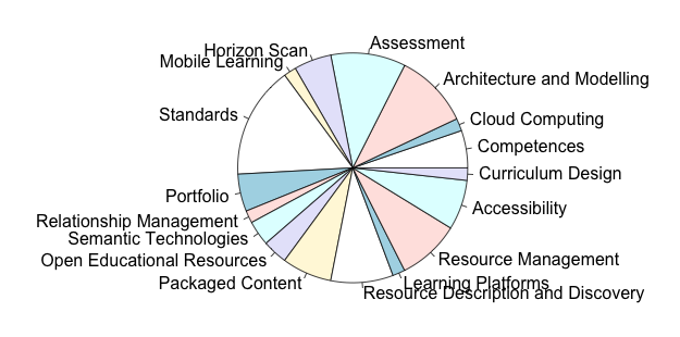
This simply grabs the feed and puts all the categories tags into a dataframe. I then removed the tags that referred to the type of publication and plotted it as a piechart. I’m pretty sure this isn’t the prettiest way to do this, but it was very quick and worked!


         cats <- subset(tags, tag != "Briefing Paper" & tag != "White Paper" & tag != "Other Publication" & tag != "Journal Paper"  & tag != "Report")
         levels(cats$tag)
         df$tag = factor(df$tag)
         pie(table(cats$tag))


Which gave me a visual breakdown of all the categories used on our publications site and how much they are used:

typesI was surprised at how much of a 5 minute job it was. It struck me that because the feed has the publication date it would be easy to do the Google Hans Rosling style chart with it. My next step would be to grab multiple feeds and use some of Adams techniques on the descriptions/content of the feed.

*UPDATE*

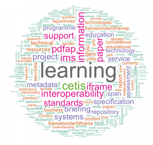
I had been interested in how to grab RSS and pump it into R and ‘interesting things we can do with the CETIS publications RSS feed’ had been a bit of an after thought. Martin brought up the idea of using the feed to drive a wordl (see comments). I stole the code from the comment and changed my code slightly so that I was grabbing the publication descriptions rather than the tags used… This is what it came up with.. Click to enlarge

wordl

SNA session at CETIS 12

I attended the SNA session at the CETIS conference hosted by Lorna, Sheila, Tony and Martin. Before the session I had blogged about some of the questions I had on SNA and although I think I have more new questions than answers I feel like things are much clearer now. My mind is still going over the conversations that were had at the session but these are the main themes and some early thoughts that I came away with.

What are the quick wins?
At the start of the session Sheila asked the question ‘What are the quick wins?’.   While Tony and Martins presentations were excellent I think it is hard for people who don’t have their head regularly in this space to replicate the techniques quickly. Lorna said that although she understood what was happening in the SNA examples there was some ‘secret magic that she couldn’t replicate when doing it for herself, Tony agreed that when you work in this area for a while you start to develop a workflow and understand some of the quirks of the software. I could relate to Lorna’s dilema as it took me a few hours of using Gephi just to know exactly when I needed to force quit the program and start all over again.

So for people who want to find out useful information about social networks but don’t have the time to get into the secret magic of SNA can we develop quick and simple tools that answer quick and simple questions?

The crossover between data driven visualisations and SNA
The session helped me make a clear distinction between Data Driven Journalism and SNA . While there is a crossover between the two the reasons for doing them are quite different. SNA is a way to study social networks and data driven visualisations are a way to convey a story to an audience. Although the two do cross over I found that making distinctions between them both helped me get to grips with the ‘why is it worth doing this’ question.

Data Validation
Martin made the point that when he was playing with PROD data to create visualisations he found that it was a great way of validating the data itself as he managed to spot errors and feed that back to Wilbert and myself.

Lies, Damned Lies and Pretty Pictures
Amber Thomas did a fantastic presentation, if you missed the session it is available here. I felt Amber had really thought about the ‘How is this useful?’ question and I felt lots of pieces of the puzzle click into place during the presentation. I really recommend spending the time to go through the slides.

Thanks to Sheila, Lorna, Amber, Tony and Martin for an interesting session.

Standards used in JISC programmes and projects over time

Today I took part in an introduction to R workshop being held at The University of Manchester. R is a software environment for statistics  and while it does all sorts of interesting things that are beyond my ability one thing that I can grasp and enjoy is exploring all the packages that are available for R, these packages extend Rs capabilities and let you do all sorts of cool things in a couple of lines of code.

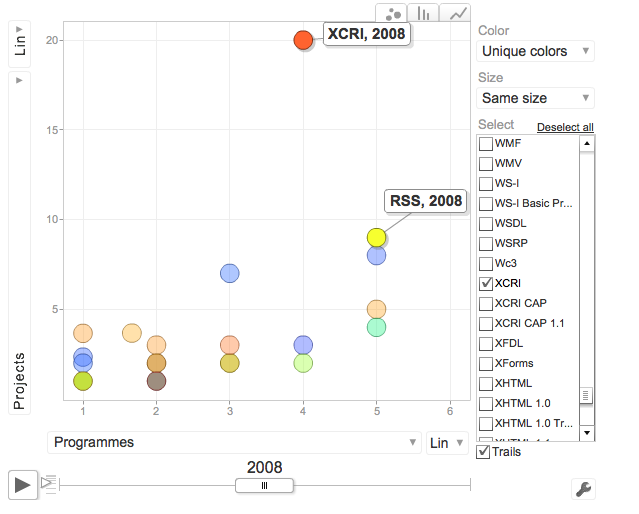
The target I set out for myself was to use JISC CETIS Project Directory data and find a way of visualising standards used in JISC funded projects and programmes over time. I found a Google Visualisation package and using this I was surprised at how easy it was to generate an output , the hardest bits being manipulating the data (and thinking about how to structure it).  Although my output from the day is incomplete I thought I’d write up my experience while it is fresh in my mind.

First I needed a dataset of projects, start dates, standards and programme. I got the results in CSV format by using the sparqlproxy web service that I use in this tutorial and stole and edited a query from Martin

Sparql:

PREFIX rdfs:
PREFIX jisc:
PREFIX doap:
PREFIX prod:
SELECT DISTINCT ?projectID ?Project ?Programme ?Strand ?Standards ?Comments ?StartDate ?EndDate
WHERE {
?projectID a doap:Project .
?projectID prod:programme ?Programme .
?projectID jisc:start-date ?StartDate .
?projectID jisc:end-date ?EndDate .
OPTIONAL { ?projectID prod:strand ?Strand } .
# FILTER regex(?strand, “^open education”, “i”) .
?projectID jisc:short-name ?Project .
?techRelation doap:Project ?projectID .
?techRelation prod:technology ?TechnologyID .
FILTER regex(str(?TechnologyID), “^http://prod.cetis.org.uk/standard/”) .
?TechnologyID rdfs:label ?Standards .
OPTIONAL { ?techRelation prod:comment ?Comments } .
}

From this I created a pivot table of all standards, and how much they appeared in each projects and programmes for each year (using the project start date). After importing this into R, it took two lines to grab the google visualisation package and plot this as Google Visualisation Chart.

library(“googleVis”)
M = gvisMotionChart(data=prod_csv, idvar=”Standards”, timevar=”Year”, chartid=”Standards”)

Which gives you the ‘Hans Rosling’ style flow chart. I can’t get this to embed in my wordpress blog, but you can click the diagram to view the interaction version. The higher up a standard is the more projects it is in and the further across it goes the more programmes it spans.

Google Visualisation Chart

Some things it made me think about:

  1. Data from PROD is inconsistent
  2. Standards can be spelt differently; some programmes/projects might have had a more time spent on inputting related standards than others

  3. How useful is it?
  4. This was extremely easy to do, but is it worth doing? I feel it has value for me because its made me think about the way JISC CETIS staff use PROD and the sort of data we input. Would this be of value to anybody else?  Although it was interesting to see the high number of projects across three programmes that involved XCRI in 2008.

  5. Do we need all that data?
  6. There are a lot of standards represented in the visualisation. Do we need them all? Can we concentrate on subsets of this data.